Application Distribution
Each application distribution must define its own settings in a JSON formatted object. This documentation describes the supported settings of the Kitchen application that should be provided for any application distribution linked to the Kitchen application.
You can find here 🔗 a complete JSON sample example of the Kitchen application distribution settings.
Notes:
- The settings format recently changed. Find here 🔗 the documentation of the previous settings format.
- The JSON object cannot contain any comment.
JSON Schema
Description
JSON schema is a specification that can offer descriptions, validation, code completion and more, while editing a JSON file in a compatible text editor. You can find a non-exhausive list of compatible editors here. We recommend using VSCode.
For the application distribution settings file, we offer a JSON schema that simplifies a lot its edition, and reduces potential errors to the minimum. The Kitchen team ensures that the JSON schema is always up-to-date.
Our JSON schema contains a short description for all of the supported settings, so for most of them you don't need to check the documentation on the current page to understand their purpose. For complex settings or if you need to see examples, the current documentation offers more information.
How to use
To use our JSON schema, you just have to add this line in your application distribution settings file:
{
   "$schema": "https://kitchen.enterprise.by.me/Kitchen/assets/appSettingsSchema.json"
}
Once the line is added as part of the JSON itself, you editor should start directly to use the schema to underline wrong fields, offer code completion, description, etc.
Note: this line is only useful during the edition process. Once your settings file is ready, you can remove it before updating your settings. However it has no impact if you leave it in the settings (so that you don't have to re-add it next time for example).
Supported settings
Top structure
The application distribution settings object is defined with the following attributes:
| Attribute | Type | Description |
|---|---|---|
locales | array of objects | A list of supported locales in the application distribution |
currencies | array of objects | A list of supported currencies in the application distribution |
project | object | Application distribution settings related to the projects |
pricing | object | Application distribution settings related to the pricing |
widgets | object | Application distribution settings to enable & configure the default widgets |
catalog | object | Application distribution settings related to the catalog |
panelOption | object | Application distribution settings related to the product panels |
search | object | Application distribution settings related to the search |
feature | object | Application distribution settings to enable & configure different features in the planner |
deprecated | object | Application distribution settings listing the deprecated settings (still supported for a short period) |
The only mandatory attributes are locales, project.defaultWallMaterial and project.defaultFloorMaterial.
locales
| Status | Type | Default value |
|---|---|---|
| Mandatory | array of locale objects | [] |
This parameter contains the list of supported locales for the Application Distribution. It must contain at least one element.
A locale object is defined as follow:
| Attribute | Type | Mandatory | Description |
|---|---|---|---|
isDefault | boolean | NO | If true, tells the application to use this locale by default. It is possible to launch the planner with a specific locale thanks to the "ln" URL parameter 🔗 |
name | string | YES | A combination of a mandatory and an optional element joined in a string and separated by a "-" (dash). - MANDATORY: 2-letter code of a language, following 🔗 ISO 639-1. - OPTIONAL: 2-letter code of a region / country, following 🔗 ISO 3166-1. Examples: "da-DK" for "Danish-Danemark" or "fr-FR" for "French-France" or "PT-pt" for "Poruguese-Portugal". |
fallback | string | NO | Used for translations only. If a translation key is not found for the given locale, the translation system falls back to this locale instead. If not specified, falls back to English. |
unitSystem | string | YES | Defines which unit system is used in the application. Can be metrics or imperial |
lengthUnit | string | YES | Defines the base unit for length in the application. Can be millimeter, centimeter, decimeter or meter (for unitSystem = metrics) and inch, foot or yard (for uniSystem = imperial) |
lengthPrecision | integer | YES if uniSystem is metrics | The various lengths displayed in the application will be displayed with lengthPrecision decimal digits |
lengthFractionPrecision | integer | YES if uniSystem is imperial | Minimal fraction of lengthUnit. Valid values are: 8, 16 or 32 |
Example
{
    "locales":
    [
        {
            "name": "fr-BE",
            "unitSystem": "metrics",
            "lengthUnit": "millimeter",
            "lengthPrecision": 0,
            "fallback": "en"
        },
        {
            "name": "en-US",
            "unitSystem": "imperial",
            "lengthUnit": "foot",
            "lengthPrecision": 0,
            "lengthFractionPrecision": 16,
            "fallback": "en"
        },
        {
            "name": "de-DE",
            "unitSystem": "metrics",
            "lengthUnit": "millimeter",
            "lengthPrecision": 0,
            "fallback": "en"
        }
    ]
}
currencies
| Status | Type | Default value |
|---|---|---|
| Optional | array of currency objects | [] |
This parameter contains a list of specific currency configurations for the Application Distribution. Each object in this array is used to configure how a particular currency is configured for its display in the application.
When the application starts, it determines which currency to use (see currency URL param 🔗). If it is in this list of currencies, it uses the associated object to configure the currency display. If the currency is not in the currencies list, it fallsback on the locale-currency configuration (see GET /applications/{id}/currencylocales/{locale} 🔗).
A currency object is defined as follow:
| Attribute | Type | Mandatory | Description |
|---|---|---|---|
currencyCode | string | YES | A 3 letters string following 🔗 ISO 4217 |
currencyName | string | YES | The currency name |
numberSystem | string | YES | "latin" or "arab". Defines which alphabet to use to display the digits |
currencySymbol | string | YES | The symbol to display for the currency |
currencySignRighthand | boolean | YES | Defines if the currency symbol should be on the right side of the price number. true to display the symbol on the right side |
currencySpacing | boolean | YES | Defines if there should be a space between the price number and the currency symbol. true to display a spacing |
decimalSeparator | string | YES | The separator string to separate the decimal digits of the price |
thousandSeparator | string | YES | The separator string to separate the thousand groups |
noDecimalString | string | YES | The string to display when there is no decimal digits |
Example 1 – Array of two currencies
{
    "currencies": [
        {
            "currencyCode": "GBP",
            "currencyName": "British Pound",
            "numberSystem": "latin",
            "currencySymbol": "\u00a3",
            "currencySignRighthand": false,
            "currencySpacing": false,
            "decimalSeparator": ".",
            "thousandSeparator": ",",
            "noDecimalString": ""
        },
        {
            "currencyCode": "EUR",
            "currencyName": "euro",
            "numberSystem": "latin",
            "currencySymbol": "\u20ac",
            "currencySignRighthand": true,
            "currencySpacing": true,
            "decimalSeparator": ",",
            "thousandSeparator": " ",
            "noDecimalString": ""
        }
    ]
}
project
The project attribute groups settings related to project configuration.
defaultWallMaterial
| Status | Type | Default value |
|---|---|---|
| Optional | string | null |
Define the wall material that is used by default when the application launches.
If default room shapes 🔗 is defined, this parameter should not be provided.
For example:
"defaultWallMaterial": "4755",
defaultFloorMaterial
| Status | Type | Default value |
|---|---|---|
| Optional | string | null |
Defines the floor material that is used by default when the application launches.
If default room shapes 🔗 is defined, this parameter should not be provided.
For example:
"defaultFloorMaterial": "4296"
defaultStyle
| Status | Type | Default value |
|---|---|---|
| Optional | object | null |
This object is used to define the default styling in the Kitchen application. Note that it is possible to overwrite this style at runtime with the SetUpSettings iframe message 🔗. Below is the list of supported attributes for this object.
styleVersion
| Status | Type | Default value |
|---|---|---|
| Mandatory | positive integer | – |
Version in which to read the rest of the object. The current version is 2. Version 0 is deprecated.
linearStyle
| Status | Type | Default value |
|---|---|---|
| Optional | object | {} |
Object containing the linear style. Keys are linear names, values are a single DBID as a string. The only supported keys (case sensitive) for this object are:
- "worktop"
- "plinth"
- "wallPanel"
- "wallEdgeStrip"
- "cornice"
- "decostrip"
furnitureStyle
| Status | Type | Default value |
|---|---|---|
| Optional | object | {} |
Object containing the furniture style of every products in the planner. Keys are parameter names (case sensitive), values are arrays of accepted values.
Listed parameters can be of any valid type (boolean, integer, product, etc.), not necessarily of product type.
Note: Putting parameter style in this object is similar to putting it in both
floorStyleandwallStyle.
floorStyle
| Status | Type | Default value |
|---|---|---|
| Optional | object | {} |
Object containing the furniture style of products touching the floor in the planner. Keys are parameter names (case sensitive), values are arrays of accepted values.
Listed parameters can be of any valid type (boolean, integer, product, etc.), not necessarily of product type.
wallStyle
| Status | Type | Default value |
|---|---|---|
| Optional | object | {} |
Object containing the furniture style of products not touching the floor in the planner. Keys are parameter names (case sensitive), values are arrays of accepted values.
Listed parameters can be of any valid type (boolean, integer, product, etc.), not necessarily of product type.
ignoredParameters
| Status | Type | Default value |
|---|---|---|
| Optional | array of string | [] |
📌 Supported from styleVersion 2.
Array of blacklisted parameter names. These parameters are never added to the global style when planning your kitchen.
For example:
   "defaultStyle": {
      "styleVersion": 2,
      "linearStyle": {
         "plinth": "13950",
         "cornice": "14178",
         "worktop": "14130",
         "decostrip": "14146",
         "wallPanel": "18510",
         "wallEdgeStrip": "14173"
      },
      "furnitureStyle": {
         "handle": [ "13776" ],
         "drawerFront": [ "13700" ],
         "front": [ "13855" ]
      },
      "floorStyle": {
         "front": [ "13855" , "13902" ]
      },
      "wallStyle": {
         "front": [ "13699" , "16059" ]
      },
      "ignoredParameters": [ "cooktop", "leftSidePanel", "rightSidePanel" ]
   },
Note: The priorty of
floorStyleandwallStyleis alywas higher than furnitureStyle. If eitherfloorStyleorwallStyleis empty, the value offurnitureStylewill be used. IffurnitureStyleis also empty, the default parameter values will be asigned to product.
hideProjectTitle
| Status | Type | Default value |
|---|---|---|
| Optional | boolean | false |
Indicates whether the project title in floorplan and design state should be hidden or not.
insertStyleParameters
| Status | Type | Default value |
|---|---|---|
| Optional | array of string | [] |
Array of parameters to check upon inserted products. Any inserted product that has one of these parameters triggers a style check. If the array is empty or if the user adds a product with no parameter from this list, no style check is performed.
During a style check the planner verifies that the current style can be fully applied. If any style parameter has no valid value on the inserted product, a pop-in is displayed to the user alerting that the current style cannot be fully applied.
Note: In any case, the current style is applied to any inserted product. The
insertStyleParameterssetting only controls in what cases to display a pop-in to the user.
For example:
"insertStyleParameters": [
      "front",
      "drawerFront",
      "decorativePanelFront"
]
roomShapes
| Status | Type | Default value |
|---|---|---|
| Optional | object | null |
Defines all the room shapes that can be overriden. There are six room shapes:
- Three with a kitchen in a specific room (the Closed Kitchen)
- Three with a kitchen opening to another room (the Open Kitchen)


❗ It is highly recommended that you override all the possible room shapes, even if they are not used. Their availability in the planner is built dynamically; if they are not specified in the JSON, they will not be visible and appear greyed out. Instead of one the three possible plans, the choice will be limited to a plan with walls.
📌Note: If room shapes are defined, defaultWallMaterial 🔗 and defaultFloorMaterial 🔗 must not be provided.
➡️ Please read Create a default project for complementary information of how to setup your default projects for each room shape.
closedKitchen1
| Status | Type | Default value |
|---|---|---|
| Optional | string | null |
The value is the name of the project saved as default project. If the value is not specified, a default project from the application is used.
📌 There is only one possible value:
closedKitchen1.
closedKitchen2
| Status | Type | Default value |
|---|---|---|
| Optional | string | null |
The value is the name of the project saved as default project. If the value is not specified, a default project from the application is used.
📌 There is only one possible value:
closedKitchen2.
closedKitchen3
| Status | Type | Default value |
|---|---|---|
| Optional | string | null |
| The value is the name of the project saved as default project. | ||
| If the value is not specified, a default project from the application is used. |
📌 There is only one possible value:
closedKitchen3.
openKitchen1
| Status | Type | Default value |
|---|---|---|
| Optional | string | null |
The value is the name of the project saved as default project. If the value is not specified, a default project from the application is use.
📌 There is only one possible value:
openKitchen1.
openKitchen2
| Status | Type | Default value |
|---|---|---|
| Optional | string | null |
The value is the name of the project saved as default project. If the value is not specified, a default project from the application is used.
📌 There is only one possible value:
openKitchen2.
openKitchen3
| Status | Type | Default value |
|---|---|---|
| Optional | string | null |
The value is the name of the project saved as default project. If the value is not specified, a default project from the application is used.
📌 There is only one possible value:
openKitchen3.
For example
📌 We recommend that you copy and paste the seven lines of the sample code below in order to ensure the integration of your room shapes.
"roomShapes": {
   "closedKitchen1": "closedKitchen1",
   "closedKitchen2": "closedKitchen2",
   "closedKitchen3": "closedKitchen3",
   "openKitchen1": "openKitchen1",
   "openKitchen2": "openKitchen2",
   "openKitchen3": "openKitchen3"
},
pricing
The pricing attribute groups settings related to pricing configuration.
priceTopAssembly
| Status | Type | Default value |
|---|---|---|
| Optional | boolean | false |
Indicates whether the assembly product prices should include the price of the top assembly or not. This only affects assembly products (i.e. BMA products); Single component products (i.e. BM3 products) are always priced with their own price.
assemblyCatalogPrice
| Status | Type | Default value |
|---|---|---|
| Optional | boolean | true |
Set to false if you want to hide the product prices that are displayed in the different catalog browsers in the planner. It only affects assembly products (i.e. BMA products). Even if set to true, the price of the products that are not assemblies (i.e. single component products corresponding to BM3 files) will be displayed in the catalog browser (worktops, accessories, etc.).
nonAssemblyCatalogPrice
| Status | Type | Default value |
|---|---|---|
| Optional | boolean | true |
Set to false if you want to hide the product prices that are displayed in the different catalog browsers in the planner. It only affects non assembly products (i.e. BM3 products). Even if set to true, the price of the products that are assemblies will be displayed in the catalog browser.
linearPrecision
| Status | Type | Default value |
|---|---|---|
| Optional | positive integer | 3 |
Defines the decimal precision for linear lengths in the BOM. Depending on the chosen pricing method, the 'linear' or 'square' value will be expressed in m (linearMeter), ft (linearFeet), m² (squareMeter), dm (linearDecimeter) or ft² (squareFeet).
For example, if linearPrecision is set to "3" and a product is priced in linearMeter, the BOM linear attribute will be: 1.355.
In other terms, it will be precise to the millimeter (meter * 10 power to -3).
Note:
- The
linearPrecisionparameter is only used for the five pricing methods listed above.- A value rounding will be necessary if you set a number lower than "3". The
roundingMethodattribute is used to control-how to perform this rounding.
coefficient
| Status | Type | Default value |
|---|---|---|
| Optional | positive integer | 1 |
Defines a coefficient that is multiplied to every prices of the products contained in the user's project. For exemple, it allows for a particular app-distribution to have prices down by 10% (in this case, coefficient would need to be 0.9). Note that, only products available in the project are affected, the products price displayed in the catalog are not changed and the coefficient is not taken into account. We recommend to hide the price displays on the product card in the catalog. See below assemblyCatalogPrice or nonAssemblyCatalogPrice parameters in this page.
externalPrice
| Status | Type | Default value |
|---|---|---|
| Optional | boolean | false |
Set to true if you want to use an external module to compute the kitchen price. By choosing this option, after each BOM computation, the planner sends it via an iframe message 🔗 and waits for a reply that must contain the kitchen price to display in the UI.
Note: this option is not compatible with the
financesetting below. Using both will result in undefined behaviors in the planner.
externalMonthlyPrice
| Status | Type | Default value |
|---|---|---|
| Optional | boolean | false |
Set to true if you want to use an external module to compute the monthly kitchen price. By choosing this option, after each BOM computation, the planner sends it via an iframe message 🔗 and waits for a reply that must contain the monthly kitchen price to display in the UI.
finance
| Status | Type | Default value |
|---|---|---|
| Optional | object | { durations: [], defaultDuration: null, interestPercentage: null, depositPercentage: null } |
The finance object is used to configure the monthly price of kitchen projects. If you don't need this feature, you can omit this object as it is optional. If you want to enable this option, you can provide the keys / pairs below.
durations
| Status | Type | Default value |
|---|---|---|
| Optional | array of integer | [] |
Indicates the list of accepted loan durations, expressed in months. Values are integer comprised between 2 and 120 (10 years). Values outside this range will be clamped (i.e. below 2 it will be 2 and over 120 it will be 120). Note: if this array is empty, the entire finance feature will not be active.
defaultDuration
| Status | Type | Default value |
|---|---|---|
| Optional | integer | null |
If not provided, the first value of the durations array is used.
Defines the default duration of the loan (the first proposed duration). If given, it must be a value comprised in the durations array.
interestPercentage
| Status | Type | Default value |
|---|---|---|
| Optional | integer | null |
Defines the interest rate of the loan (APR) in percentage. It must be between 0.1 and 100 and the value is clamped if outside this range.
depositPercentage
| Status | Type | Default value |
|---|---|---|
| Optional | integer | null |
Defines the deposit percentage of the loan (i.e. the percentage of the total price that will have to be payed directly during the sale). It must be between 0 and 100 and the value is clamped if outside this range.
For Example:
"finance":
{
   "durations": [ 3, 6, 12, 36, 48 ],
   "defaultDuration": 6,
   "interestPercentage": 2.6,
   "depositPercentage": 10.5
},
secondaryCurrency
| Status | Type | Default value |
|---|---|---|
| Optional | string | "" |
Defines a secondary currency to include in the BOM computation. The expected value for this parameter is the currency code (3 characters) of your secondary currency. If this setting corresponds to a valid currency, a second price value is appended in the BOM for each product that is priced in this secondary currency. The total project price is also computed in both currencies.
Note: you also have to set the BOM version to 11 or above. See the BOM documentation.
hide
| Status | Type | Default value |
|---|---|---|
| Optional | boolean | false |
Defines whether the total project price is displayed or not in the application.
marketZone
Optional parameter – Value type: string
This parameter is used to define the catalog as well product prices that users can view for a given market zone in Home Retailers as well as the external configurators.
It can also be provided though an url parameter in which case it will override the application distribution parameter value. See here 🔗 for a complete description of how to use this parameter.
lowestPrice
| Status | Type | Default value |
|---|---|---|
| Optional | integer | null |
This parameter is used to display pricing to enhance consumer decision-making by adding the lowest price from the last 30 days in products and widgets.Integer 30 is the value that lowestPrice holds.
showSecondaryCurrencyPrice
| Status | Type | Default value |
|---|---|---|
| Optional | boolean | false |
This parameter is used to display dual currencies in the planner to support dual currency regulation.
useActualShapeAreaForWorktopPricing
| Status | Type | Default value |
|---|---|---|
| Optional | boolean | false |
This parameter is used to determine whether the actual worktop shape area should be used for worktop pricing.
priceDecoByRoom
| Status | Type | Default value |
|---|---|---|
| Optional | boolean | false |
Determines whether the pricing of decoration products is calculated based on the total area of all rooms combined or separately for each individual room. By default, this setting is false, indicating that the price is calculated using the total area across all rooms. When set to true, the price is determined independently for each room, and the BOM will include room-specific details such as room name and type for each decoration product.
widgets
The widgets attribute is used to configure the use of default widgets in the application. It contains a key for each supported widget in the application.
images2DPlans
| Status | Type | Default value |
|---|---|---|
| Optional | boolean or object | false |
Defines whether the Medias 🔗 default widget is used in the planner in the summary step. This widget lists the project medias and allows the user to browse and download them.
To disable the widget, set images2DPlans to false. To enable it, set it as an object with the following key/values:
download2DPlans
| Status | Type | Default value |
|---|---|---|
| Optional | boolean | false |
Defines if the 2D plans are downloadable or not.
downloadImages
| Status | Type | Default value |
|---|---|---|
| Optional | boolean | false |
Defines if the HQ renders are downloadable or not.
For example:
"images2DPlans": {
   "download2DPlans": true,
   "downloadImages": true
}
productSheet
| Status | Type | Default value |
|---|---|---|
| Optional | boolean or object | false |
Defines whether the Product Sheet 🔗 default widget is used in the planner for displaying product information.
To disable the widget, set productSheet to false. To enable it, set it as true.
To display the dimensions of the product, set dimensions to true.
To display the price of the product, set price to true. To enable/disable it, set it as an object with the following keys/values:
dimensions
| Status | Type | Default value |
|---|---|---|
| Optional | boolean | true |
Defines if the 'dimensions' of the product are displayed or not.
price
| Status | Type | Default value |
|---|---|---|
| Optional | boolean | true |
Defines if the 'price' of the product is displayed or not.
Example - where the dimensions and price are disabled:
"productSheet": {
   "dimensions": false,
   "price": false
}
shareProject
| Status | Type | Default value |
|---|---|---|
| Optional | boolean | false |
Defines whether the Share Project 🔗 default widget is used in the planner in the summary step. This widget is used to display sharing options to the user.
Note: Your website must have a project page to take advantage of this feature and the project page must be accessible by putting the project UUID in the URL.
To disable the widget, set shareProject to false. To enable it, set it as an object with the following key/values:
url
| Status | Type | Default value |
|---|---|---|
| Optional | string | "" |
Defines the URL to the project page. It must be a valid client URL and contain the string "{projectUUID}" where the project UUID should be injected.
For example:
"shareProject": {
   "url": "https://my-client-url.com/projects/{projectUUID}/project-page.md"
}
ecoFee
| Status | Type | Default value |
|---|---|---|
| Optional | boolean | false |
Defines whether the Ecofee 🔗 default widget is used in the planner to display ecofee information to the user.
To disable the widget, set ecoFee to false. To enable it, set it as true.
projectPriceInfo
| Status | Type | Default value |
|---|---|---|
| Optional | boolean | false |
Defines whether the Price Info 🔗 default widget is used in the planner to display project price information to the user. In the planner it is triggered by clicking the (i) icon next to the project price in the main planning steps (i.e. not in sub-editors, see editorPriceInfo).
To disable the widget, set projectPriceInfo to false. To enable it, set it as true.
editorPriceInfo
| Status | Type | Default value |
|---|---|---|
| Optional | boolean | false |
Defines whether the Price Info 🔗 default widget is used in the planner to display specific editor price information to the user. In the planner it is triggered by clicking the (i) icon next to the price in thefollowing editors:
- worktop editor
- wall-panel editor
- wall-edge-strip editor
- cabinet editor
To disable the widget, set editorPriceInfo to false. To enable it, set it as true.
needMapping
| Status | Type | Default value |
|---|---|---|
| Optional | boolean | false |
Defines whether the Need Mapping 🔗 default widget is used in the planner in the proposal step. This widget is used to update the kitchen style & template settings in case the user is not happy with the solutions proposed in step 2.
To disable the widget, set needMapping to false.
To enable it, set needMapping to true and add the needmapping.json file as explained in the need mapping widget. here
print
| Status | Type | Default value |
|---|---|---|
| Optional | boolean | false |
Defines whether the Print 🔗 default widget is used in the planner to display Save & print widget on the summary step to the user.
To disable the widget, set print to false. To enable it, set it as true.
helpCenter
| Status | Type | Default value |
|---|---|---|
| Optional | boolean | false |
Defines whether the HelpCenter 🔗 default widget is used in the planner to display Help Center widget in the planner.
To disable the widget, set helpCenter to false. To enable it, set it as true.
catalog
The catalog attribute groups settings related to catalog configuration.
catalogEntries
This object is used to configure the different catalog entries displayed in the planner.
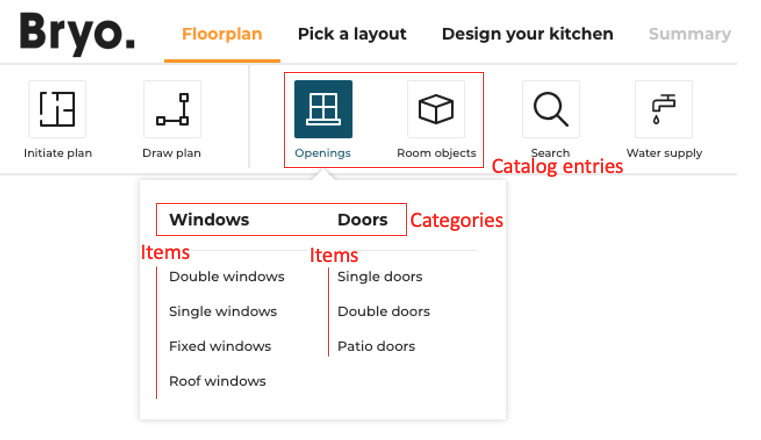
The navigation structure in the planner is the following:
- The first level of definition is the catalog entry. Only this level has an icon.
- The second level is the category. It is displayed as menu header in the planner.
- The third level is the sub-level of the menu, i.e. the menu item.
Catalog entries in the floorplan step:
Catalog entries in the design step:
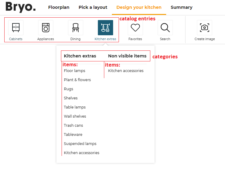
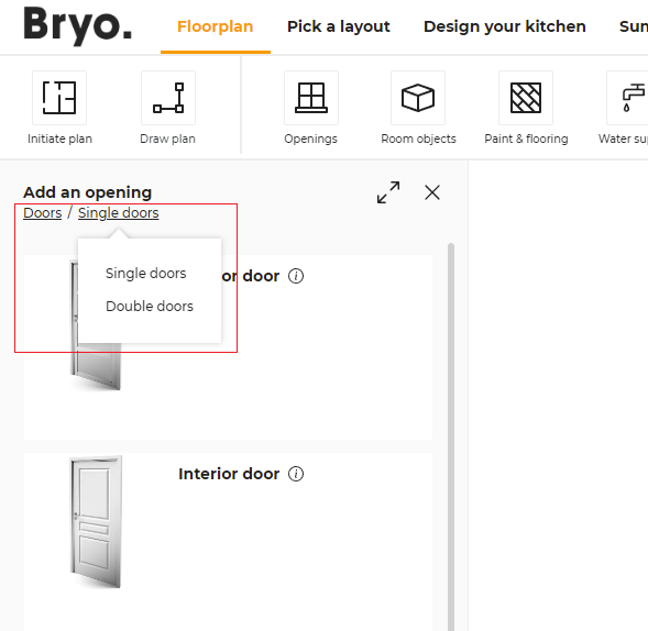
Note: Some planner entries are displayed at the same level as catalog entries:
- in floorplan step: "initiate plan", "draw plan" and "water supply" are displayed as in the capture above. They are not catalog entries.
- in design step: "favorites", "search" and "create image". They are not catalog entries.
floorplan (context)
	|
	|__ catalogEntry (first level, with picto) e.g.`objects`
	|	|
	|	|__ item (second level) e.g. `columns`
	|	|
	|	|__ item (second level) e.g. `radiators`
	|
	|__ catalogEntry (first level, with picto) e.g. `openings
	|	|
	|	|__ category (second level) e.g. `window`
	|	|	|
	|	|	|__ item (third level) e.g. `simpleWindow`
	|	|	|
	|	|	|__ item (third level) e.g. `doubleWindow`
	|	|
	|	|__ category (second level) `door`
	|	|	|
	|	|	|__ item (third level) e.g. `simpleDoor`
	|	|	|
	|	|	|__ item (third level) e.g. `doubleDoor`
	|	|
detailedDesign (context)
	|	|
	|__ catalogEntry (first level, with picto ) e.g. `cabinets`
	|	|
	|	|__  item (second level) e.g. `baseCabinets`
	|
	|__ catalogEntry (first level) `appliances` (first level)
	|	|
	|	|__ item (second level) e.g. `oven`
	|	|
About the Icons
Each catalog entry is illustrated by an icon that you can choose from the predefined list below:
| Picto name | Icon |
|---|---|
| accessories |  |
| appliances |  |
| coverings |  |
| deco |  |
| dining |  |
| doors |  |
| front |  |
| furniture-alt |  |
| furniture |  |
| handles |  |
| objects |  |
| openings |  |
| worktop |  |
Top level structure
The catalogEntries object can contain the keys / pairs below.
floorplan
| Status | Type | Default value |
|---|---|---|
| Optional | array of catalog-entry objects | [] |
Define all possible catalog entries in the floorplan state of the planner.
detailedDesign
| Status | Type | Default value |
|---|---|---|
| Optional | array of catalog-entry objects | [] |
Define all possible catalog entries in the detailed design state of the planner.
Catalog-entry object structure
This level is the only one that has pictos. A catalog-entry object contains the keys / pairs below.
picto
| Status | Type | Default value |
|---|---|---|
| Mandatory | string | "" |
The name of the SVG picto to use for this catalog entry. Supported values are listed above.
translationKey
| Status | Type | Default value |
|---|---|---|
| Mandatory | string | "" |
The translation key suffix for the catalog entry name. The application builds the full translation key like follows (where {key_suffix} is replaced by the provided translationKey):
for catalog entries in floorplan
full key = navigation_catalog.design_room_state.{key_suffix}
for catalog entries in detailedDesign
full key = navigation_catalog.detailed_design_state.{key_suffix}
Note: Though
translationKeycan be any string chosen by the range maintainer, some categories and sub-categories have a specific behaviour in the planner, and we use thetranslationKeyto identify them. So for these catalog entries, you must use the exacttranslationKeyas defined in the list below to benefit from the associated behaviours in the kitchen planner:
- For "Openings" category in
floorplan, thetranslationKeymust be "openings". ➡️ See associated behavioursediting wall🔗.- For "Paint & flooring" category in
floorplan, thetranslationKeymust be "covering" and for its sub-categories, thetranslationKeyfor "floors" must be "floors" and thetranslationKeyfor "walls" must be "walls".- For "Cabinets" category in
detailedDesign, thetranslationKeymust be "cabinets". If not, the associated tooltip in the Help Center will not work.- For "Appliances" category in
detailedDesign, thetranslationKeymust be "appliances". If not, the associated tooltip in the Help Center will not work.
categories
| Status | Type | Default value |
|---|---|---|
| Mandatory | array of category objects | [] |
Define in this array all the categories to display in the catalog entry.
isObstacle
| Status | Type | Default value |
|---|---|---|
| Optional | boolean | false |
Only used for catalog entries in floorplan. If set as true, it marks any product present in the entry catalogs as "obstacle". Obstacles have some specific behaviors in the application.
isAccessory
| Status | Type | Default value |
|---|---|---|
| Optional | boolean | false |
Only used for catalog entries in detailedDesign. If set as true, the categories of the catalog entry are considered as "accessories".
Category object structure
A category object contains the keys / pairs below.
translationKey
| Status | Type | Default value |
|---|---|---|
| Mandatory | string | "" |
Translation key. It follows the same logic as the translationKey attribute of catalog-entry entries as defined above.
categories
| Status | Type | Default value |
|---|---|---|
| Mandatory | array of sub-category objects | [] |
Define in this array all the sub-categories to display in the category.
isNonVisibleItem
| Status | Type | Default value |
|---|---|---|
| Optional | boolean | false |
If set as true, the sub-categories associated to that category are considered as non-visible items. Products added via these catalogs have no 3D representation and the catalog is displayed differently to allow users to easily add and remove such items from their projects.
Sub-category object structure
The last level is the second level of navigation, i.e. the items in the menu.
translationKey
| Status | Type | Default value |
|---|---|---|
| Mandatory | string | "" |
Translation key. It follows the same logic as the translationKey attribute of catalog-entry entries as defined above.
closedTags
| Status | Type | Default value |
|---|---|---|
| Mandatory | array of number | [] |
List of closed tag IDs that are searched when the user clicks on that sub-category. Search results are any product that has either of these closed tags.
Note: when clicking on a category (and not a sub-category), the planner searches for the all the closed tags of its sub-categories.
freeTags
| Status | Type | Default value |
|---|---|---|
| Mandatory | array of string | [] |
List of free tag IDs that are searched when the user clicks on that sub-category. Search results are any product that has either of these free tags.
Note: when clicking on a category (and not a sub-category), the planner searches for the all the free tags of its sub-categories.
productRank
| Status | Type | Default value |
|---|---|---|
| Optional | boolean | false |
Defines if the searchScore must be used when sorting results of the search.
Complete Example
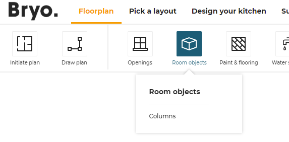
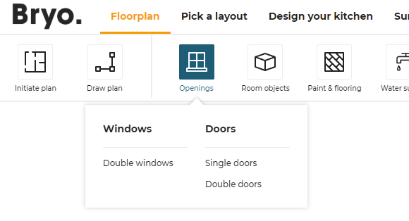
"floorplan": [
   {
      "translationKey": "objects",
      "picto": "objects",
      "categories": [
         {
            "translationKey": "objects",
            "categories": [
               { "translationKey": "columns", "closedTags": [286], "freeTags": [], "productRank": true}
            ]
         }
      ]
   },
   {
      "translationKey": "openings",
      "picto": "openings",
      "categories": [
         {
            "translationKey": "window",
            "categories": [
               { "translationKey": "doubleWindow", "closedTags": [252], "freeTags": [], "productRank": true }
            ]
         },
         {
            "translationKey": "door",
            "categories": [
               { "translationKey": "simpleDoor", "closedTags": [244], "freeTags": [], "productRank": true },
               { "translationKey": "doubleDoor", "closedTags": [245], "freeTags": [], "productRank": true }
            ]
         }
      ]
   }
],
The above example produces the following catalog entries in the floorplan step:
"Room objects" catalog
"Openings" catalog
Impact in the catalog browser
pinPanel
| Status | Type | Default value |
|---|---|---|
| Optional | boolean | true |
Defines if the search bar panel remains visible when the user adds any product in the scene (with drag and drop or click).
The default value for the key is true. If no value is provided for the key, by default the search bar panel will be visible after product insertion.
panelOption
The panelOption attribute groups settings related to product panel configuration.
editPanelStructure
This object defines how to display the properties of a product depending on the context (the first definition level of the object) and the type.
The data structure of the editPanelStructure object is the following.
editPanelStructure
|____ DetailedDesignState (array)
|           |__ types (array of strings)
|           |__ presentation
|           |     |__ parameter 1
|           |     |      |__ parameter
|           |     |__ parameter 2
|           |     |      |__ parameter 1
|           |     |      |__ parameter2
|           |     |__ parameter 3
|           |     |      |__ parameter 1
|           |     |      |__ parameter 2
|           |     |      |__ parameter 3
|           |     |__ parameter 4
|           |     |__ parameter 5
|____ CabinetComposer (array)
|           |__ types [536]
|           |__ presentation
|           |     |__ parameter 1
|           |     |      |__ parameter
|           |     |__ parameter 2
Top level structure
The editPanelStructure object can contain the keys / pairs below.
DetailedDesignState
| Status | Type | Default value |
|---|---|---|
| Optional | array of panel-option objects | [] |
Use types to define the way the properties will be displayed in the kitchen application, in the context of a detailed design.
CabinetComposer
| Status | Type | Default value |
|---|---|---|
| Optional | array of panel-option objects | [] |
Use types to define the way the properties will be displayed in the kitchen application, in the context of the cabinet composer.
Panel-option object structure
types
| Status | Type | Default value |
|---|---|---|
| Mandatory | array of number | [] |
An array of closed tag IDs. If empty, it means that this presentation is for all type of products (closed tag type) that do not have a more specific presentation defined. If not empty, this presentation represents all products matching one of the closed tags in the list.
presentation
| Status | Type | Default value |
|---|---|---|
| Mandatory | object | {} |
Define the list of parameters in the right order.
The presentation object contains a single mandatory key: parameters which is itself an array of panel-parameter objects.
Panel-parameter object structure
Object defining a parameter and its possible sub-options. The edit panel in the planner uses the order in which those panel-parameter objects are defined. Parameters not defined in the application distribution settings are displayed at the end of the edit panel.
id
| Status | Type | Default value |
|---|---|---|
| Mandatory | string | "" |
A valid parameter name.
parameters
| Status | Type | Default value |
|---|---|---|
| Mandatory | array of panel-parameter objects | [] |
An array panel-parameter objects. Putting parameters inside other parameters has the effect to add an "options" button on the top parameter. This button displays an option panel where sub-parameters can be edited.
Note: it is advised not to add more than 1 sub-parameter level to avoid confusion for the user.
Example 1
{
   "DetailedDesignState": [
      {
         "types": [],
         "presentation": {
            "parameters": [
               {
                  "id": "front",
                  "parameters": [
                     { "id": "side" }
                  ]
               },
               { "id": "drawerFront" }
            ]
         }
      }
   ]
}
In this example, there is a single presentation that works for any type of product. It defines two parameters that we want to show first (all other parameters are shown below those two).
- The first one is "front" and it has the sub-parameter "side"
- The second one is "drawerFront".
Example 2
{
   "DetailedDesignState": [
      {
         "types": [],
         "presentation": {
            "parameters": [
               { "id": "front" },
               { "id": "drawerFront" }
            ]
         }
      },
      {
         "types": [258],
         "presentation": {
            "parameters": [
               { "id": "drawerFront" },
               { "id": "front" }
            ]
         }
      }
   ]
}
In this example there are two presentations each defining 2 parameters.
- For all products with close tag 258, the second presentation applies in the planner : the edit panel show parameter "drawerFront", then "front" and then all the others.
- For all other products, the first presentation applies in the planner: the edit panel show parameter "front", then "drawerFront" and then all the others.
editPanelStructure new categories structure
A categories array is available to group presentations under DetailedDesignState or CabinetComposer. Each entry in categories contains a translationKey and a category array; each element of category is a panel-option object that follows the types + presentation format described below. The added level provides parameter categorization only — the types logic is unchanged: panel-option objects target products using a types array of closedTags, and presentation.parameters retains the same behavior.
The following structure applies under either DetailedDesignState or CabinetComposer:
{
   "DetailedDesignState": [
      {
         "categories": [
            {
               "category": [ /* array of panel-option objects */ ],
               "translationKey": "..."
            }
         ]
      }
   ]
}
This structure groups related presentations (for example style, linears) and keeps the edit-panel configuration organized by logical sections.
Example 3
"DetailedDesignState": [
   {
      "categories": [
         {
            "category": [
               {
                  "types": [],
                  "presentation": {
                     "parameters": [
                        { "id": "box",
                          "parameters":[ {"id":"leftSidePanel"},{"id":"leftSideOption"},{"id":"rightSidePanel"},{"id":"rightSideOption"} ] },
                        { "id": "leg", "parameters": [ {"id":"legHeight"} ] },
                        { "id": "oven" },
                     ]
                  }
               },
               {
                  "types": [554],
                  "presentation": {
                     "parameters": [ {"id":"leg"},{"id":"angle"},{"id":"leftDepth"},{"id":"leftWidth"},{"id":"rightDepth"},{"id":"rightWidth"},{"id":"plinthOption"},{"id":"worktopOption"},{"id":"decoStripOption","parameters":[{"id":"leftDecoStripBack"},{"id":"rightDecoStripBack"},{"id":"sectionOrientation"}]} ]
                  }
               }
            ],
            "translationKey": "style"
         },
         {
            "category": [
               {
                  "types": [],
                  "presentation": { "parameters": [ {"id":"coverPanel"},{"id":"worktopLight"},{"id":"riserOption","parameters":[{"id":"leftCorniceBack"},{"id":"rightCorniceBack"}]},{"id":"corniceOption","parameters":[{"id":"leftCorniceBack"},{"id":"rightCorniceBack"}]} ] }
               },
               {
                  "types": [554],
                  "presentation": { "parameters": [ {"id":"angle"},{"id":"leftDepth"},{"id":"leftWidth"},{"id":"rightDepth"},{"id":"rightWidth"},{"id":"plinthOption"},{"id":"worktopOption"},{"id":"decoStripOption","parameters":[{"id":"leftDecoStripBack"},{"id":"rightDecoStripBack"},{"id":"sectionOrientation"}]} ] }
               }
            ],
            "translationKey": "linears"
         }
      ]
   }
]
The following exemple allows us to display this structure of edit panel
"edit panel"
backPlinthOption
| Status | Type | Default value |
|---|---|---|
| Optional | boolean | true |
The visibility of "back plinth" option under the plinth options is controlled by this parameter. By setting this option to false, the user has no possibility to disable the back plinth in the planner UI.
Note: the back plinth feature cannot be disabled completely. This setting only controls wheteher the user has access to a toggle in the UI to enable/disable the back plinth.
hideEditPanelParameters
This object defines, which properties to be excluded from properties panel.
The data structure of the hideEditPanelParameters object is the following.
hideEditPanelParameters
|____ backCoverPanel
|____ leftCoverPanel
|____ rightCoverPanel
search
The search attribute groups settings related to the search configuration.
sortLocale
| Status | Type | Default value |
|---|---|---|
| Optional | string | "raw" |
In the catalog of a products, some retailers rank the products according to their requirements. The sortLocale parameter is used to enable/disable the product ranks.
See Product Rank for catalog search 🔗 for detailed information on product ranking.
sortLocale defines the sorted locale used for sorting lexicographical order. If not specified, the lexicographical order uses Unicode characters for sorting. Therefore the order is the same in any language context.
Possible values are:
- "locale": The planner uses the current locale from its context. For example, if the current planner locale is "ru-RU", setting the value to "locale" means to use the Russian alphabet to sort. If the locale is "de-DE", it uses the German alphabet to sort.
- A given locale that is combination of a mandatory and an optional element:
- MANDATORY: 2-letter code of a language, following 🔗 ISO 639-1.
- OPTIONAL: 2-letter code of a region / country, following 🔗 ISO 3166-1.
❗ Currently, "sv-SE" is the only locale supported as "given locale" value.
sortStringFilter
| Status | Type | Default value |
|---|---|---|
| Optional | string | "desc" |
sortStringFilter defines the sorting order of the filters in the Catalog Browser. If the value of the sortStringFilter is asc it will be sorted in alphabetical order. And If the value is desc, it will be sorted in reverse alphabetical order.
The default value for the key is desc. If no value is provided for the key, by default the filter will be sorted in the reverse alphabetical order.
{
   "sortStringFilter": "desc",
}
sortNumericFilter
| Status | Type | Default value |
|---|---|---|
| Optional | string | "desc" |
sortNumericFilter defines the sorting order of the filters in the Catalog Browser. If the value of the sortNumericFilter is asc it will be sorted in ascending order. And If the value is desc, it will be sorted in descending order.
The default value for the key is desc. If no value is provided for the key, by default the filter will be sorted in the descending order.
{
   "sortNumericFilter": "desc"
}
aggregationParameters
| Status | Type | Default value |
|---|---|---|
| Optional | array of string | [] |
List of all parameter IDs used by the application as catalog filters.
➡️ See the Parameter Dictionary 🔗 for the complete list of these parameters.
{
   "aggregationParameters": [
      "commercialDepth",
      "commercialWidth",
      "function",
      "worktopType",
      "worktopThickness",
      "worktopMaterial",
      "repairabilityIndex",
      "durabilityIndex"
   ],
}
sortBy
| Status | Type | Default value |
|---|---|---|
| Optional | array of objects | [] |
List of the sort by options for new filters panel. Each item in the array contains two attributes:
key(mandatory): defines the sort by option value. The possible values are:byName,byStartDate, andbyProductRank.byName: sort by the name of the product.byStartDate: sort by the start date of the product.byProductRank: sort by the score of the product (See Product Rank for catalog search 🔗 for detailed information on product ranking).
isDefault(optional): defines if the current sort by option will be applied by default.
Note: The order of the sort by options shown in the panel will be exactly the same order defined in the array. If none of the items have the
isDefaultvalue, the first item will be applied as the default sort by option.
{
   "sortBy":
   [
      { "key": "byName", "isDefault": true },
      { "key": "byStartDate" },
      { "key": "byProductRank" }
   ]
}
filters
| Status | Type | Default value |
|---|---|---|
| Optional | array of objects | [] |
List of the filter options for new filters panel. Each item in the array contains two attributes:
key(mandatory): defines the filter option. It can be either a filter option proposed by default or a custom filter (defined by searchable parameter). There are six filter options proposed by default:brands: filter by the brands value of a product.closed_tags_type: filter by the type closed tag of a product.closed_tags_style: filter by the style closed tag of a product.closed_tags_material: filter by the material closed tag of a product.closed_tags_color: filter by the color closed tag of a product.closed_tags_room: filter by the room closed tag of a product.
order(optional): define the sort order of the filter values. By default, the values are sorted in ascending order. If the value isdesc, it will be sorted in descending order.
Note: If the
filtersvalue is set, the planner will ignore the settingssortStringFilter,sortNumericFilterandaggregationParameters. The order of the filters shown in the panel will be exactly the same order defined in the array.
Note: To use six filter options proposed by default, you need to add the translation for them. To do so, you need to provide the translation values in "catalog" part of the translation file. Here is an example of translations:
{
   "catalog": {
      ...,
      "default_agg": {
         "brands": "Brands",
         "material": "Material Tag",
         "style": "Style",
         "type": "Type",
         "room": "Room",
         "color": "Color"
      },
      ...
   }
}
Note: For a custom filter, it can be shown as a customized color chip in the filters panel. The color is defined as the value of the searchable parameter and the value should be a valid hexadecimal color code (such as “#86252e”).
An example of filters option:
{
  "filters": [
    { "key": "brands" },
    { "key": "commercialDepth", "order": "desc" },
    { "key": "commercialWidth", "order": "desc" },
    { "key": "commercialMaterial" },
    { "key": "commercialColor" },
    { "key": "worktopType" },
    { "key": "worktopThickness" },
    { "key": "worktopMaterial" },
    { "key": "closed_tags_type" },
    { "key": "closed_tags_style" },
    { "key": "closed_tags_material" }
  ]
}
feature
The feature attribute groups settings used to enable/disable specific features of the planner.
2dPlans
| Status | Type | Default value |
|---|---|---|
| Optional | object or "false" | see below |
Defines whether 2D plans are accessible to the user in the Design("View image") and Summary step, and describes the 2D Plans configuration, or the "false" value to deactivate the option.
The configuration format is as follows:
| Key | Type | Value/Template | Description |
|---|---|---|---|
| content | object | versionsaveWithProjectconfigsformatitemSymbolsuseDefaultSymbols installationPlans nomenclature | version: Positive integer(>=0). saveWithProject: 0 or 1, save with current project. (default value: 0)configs: a list of configuration objectsformat: a list of object which defines a printable layout option for 2D plans.itemSymbols: a list of object which defines specific representations for a product type.useDefaultSymbols: if false, deactivates the default appliances representation. (true by default) installationPlans: 0 or 1, installation plans added in the current project (default value: 0) nomenclature: 0 or 1, nomenclature added in the current project (default value: 0) |
➡️ To use the new vectorial and symbolic 2D Plans, you need to increase the version to 2 in the "version" attribute.
Possible parameters for a configuration:
| Name | Mandatory | Type | Possible Values | Description |
|---|---|---|---|---|
typePlan | yes | string | "Top" "Face" "TopGround" "TopWall" "Worktop" "WallPanel" "WallEdgeStrip" | the type of plan to compute |
showExteriors | – | num | 0 or 1 | draws the exteriors. (default value: 1) |
showFurniture | – | num | 0 or 1 | draws the furniture. (default value: 1) |
showFurnitureDimension | – | num | 0 or 1 | draws the furniture dimensions. (default value: 0) |
showDepthDimension | – | num | 0 or 1 | draws the furniture depth dimensions. (default value: 0) |
showWallDimension | – | num | 0 or 1 | draws the wall and bay dimensions. (default value: 0) |
showEquipmentReference | – | num | 0 or 1 | draws equipement references (default value: 1) |
showCabinetReference | – | num | 0 or 1 | draws equipement references (default value: 0) |
showFullIslandDimension | – | num | 0 or 1 | draws 2 positioning dimensions on islands instead of just one. (default value: 0) |
showAnnotations | – | num | 0 or 1 | draws the annotations coming from the front elevation or top views. (default value: 0) |
automaticSymbols | – | object | "show" / value: 0 or 1 "showDimensions" / value: 0 or 1 "addLegendOnDimensions" / value: "none" or "name" or "description" or "shortDescription" "legendPosition" / value: "left" or "right" | draws automatic symbols for sanitaries and appliances + options related to their dimensions |
showNumbering | – | num | 0 or 1 | draws the furniture numbers. (default value: 0) |
showCutouts | – | num | 0 or 1 | draws the cutouts in wortops and wallpanels plans (default value: 1) |
showFronts | – | num | 0 or 1 | draws the front and handles of the cabinets (default value: 1) |
tagsToShow | – | Array<num> | [...] | a list of product tags to show in the 2D Plans |
tagsToHide | – | Array<num> | [...] | a list of product tags to hide in the 2D Plans |
tagsToMeasure | – | Array<num> | [...] | a list of product tags to measure in the 2D Plans |
roomsOnly | – | num | 0 or 1 | draws a plan for each room that contains cabinets (default value: 1) |
resol | – | num | 1 - 1000 | Resolution in PPI. (default value: 300) |
scale | – | num | 0 or 1 | Scale of the plan when printed at the current resol (20 means 1/20 scale) (default value: 20) |
imageWidth | – | num | Width of the 2D plans in pixels | |
imageHeight | – | num | Height of the 2D plans in pixels | |
groupLinears | – | num | 0 or 1 | Draws all the worktop boards in the same 2D Plan. (default value 0) |
The default value is :
{
    "version": 2,
    "saveWithProject": 0,
    "configs": [
        {
            "typePlan": "Top",
            "showFurnitureDimension": 1,
            "showWallDimension": 1,
            "showEquipmentReference": 1,
            "showAnnotations": 1,
            "automaticSymbols": {show: 0, showDimensions:1, addLegendOnDimensions : "none" , legendPosition:"right" },
            "showNumbering": 1,
            "resol": 150,
            "imageWidth": 1600,
            "imageHeight": 900
        },
        {
            "typePlan": "Face",
            "showFurnitureDimension": 1,
            "showWallDimension": 1,
            "showEquipmentReference": 0,
            "showAnnotations": 1,
            "automaticSymbols": {show: 0, showDimensions:1, addLegendOnDimensions : "name" , legendPosition:"right" },
            "showNumbering": 1,
            "resol": 150,
            "imageWidth": 1600,
            "imageHeight": 900
        },
        {
            "typePlan": "Worktop",
            "showFurnitureDimension": 1,
            "showWallDimension": 1,
            "automaticSymbols": {show: 0, showDimensions:1, addLegendOnDimensions : "name" , legendPosition:"right" },
            "showEquipmentReference": 1,
            "showNumbering": 1,
            "resol": 150,
            "imageWidth": 1600,
            "imageHeight": 900,
            "groupLinears": 1
        },
        {
            "typePlan": "WallPanel",
            "showFurnitureDimension": 1,
            "showWallDimension": 1,
            "showEquipmentReference": 1,
            "showNumbering": 1,
            "resol": 150,
            "imageWidth": 1600,
            "imageHeight": 900
        },
        {
            "typePlan": "WallEdgeStrip",
            "showFurnitureDimension": 1,
            "showWallDimension": 1,
            "showEquipmentReference": 1,
            "showNumbering": 1,
            "resol": 150,
            "imageWidth": 1600,
            "imageHeight": 900
        }
    ]
}
The format attribute description:
| Name | Mandatory | Type | Possible Values | Description |
|---|---|---|---|---|
name | yes | string | eg: "A3", "A4" | The name of the paper format. Common values include standard formats like A3 or A4. |
isDefault | yes | boolean | true/false | Indicates whether this format is the default selection shown in the dropdown menu. |
imageWidth | yes | number | Positive number | Width of the 2D plan image (in pixels) for the specified format. |
imageHeight | yes | number | Positive number | Height of the 2D plan image (in pixels) for the specified format. |
➡️ If the
formatattribute has not been specified, the system will apply the default value illustrated in the example below.
Example
[
    {
        "name": "A3",
        "isDefault": false,
        "imageWidth": 2480,
        "imageHeight": 1754
    },
    {
        "name": "A4",
        "isDefault": true,
        "imageWidth": 1600,
        "imageHeight": 900
    }
]
The itemSymbols attribute description:
| Name | Mandatory | Type | Possible Values | Description |
|---|---|---|---|---|
tags | yes | array of number | list of ClosedTags | Apply the symbol to these closed tags |
sides | yes | array of object | a list of different symbols, for each side of the product |
The sides attribute description:
| Name | Mandatory | Type | Possible Values | Description |
|---|---|---|---|---|
side | yes | string | "front", "right", "back", "left", "top", "bottom" | Defines on which side of the product the symbol is applied |
symbolDescription | yes | object | symbol description |
The symbolDescription attribute description:
| Name | Mandatory | Type | Possible Values | Description |
|---|---|---|---|---|
width | yes | number | positive number | the width of the symbol |
height | yes | number | positive number | the height of the symbol |
keepRatio | yes | number | 0 or 1 | defines if the symbol needs to be stretched to the product face, or if it needs to keep its width/depth ratio |
dataLines | yes | array of array of numbers | lines defined as [start_X, start_Y, end_X, end_Y] or arcs defined as [start_X, start_Y, end_X, end_Y, center_X, center_Y] | defines the symbol lines |
dataOutline | yes | array of array of numbers | points defined as [X, Y] | defines the points on the outline |
Example
Here is how these 2 symbols are defined :
Front PlugsAndMeters symbol

Front Ovens symbol

[
    {
        tags: [116],                             // PlugsAndMeters tag
        sides: [
            {
                side: "front",                   // Symbol defined for the front
                symbolDescription: {
                    width: 1000,                 // Width of the symbol
                    height: 1000,                // Height of the symbol
                    keepRatio: 1,                // the symbol will keep its width/depth ration event if it is stretched
                    dataLines: [
                        [400, 900, 600, 900],    // defines the coordinates of each lines ( start_X, start_Y, end_X, end_Y )
                        [600, 900, 700, 400],
                        [700, 400, 450, 500],
                        [450, 500, 500, 100],
                        [500, 100, 300, 650],
                        [300, 650, 500, 600],
                        [500, 600, 400, 900],
                    ],
                    dataOutline: [
                        [0, 0],                  // defines the list of the points of the outline (X, Y)
                        [1000, 0],
                        [1000, 1000],
                        [0, 1000],
                    ],
                },
            },
        ],
    },
    {
        tags: [234],                             // Ovens tag
        sides: [
            {
                side: "front",
                symbolDescription: {
                    keepRatio: 0,                // the symbol is stretched
                    width: 1,
                    height: 1,
                    dataLines: [
                        // horizontal line separator
                        [0, 0.8, 1, 0.8],
                        // window outline
                        [0.1, 0.1, 0.9, 0.1],
                        [0.9, 0.1, 0.9, 0.7],
                        [0.9, 0.7, 0.1, 0.7],
                        [0.1, 0.7, 0.1, 0.1],
                        // window "reflection" lines
                        [0.3, 0.2, 0.6, 0.5],
                        [0.5, 0.3, 0.8, 0.6],
                        // buttons
                        [0.9, 0.95, 0.9, 0.85, 0.9, 0.9],
                        [0.9, 0.85, 0.9, 0.95, 0.9, 0.9],
                        [0.75, 0.95, 0.75, 0.85, 0.75, 0.9],
                        [0.75, 0.85, 0.75, 0.95, 0.75, 0.9],
                        [0.4, 0.85, 0.6, 0.85],
                        [0.6, 0.85, 0.6, 0.95],
                        [0.6, 0.95, 0.4, 0.95],
                        [0.4, 0.95, 0.4, 0.85],
                    ],
                    dataOutline: [
                        [0, 0],
                        [1, 0],
                        [1, 1],
                        [0, 1],
                    ],
                },
            },
        ],
    },
]
360Rendering
| Status | Type | Default value |
|---|---|---|
| Optional | boolean | false |
Defines whether the planner allows to make 360 reders of user projects in the Design('View images') and Summary step.
additionalHelp
| Status | Type | Default value |
|---|---|---|
| Optional | boolean | false |
Defines if the additional help is available for the user in help center.
applianceInTemplate
| Status | Type | Default value |
|---|---|---|
| Optional | boolean | true |
Defines if appliance information is displayed for each proposals in the application second step.
Finding the appliances in templates is controlled by closed tags.
- Cooktop : Closed tag "Cooktops"
- Hood : Closed tag "Hoods"
- Oven : Closed tag "Ovens" or "OvenCabinets"
- Fridge : Closed tag "Refrigerators" or "Freezers"
- Dishwasher : Closed tag "Dishwashers"
- Washer : Closed tag "Washers" or "Dryers"
See layout information 🔗.
restrictedLinearReplacements
| Status | Type | Default value |
|---|---|---|
| Optional | boolean | false |
Defines the activation of the feature to limit the available worktops depending on some conditions on the cabinet options.
cabinetEditor
| Status | Type | Default value |
|---|---|---|
| Optional | boolean or object | { displayPrice: true } |
Defines the cabinet editor availability. Setting cabinetEditor to false disables completely the cabinet editor.
If set to an object, the cabinet editor is enabled. The configuration object supports the following key/values pairs:
displayPrice
| Status | Type | Default value |
|---|---|---|
| Optional | boolean | true |
Defines whether the cabinet editor should display the product price.
delivery
| Status | Type | Default value |
|---|---|---|
| Optional | boolean | false |
Defines if the "Delivery date and price" in summary step is displayed.
favorites
| Status | Type | Default value |
|---|---|---|
| Optional | boolean | false |
Defines if the favorites is available for the user in step 3.
floorPlanImport
| Status | Type | Default value |
|---|---|---|
| Optional | object | { measureImage: true, leicaMeasure: false, planMeasure: false } |
| Defines options related to planner import capabilities. |
It supports the following key/value pairs.
measureImage
| Status | Type | Default value |
|---|---|---|
| Optional | boolean | true |
Defines the availability of the feature "upload a 2D floorplan" in the application first step.
leicaMeasure
| Status | Type | Default value |
|---|---|---|
| Optional | boolean | false |
Defines the availability of the feature "laser measurment import" in the application first step.
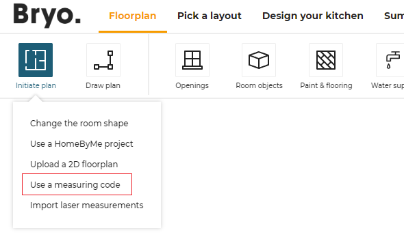
planMeasure
| Status | Type | Default value |
|---|---|---|
| Optional | boolean | false |
Defines whether the measure service is enabled or disabled. If set to true, the measure service is displayed to the user in the Initiate Plan menu.
guidedTour
| Status | Type | Default value |
|---|---|---|
| Optional | boolean | false |
Defines if the guided tour is available for the user in step 1.
hqRendering
| Status | Type | Default value |
|---|---|---|
| Optional | boolean or object | { imageResolution: "1920x1080" } |
This parameter controls the HQ rendering feature of the application. Setting hqRendering to false disables completely the HQ rendering feature in the Design('View images') and Summary step.
If set to an object, the HQ rendering is enabled. The configuration object supports the following key/values pairs:
is3DViewDefault
❗️ Note: This parameter is DEPRECATED due to the new photo studio.
| Status | Type | Default value |
|---|---|---|
| Optional | boolean | false |
| Defines the default view when entering the HQ rendering step. When "false", the user lands in first person view when entering HQ rendering step. If "true", the user lands in 3D view. |
imageResolution
| Status | Type | Default value |
|---|---|---|
| Optional | string | "1920x1080" |
Defines the image quality/resolution for the HQ rendered images generated. Possible values are:
- "1920x1080"; this is the default, high value.
- "640x360"; this is the "low" resolution.
designTechnicalView
| Status | Type | Default value |
|---|---|---|
| Optional | object or "false" | see below |
The main goal of this setting is to add the possibility to configure the colors of elements such as cabinets, walls etc. in 2D Top view Possible parameters for a configuration:
| Name | Mandatory | Type | Possible Values | Description |
|---|---|---|---|---|
onGround | – | Array<num> | [...] | [R, G, B] (an array of three integers, each ranging from 0 to 255) for onGround elements |
aboveGround | – | Array<num> | [...] | [R, G, B] (an array of three integers, each ranging from 0 to 255) for elements aboveGround |
walls | – | Array<num> | [...] | [R, G, B] (an array of three integers, each ranging from 0 to 255) for walls |
productBorders | – | Array<num> | [...] | [R, G, B] (an array of three integers, each ranging from 0 to 255) for productBorders |
wokrtopAltitude | – | Array<num> | [...] | [R, G, B] (an array of three integers, each ranging from 0 to 255) for worktopAltitude |
Example :
{
   "onGround": [0, 255, 0],
   "aboveGround": [255, 0, 255],
   "walls": [0, 0, 0],
   "productBorders": [0, 0, 0],
   "wokrtopAltitude": [0, 0, 1]
}
installation
| Status | Type | Default value |
|---|---|---|
| Optional | boolean | false |
Defines if the "Installation date and price" in summary step is displayed.
itemList
| Status | Type | Default value |
|---|---|---|
| Optional | boolean | true |
Controls if the item list icon is displayed in the planner header.
measureTool
| Status | Type | Default value |
|---|---|---|
| Optional | boolean | false |
Controls if the measuring tool is displayed in the planner header.
minimizeWindow
| Status | Type | Default value |
|---|---|---|
| Optional | boolean | false |
Controls if the minimize button is displayed in the planner header.
priceDetail
| Status | Type | Default value |
|---|---|---|
| Optional | boolean | false |
Defines if the "Price Detail" module in the summary step is activated or not.
print
| Status | Type | Default value |
|---|---|---|
| Optional | boolean | true |
Controls if the Print icon is displayed in the summary step.
productDetails
| Status | Type | Default value |
|---|---|---|
| Optional | object | { energyLabelParameter: null, dimensionParameter: null } |
Controls additional details to display on products.
It supports the following key/value pairs.
energyLabelParameterOld
| Status | Type | Default value |
|---|---|---|
| Optional | string | null |
The name of the product parameter that represents the old energy label.
energyLabelParameter
| Status | Type | Default value |
|---|---|---|
| Optional | string | null |
The name of the product parameter that represents the energy label (2021 regulation).
dimensionParameter
| Status | Type | Default value |
|---|---|---|
| Optional | string | null |
The name of the product parameter that represents the commercial dimensions.
proposalStep
| Status | Type | Default value |
|---|---|---|
| Optional | boolean | true |
Controls if the planner second step (automatic proposals) is activated or not.
Note: when set to
false, the water supply icon is also removed as this feature is only required for automatic proposals.
rulePopin
| Status | Type | Default value |
|---|---|---|
| Optional | boolean or object | false |
Controls the popin for broken rules feature of the application. Setting rulePopin to false disables completely the rules popin.
If set to an object, rules are checked and a popin is displayed is case of broken rules. The type sub-attribute controls when the check should occur. The configuration object supports the following key/values pairs:
type
| Status | Type | Default value |
|---|---|---|
| Optional | string | null |
Controls when to display the popin for broken rules. Supproted values are:
- "designDone" : The check occurs when leaving the design step (step 3).
- "proceed" : The check occurs when clicking the Proceed button in summary step.
- "editorValidated" : The check occurs when the design has errors and we validate the worktop, wallpanel or cabinet editors.
servicesInfo
| Status | Type | Default value |
|---|---|---|
| Optional | boolean | false |
Defines if the "Services" module in the summary step is activated or not.
sharing
| Status | Type | Default value |
|---|---|---|
| Optional | boolean | false |
Controls if the Share button is displayed in the summary step. If enabled, you can configure the behavior of this button with the shareProject setting.
textualFields
| Status | Type | Default value |
|---|---|---|
| Optional | boolean | true |
Defines wether text input fields are available for edition. The following fields are affected by this setting:
- manual notes
- project description
worktopFrontEdge
| Status | Type | Default value |
|---|---|---|
| Optional | boolean or object | { isPriced: false } |
Controls the worktop front edge feature of the application. Setting worktopFrontEdge to false disables completely the front edge feature (no arrow display in the worktop editor and no possibility to change the front edge position).
If set to an object, the front edge feature is enabled. The configuration object supports the following key/values pairs:
isPriced
| Status | Type | Default value |
|---|---|---|
| Optional | boolean | false |
Defines whether the front edge of the worktop should be priced.
annotations
| Status | Type | Default value |
|---|---|---|
| Optional | boolean or object | false |
When set to a boolean it defines whether the annotation feature is available.
If set to an object, annotation feature is available. The configuration object supports the following key/values pairs:
imageUpload
| Status | Type | Default value |
|---|---|---|
| Optional | boolean | true |
The imageUpload sub-attribute controls the avalibility of image section in annotations. By default it will be available.
technicalElements
| Status | Type | Default value |
|---|---|---|
| Optional | boolean | true |
The technicalElement sub-attribute controls the avalibility of technical elements section in annotations. By default it will be available.
optimizeFillers
| Status | Type | Default value |
|---|---|---|
| Optional | boolean | false |
Controls the optimization of the fillers. Setting optimizeFillers to true enables the optimization of the fillers, which means the same filler can be used twice for the cabinets if certain "width" and "height" checks are fulfilled.
technicalElements
| Status | Type | Default value |
|---|---|---|
| Optional | boolean | false |
Controls if the user have the options to add cornice, picture rail and baseboard.
FPImproved
| Status | Type | Default value |
|---|---|---|
| Optional | boolean or object | false |
The FPImproved sub-attribute controls whether the walls will be hidden in First Person View while taking a Realistic Picture.
If we need to add distance from where the wall should disappear we will need to use following object
"FPImproved" :{
   "viewPointToWallDistance" : 10000,
   "hideFurnitureWithWall" : true
}
If we don't use the above object but just add true in the value, the default value will be 1000mm
| Status | Type | Default value |
|---|---|---|
| Optional | boolean | false |
The FPImproved sub-attribute controls whether the walls will be hidden in First Person View while taking a Realistic Picture.
installationPlans
| Status | Type | Default value |
|---|---|---|
| Optional | boolean | false |
Controls if the installation plans are enabled in the summary step. If enabled, you can edit customized 2D plans.
hideExteriorWallsDimensions
| Status | Type | Default value |
|---|---|---|
| Optional | boolean | false |
Controls if the Exterior Walls Dimensions are enabled in the floor plan step.
videoRendering
| Status | Type | Default value |
|---|---|---|
| Optional | boolean | false |
This parameter controls the Video rendering feature of the application. Setting videoRendering to false disables completely the Video rendering feature in the Design step.
shadingOption
| Status | Type | Default value |
|---|---|---|
| Optional | boolean | false |
Controls if the shadows are enabled in the application. If enabled, shadows are rendered in the 3D scene.
niches
| Status | Type | Default value |
|---|---|---|
| Optional | boolean | false |
Controls if the user has the options to add Niche feature on the wall.
deprecated
The deprecated attribute groups deprecated settings that are still supported but should be avoided.
ignoreStyleFromIframe
⚠ DEPRECATED
| Status | Type | Default value |
|---|---|---|
| Optional | boolean | false |
Option that disallows the override of application style made by using setupSettings Iframe message.
This parameter is now useless and will be removed shortly.
productInfoByIframe
⚠ DEPRECATED
| Status | Type | Default value |
|---|---|---|
| Optional | boolean | false |
- The Product Information
 icon in the third step of the planner displays information on the product.
Use this parameter to choose between using the default Product Sheet pop-in or a specific one. The product sheet is now managed by the productSheet setting.
resetCustomizedLinear
⚠ DEPRECATED
| Status | Type | Default value |
|---|---|---|
| Optional | boolean | true |
Defines if the customized worktop/wallpanel is reset when changing to a different product. This parameter should only be used for simple worktop catalogues where, for example, edgeCompatibility is the same for all worktops or wall panels.
The new feature of automatic change detection for worktop replacement made this parameter useless. It will be removed shortly.
Note regarding the migration
Below are 4 settings that used to be defined in the application distribution settings and are now defined elsewhere.
When migrating to the new settings format, you should consider those parameters and redefine them at the correct place.
displayPopInForEmptyValue
This parameter used to control the pop-in behavior when encountering empty arrays in the apply applicative rule.
It is now included in the overload of the ApplyKitchenRule 🔗 directly under tha name handleEmptyArrays.
defaultWorktopOverhang
This parameter used to control the worktop overhang values in the planner.
It is now moved to an application ditribution overloads: WorktopParameterRule 🔗
waterfallInset
This parameter used to control the waterfall inset values in the planner.
It is now moved to an application ditribution overloads: WorktopParameterRule 🔗
coverPanelOptimizationOption
This parameter used to control the cover-panels pricing optimization.
It is now moved to an application ditribution overloads: CoverPanelParameterRule 🔗