Kitchen Planner Iframe Messages
Iframe messages support the communication between the planner and the embedding web site to provide openness and integration. This section describes Iframe messages that are listened by the planner (input) to react to parent window actions or emitted by the planner (output) to enable parent window to react.
Iframe Communication
To have an overview of the subject, we advise you to read window.postMessage documentation on the web.
➡️ Refer to PostMessage documentation 🔗
Every message received by the application or sent by the application through window.postMessage must be an object of this format:
| Key | Type | Description |
|---|---|---|
| event | string | The event name is used as unique identifier for a given event. |
| content | * | Content sent with the event. It is optional and can be anything: integer, array, object... |
Template
{
   event:"Login",
   content:
   {
      token:"dez2fre589e"
   }
}
Authentication
AuthenticationRequired
Output emitted when the application requests authentication parameters. Upon this request, the parent window must reply with an Authentication message.
| Key | Type | Value/Template | Description |
|---|---|---|---|
| event | string | AuthenticationRequired | – |
| content | – | – | – |
Authentication
Input received when authentication is requested by the message AuthenticationRequired, the parent window must reply with the following message.
| Key | Type | Value | Description |
|---|---|---|---|
| event | string | Authentication | – |
| content | object | tokendistributionID | token: The legal entity token generated by the client website.distributionID: The specific distribution in the legal entity. |
Template
{
 "token": string
 "distributionID": string
}
AuthenticationSucceeded
Output emitted by the application to acknowledge that authentication is successful.
| Key | Type | Value/Template | Description |
|---|---|---|---|
| event | string | AuthenticationSucceeded | – |
| content | object | originappIDdistributionIDdistributionParams | origin: The domain from which the message originated. appID: The application ID associated with the provided credentials. distributionID: The distribution ID associated with the provided credentials.distributionParams: The distribution-specific parameters, if any, of the distribution associated with the provided credentials. |
Template
{
    "origin": string,
    "appID": string,
    "distributionID": string,
    "distributionParams": object
}
AuthenticationFailed
Output emitted by the application to inform that authentication has failed.
| Key | Type | Value/Template | Description |
|---|---|---|---|
| event | string | AuthenticationFailed | – |
| content | object | httpCodeidmessage | httpCode: The HTTP error code for the request.id: The error id message: The detailed error message. |
Template
{
    "httpCode": HttpErrorCode,
    "id": string,
    "message": string
}
TokenExpired
Output emitted and sent to the parent window when a token is expired, subsequent calls to the web-services will fail with a 401 error.
| Key | Type | Value/Template | Description |
|---|---|---|---|
| event | string | TokenExpired | – |
| content | object | null | – |
TokenRefreshed
Input received from the parent window. This message is send by the parent window when receiving TokenExpired. This message provides a new valid token to the application to authentify subsequent calls to web services.
| Key | Type | Value | Description |
|---|---|---|---|
| event | string | TokenRefreshed | – |
| content | object | tokendistributionID | token: The legal entity token generated by the client website.distributionID: The specific distribution in the legal entity. |
Template
{
 "token": string,
 "distributionID": string
}
LoginRequired
Output emitted when an action requires a logged user and none is currently logged in the application, this message will be sent.
| Key | Type | Value/Template | Description |
|---|---|---|---|
| event | string | LoginRequired | – |
| content | – | – | – |
Login
Input received from the parent window when the user has successfully logged in and the user token is generated.
| Key | Type | Value/Template | Description |
|---|---|---|---|
| event | string | Login | – |
| content | object | token | token: Token generated by client website. |
Template
{
    "token": string
}
Note: is not acceptable to use the same userID and token for several users :
- for security and user privacy reasons,
- since the number of projects per user is limited to 1000.
LoginSucceeded
Output emitted when the application succeeded to log in the user (from a token for example), it will send this message.
| Key | Type | Value/Template | Description |
|---|---|---|---|
| event | string | LoginSucceeded | – |
| content | – | – | – |
LoginFailed
Output emitted when the application failed to log in the user (from a token for example), it will send this message.
| Key | Type | Value/Template | Description |
|---|---|---|---|
| event | string | LoginFailed | – |
| content | – | – | – |
Application
Ready
Output emitted by the planner. The application needs some time to be ready to listen to messages. Listen to this message and ensure that it has been emitted before sending any other Iframe message.
| Key | Type | Value/Template | Description |
|---|---|---|---|
| event | string | Ready | – |
| content | – | – | – |
SetUpSettings
Input request to set up a few information for the planner (especially default visual style of the kitchen and template filters).
Here is the list:
Iframe Version
First, you can set the Iframe version you want to use here. This version will drive the data structure that are sent through Iframe messages later in the application(e.g. the BOM, worktop export...). If the iframeVersion key is not given, the planner will use the latest available version.
Kitchen Default Style
You can set up the "style" of the kitchen. First you have to give a styleVersion key that indicates the planner in which version it should read the style from the Iframe message. If styleVersion is not given, it will use version 0 to keep backward compatibility. Below are the supported style versions and their data structure:
styleVersion = 0
In version 0, the kitchen style is a finite list of elements that you can define for styling. All these elements must be given at the root of the Iframe message content. Here is the exhaustive list of supported style parameters (/!\ match the case):
▪ For linears: "worktopID", "plinthID", "wallPanelID", "wallEdgeStripID", "corniceID" and "decostripID".
▪ For non-linears: "handleID", "frontID", "drawerFrontID", "legID", "fillerFrontID", leftCoverPanelID", "rightCoverPanelID", "topCoverPanelID" and "backCoverPanelID".
styleVersion = 1
In version 1, the kitchen style is dynamic for product parameters. The supported keys at the root of the object are: linearStyle, furnitureStyle, floorStyle, wallStyle, applyStyle and name. The first one contains the linear style (its only supported sub-keys are: "worktop", "plinth", "wallPanel", "wallEdgeStrip", "cornice" and "decostrip"). The three next objects contain any parameter name, for example: "handle", "drawerFront", "glassFront", "corniceOption", etc. The applyStyle attribute is a boolean indicating whether the given style should be applied directly on the current project. This is useful if you want to open a generic project with a custom style applied to it for example. The name attribute is an optional information used to identify the need-mapping style name chosen by the user.
Note (for the objects furnitureStyle, floorStyle and wallStyle):
▪ Listed parameters can be of any valid parameter type (boolean, integer, product, etc.), not necessarily product type.
▪ The parameter names are case sensitive.
▪ The value associated with each parameter must be an array of accepted values. The order matters as first values will be applied first if possible.
▪ furnitureStyle will affect every product in the planner, floorStyle will affect every products that touch the floor and wallStyle will affect every products that do not touch the floor.
styleVersion = 2
This version adds the support of the attribute ignoredParameters that can be used to blacklist some parameter names. These parameters will never be added to the global style when planning your kitchen.
Design Flow
You can set up the design flow needs for the user with the optional designFromScratch input. If this boolean is set to "true", the user will be asked if he/she wants to skip auto design step when clicking "next step" in step 1. On the other hand, if designFromScratch is "false", "next step" will go to step 2 in every case from step 1.
Template settings
There is the list of keys related to the template settings:
templateTagsnbMaxResultPerGroupnbMaxResultPerTemplatenbMaxTotalSolutionhasNeedMappingdisableSaveDisableSaveRequested
templateTags is used to set up template filters. It defines groups of required and excluded tags to filter templates that the application will compute. To fit in a group, a template's tags must contain all tags defined in required array and must not contain any tags defined in excluded array. Each group will be computed in the same order as they are defined in the message and solutions are displayed as the same order.
Example of Template Tags:
[{
	required: ["I", "ovenInColumn"],
	excluded: ["integratedFridge"]
}, {
	required: ["L"],
	excluded: []
}]
❗Be careful with the following example: templateTags:
{ required : []; excluded: [] }with an empty array for "required" and "excluded".
This example means that no tag have been set, so the planner will not filter at all the complete list of active templates. In this case, all the active template files will be loaded in the planner. If 100 templates have been created, 100 templates will be loaded in the planner.
From a performance perspective, it is not recommended because it will impact the response time of displaying the results. We recommend to follow the guidelines (filltemplateTags,nbMaxResultPerGroup,nbMaxResultPerTemplate) in this section and sort the templates by configuration in order to avoid the performance impact in the planner.
In the example before, it contains two groups of template tags. The first group defines a template
must have the tags I and ovenInColumn and must not have the tag integratedFridge. The second
group defines a template must have the tag L.
The application will first compute and display solutions for templates which fit in first group then it compute templates for second group.
So if a template has tags ["I", "ovenInColumn", "freeFridge", "traditional"], it fits the first group but not the second group.
And if a template has tags ["L", "ovenInColumn"], it fits the second group but not the first group.
Note:
- An empty array in
requiredmeans the templates don't need to require any tags. That's to say, all templates with any tags will match.- An empty array in
excludedmeans the templates don't need to exclude any tags. That's to say, all templates with any tags will match.- The same tag should not appear both in
requiredandexcluded. You can not require a tag and exclude it at the same time.- The string of template tags in
requiredandexcludedarray are the free tags defined on the template when range maintainers create the template data. Range maintainers can put any string they want as the free tags. Make sure use the exact same string defined in free tags of template to make it works. See more details about template and template strategy
nbMaxResultPerGroup defines the maximum number of solution displayed for a given group of tags. Default value if not provided : 5
nbMaxResultPerTemplate defines the maximum number of solution displayed for a given template. Default value if not provided : 1
nbMaxTotalSolution defines the total maximum number of solution displayed. Default value if not provided : Infinity
hasNeedMapping defines whether or not activate the need mapping in the application.
disableSave defines whether or not activate the save button in the application.
DisableSaveRequested defines a possibility to open the user's project just for reviewing the entire project, forbidding to save the project/as well as all options that require save.
Here is a complete example of template setting. The image below shows the user's choice for the need mapping in the application:
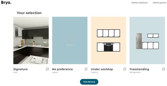
As we can see, the user has the preference for "ovenUnderWorktop" and "freeStandingFridge" and no preference for the layout. So the data sent in iframe message should be like:
templateTags:
  [
    {"required": ["L", "ovenUnderWorktop", "freeStandingFridge"], "excluded": []},
    {"required": ["I", "ovenUnderWorktop", "freeStandingFridge"], "excluded": []},
    {"required": ["II", "ovenUnderWorktop", "freeStandingFridge"], "excluded": []},
    {"required": ["U", "ovenUnderWorktop", "freeStandingFridge"], "excluded": []}
  ],
nbMaxResultPerGroup: 5,
nbMaxResultPerTemplate: 1,
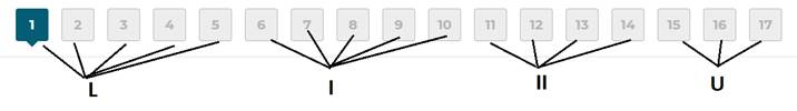
Here we define four groups in templateTags: each group contains "ovenUnderWorktop" and "freeStandingFridge" as required tags and a different layout tags ("L", "I", "II" and "U"). With this setting, template engine will calculate 5 templates per group, sorted following the order of the templateTags (groups) and will calculate 1 solution per template file provided and compliant with tags of the group:
Future Date
This parameter futureDate would allow the application to be set to a specific future date, enabling the users to view and test products with startDate values in the future.
| Key | Type | Value/Template | Description |
|---|---|---|---|
| event | string | SetUpSettings | – |
| content | object | iframeVersionstyleVersionparams ending with "ID"linearStylefurnitureStylefloorStylewallStyleapplyStylenameignoredParametersdesignFromScratch templateTagsnbMaxResultPerGroupnbMaxResultPerTemplatehasNeedMappingdisableSaveDisableSaveRequestedfutureDate | iframeVersion(optional): Positive integer. If not given, defaults to latest supported version in the planner. styleVersion(optional): Positive integer. If not given, defaults to 0. params ending with "ID"(optional): See the above note about kitchen styling. Only taken into account if styleVersion is 0.linearStyle(optional): See the above note about kitchen styling. Only taken into account if styleVersion is 1 or more.furnitureStyle: See the above note about kitchen styling. Only taken into account if styleVersion is 1 or more.floorStyle(optional): See the above note about kitchen styling. Only taken into account if styleVersion is 1 or more.wallStyle(optional): See the above note about kitchen styling. Only taken into account if styleVersion is 1 or more.applyStyle(optional): See the above note about kitchen styling. Boolean telling if the style should be applied to the current project.name(optional): See the above note about kitchen styling.ignoredParameters(optional): See the above note about kitchen styling. Only taken into account if styleVersion is 2 or more.designFromScratch(optional): Boolean telling if the user should be proposed to skip auto design step.templateTags (optional): Array containing objects containing:required: Array of stringexcluded: Array of stringnbMaxResultPerGroup(optional): Positive integer.nbMaxResultPerTemplate(optional): Positive integer.hasNeedMapping (optional): Boolean to activate or not the need mapping into the application.disableSave (optional): Boolean to activate or not the save button into the application.DisableSaveRequested(optional):Boolean to disable or not the save and buttons leading to save in the application .futureDate (optional): Date format (YYYY/MM/DD) to allow the application to be set to a specific future date. |
Template
{
   iframeVersion: integer,
   styleVersion: integer,
   handleID: string,
   baseCabinetFrontID: string,
   wallCabinetFrontID: string,
   drawerFrontID: string,
   fillerFrontID: string,
   plinthID: string,
   legID: string,
   worktopID: string,
   wallPanelID: string,
   wallEdgeStripID: string,
   corniceID: string,
   decostripID: string,
   linearStyle: {
      worktop: string,
      plinth: string,
      …
   },
   furnitureStyle: {
      handle: [string],
      front: [string],
      …
   },
   floorStyle: {
      handle: [string],
      front: [string],
      …
   },
   wallStyle: {
      handle: [string],
      front: [string],
      …
   },
   applyStyle: boolean,
   name: string,
   ignoredParameters: [string],
   designFromScratch: boolean,
   templateTags: [
      {
         required: [string],
         excluded: [string]
      }
   ],
  nbMaxResultPerTemplate: integer,
  nbMaxResultPerGroup: integer,
  hasNeedMapping: boolean,
  disableSave: boolean,
  DisableSaveRequested: boolean,
  futureDate: Date
}
Note: This message can be sent at any point while the application is used. Style information received will override any current style and apply itself to current project. Template filters will be modified. If the user is on the auto-design step, template computing will be restarted.
CloseApp
Output emitted when the user clicks on the cross button to close the application.
| Key | Type | Value/Template | Description |
|---|---|---|---|
| event | string | CloseApp | – |
| content | – | – | – |
MinimizeButtonClicked
Output emitted when the user clicks on the minimize button to minimize the application.
| Key | Type | Value/Template | Description |
|---|---|---|---|
| event | string | MinimizeButtonClicked | – |
| content | – | – | – |
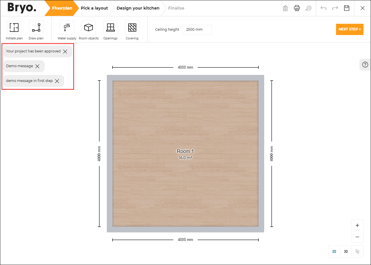
DisplayNotification
Input request used to display a notification in the planner. It can be send at any time during the planner session (i.e. any step). It will display a default-style notification with a close button. The notification will remain on screen until the user clicks the close button, as shown below.
Template
{
    event:"Test_DisplayNotification",
    content:
        {
            "text":"Your project has been approved, action = \"display\"",
            "action":"display"
        }
}
Also, this message can be used to display the project lifecycle after opening a project (if used along with the project lifecycle API).
| Key | Type | Value/Template | Description |
|---|---|---|---|
| event | string | DisplayNotification | Used to request the display of a notification in the planner. |
| content | object | texttypepersistentcloseaction | text(Mandatory): Message to display in the notification.type: Type of notification, it could be "default", "success", "error". If not precised, the default value is "default".persistent: If set to true: autoclose is disabled and close button is added. Its default value is true.close: If "content.persistent" is set to true, this string is used as the close button alt text. Its default value is the translation value for key "common.close"action: If a notification with the same action is already in DOM: no new notification will be created. Its default value is "display-notif-iframe". |
Template
{
	"text": string,
	"type": string,
	"persistent": boolean,
	"close": string,
	"action": string
}
ChangeNeedMapping
Output emitted when end user clicks the link "My kitchen needs" in the second step of the kitchen design. It allows the integration developer to display a pop in to refine the kitchen preferences used to compute the automatic proposals.
| Key | Type | Value/Template | Description |
|---|---|---|---|
| event | string | ChangeNeedMapping | – |
| content | object | setupParams | object containing infos about the settings used when the project was created. It holds the following keys (See SetUpSetting for more information about their maning):templateTagsnbMaxResultPerGroupnbMaxResultPerTemplatestyleVersionlinearStylefurnitureStylefloorStylewallStylename |
Template
{
  setupParams: {
    templateTags: [
      {
        required: [string],
        excluded: [string]
      }
    ],
    nbMaxResultPerTemplate: integer,
    nbMaxResultPerGroup: integer,
    styleVersion: integer,
    linearStyle: {
      worktop: string,
      plinth: string,
      …
    },
    furnitureStyle: {
      handle: [string],
      front: [string],
      …
    },
    floorStyle: {
      handle: [string],
      front: [string],
      …
    },
    wallStyle: {
      handle: [string],
      front: [string],
      …
    }
    name: string
  }
}
AnalyticsAppStep
Output emitted by the planner in the each step.
By listening to this event, the integration developer is notified of the current active step of the planner. For example, step1, step2 , step3 or step4. The step provided in the message can be used by the integration developer for further usage.
| Key | Type | Value/Template | Description |
|---|---|---|---|
| event | string | AnalyticsAppStep | – |
| content | object | step | Object containing information about the current active step in the planner |
Open Save
SaveRequested
Input request that triggers the save of a project in the application. SaveStarted is then sent back when the save process begins and SaveSucceeded is sent when the save process ends with success.
| Key | Type | Value/Template | Description |
|---|---|---|---|
| event | string | SaveRequested | – |
| content | – | – | – |
SaveStarted
Output emitted when the planner is starting the project save.
| Key | Type | Value/Template | Description |
|---|---|---|---|
| event | string | SaveStarted | – |
| content | object | idbomprojectInfomanualNotes | id: The UUID of the project.bom: Contains the project BOM. Refer to Bill of Material Reference for a complete description of BOM in JSON format. See also SetUpSettings to set the BOM version.projectInfo: Contains the project infos. Refer to Project Info reference.manualNotes: The manual notes of the project being saved. |
SaveSucceeded
Output emitted when the project is saved in the planner, with additional information about the saved project.
| Key | Type | Value/Template | Description |
|---|---|---|---|
| event | string | SaveSucceeded | – |
| content | object | idnamedescription | id: The UUID of the saved project.name: The name of the saved project.description: The description of the saved project. |
SaveCancelled
Output emitted when the cancel button is clicked in the Save Dialog for all instances where saving a project is required.
| Key | Type | Value/Template | Description |
|---|---|---|---|
| event | string | SaveCancelled | – |
| content | object | reason | reason: user_cancelled. |
ProjectSavingFailed
Output emitted when the project is try to save and failed in the planner, with additional information about the project.
| Key | Type | Value/Template | Description |
|---|---|---|---|
| event | string | ProjectSavingFailed | – |
| content | object | reason | reason: The reason by which saving of the project failed. |
Template
{
	id: "UUIDXX-XXX",
	name: "My Kitchen Project",
	description: "Project for my new house"
}
SnapshotRequested
Input request that triggers the generation of a current view snapshot. SnapshotGenerated event will be thrown at the end.
| Key | Type | Value/Template | Description |
|---|---|---|---|
| event | string | SnapshotRequested | – |
| content | – | – | – |
SnapshotGenerated
Output emitted when the computation of the snapshot has finished.
| Key | Type | Value/Template | Description |
|---|---|---|---|
| event | string | SnapshotGenerated | – |
| content | object | nameimage | name: "Snapshot" string.image: Contains a jpeg image of the snapshot as a base-64 encoded string. It can be set directly to an img tag by doing "img.src = image". |
Template
{
  "name": string,
  "image": string
 }
LoadProject
For performance reasons, it is recommended if applicable, to start the planner by providing the project ID as an URL parameter. This message should be used only for other scenarios.
Input request for project load in kitchen application.
| Key | Type | Value/Template | Description |
|---|---|---|---|
| event | string | LoadProject | – |
| content | object | id | UUID of the project in the ByMe platform. It can also be an integer. |
Template
{
  "id": "4144F45E-B9DA-35C0-90CE-60B9AA5DA418"
}
360ImageLayerRequested
Input request that triggers to open the 360 render layer.
| Key | Type | Value/Template | Description |
|---|---|---|---|
| event | string | 360ImageLayerRequested | – |
| content | – | – | – |
Note: The planner only listens to this event in the design step "Step 3". Sending this event at any other step will not have any effect.
Project
InfoRequested
Input request for some information from the application. Requested information depends on the content provided.
| Key | Type | Value/Template | Description |
|---|---|---|---|
| event | string | InfoRequested | – |
| content | string | ProjectUser | Project: Requests information about the currect project.User: Requests information about the current user. |
InfoRequestedProject
Output emitted after an input message InfoRequested with parameter value Project is sent.
| Key | Type | Value/Template | Description |
|---|---|---|---|
| event | string | InfoRequestedProject | – |
| content | object | projectIDprojectNameprojectDescProjectDateCreationProjectDateUpdateisLockedlifecycle | projectID: ID of the project.projectName: Name of the project.projectDesc: Description of the project.ProjectDateCreation: Creation date of the project.ProjectDateUpdate: Update date of the project.isLocked: Locked status of the project.lifecycle: Lifecycle of the project. |
Template
{
    "projectID": number or null
    "projectName": string or undefined
    "projectDesc": string or undefined
    "ProjectDateCreation": string or undefined
    "ProjectDateUpdate": string or undefined
    "isLocked": boolean or undefined
    "lifecycle": integer or undefined
}
Note: If this user is not logged the response will be null.
InfoRequestedUser
Output emitted after an input message InfoRequested with parameter value User is sent.
| Key | Type | Value/Template | Description |
|---|---|---|---|
| event | string | InfoRequestedUser | – |
| content | object | userID | userID: ID of the user. |
Template
{
  "userID": number or null
}
ManualNotesRequested
Input request for the manual notes of the current project.
| Key | Type | Value/Template | Description |
|---|---|---|---|
| event | string | ManualNotesRequested | – |
| content | – | – | – |
ManualNotesRequestedSucceeded
Output emitted that contains the manual notes of the current project.
| Key | Type | Value/Template | Description |
|---|---|---|---|
| event | string | ManualNotesRequestedSucceeded | – |
| content | string | Notes | Manual notes of the current project. |
TemplateInfoRequested
Input request for statistical information about template.
| Key | Type | Value/Template | Description |
|---|---|---|---|
| event | string | TemplateInfoRequested | – |
| content | – | – | – |
TemplateInfoRequestedSucceeded
Output emitted after a TemplateInfoRequested is sent.
| Key | Type | Value/Template | Description |
|---|---|---|---|
| event | string | TemplateInfoRequestedSucceeded | – |
| content | object | lastSelectedTemplateUUIDnbSolutionPerTemplate | lastSelectedTemplateUUID: Current template uuid selected by the user, can be null if the user did not choose a template nbSolutionPerTemplate as an object.nbSolutionPerTemplate: Each key is a template uuid and the associate value is the number of solution generated by the template in the user project. |
Template
{
	"lastSelectedTemplateUUID": string,
	"nbSolutionPerTemplate": {
		"templateUUID": integer
			....
	}
}
ProjectInfoRequested
Input request for detailed information about the project, from the structure (level, walls) to the furnishing (products, bays, linears).
| Key | Type | Value/Template | Description |
|---|---|---|---|
| event | string | ProjectInfoRequested | – |
| content | object | expanded | expanded: if true, the Product list contains the position of all the sub elements in the assembly. |
Template
{
	"expanded": true
}
ProjectInfoGenerated
Output emitted after a ProjectInfoRequested is sent.
| Key | Type | Value/Template | Description |
|---|---|---|---|
| event | string | ProjectInfoGenerated | – |
| content | object | Project Information object | See the project information documentation for a complete definition and sample of project information. |
ProjectCoverImagesRequested
Input request for all the images in the project, from ( "HQRendering" , “Screenshot” or "Rendering360").
| Key | Type | Value/Template | Description |
|---|---|---|---|
| event | string | ProjectCoverImagesRequested | – |
ProjectCoverImagesGenerated
Output emitted after a ProjectCoverImagesRequested is sent.
| Key | Type | Value/Template | Description |
|---|---|---|---|
| event | string | ProjectCoverImagesGenerated | – |
| content | object | Images information object | imageAvailable: Boolean, indicates whether the generation of HQ renders, screenshots and 360 renders is available or not.images: an array of project medias. Each item in images contains following properties:-buildMode -creationDate: creation date of the project media -id : the id of the project media -mediasTypeID -metadata : the metadata of the project media -name : the name of the project media -placeholder -searchScore -status -typeMediaID : the type of project media ( "HQRendering" , “Screenshot” or "Rendering360") -url : the url of the project media |
NotesWindowOpened
Output emitted after we open Item notes.
| Key | Type | Value/Template | Description |
|---|---|---|---|
| event | string | NotesWindowOpened | "NotesWindowOpened" iframe message is emitted. |
| content | object | {} | – |
NotesWindowClosed
Output emitted after we close Item notes.
| Key | Type | Value/Template | Description |
|---|---|---|---|
| event | string | NotesWindowClosed | "NotesWindowClosed" iframe message is emitted. |
| content | object | {} | – |
Floorplan
MeasuringServiceButtonClicked
Output emitted on clicking "Use Measure Service" menu item, allowing integration developer to display a pop in to manage the selection of the floorplan to be imported in the planner.
| Key | Type | Value/Template | Description |
|---|---|---|---|
| event | string | MeasuringServiceButtonClicked | – |
| content | – | – | – |
Note: For "Use Measure Service" button to be visible,
floorPlanImport.planMeasureparameter must be enabled in application distribution.
MeasureServiceImport
Input request for planner to replace the current floorplan by the floorplan described in the JSON provided.
| Key | Type | Value/Template | Description |
|---|---|---|---|
| event | string | MeasureServiceImport | – |
| content | object | Floor layout JSON object | Refer to Floor Layout Format for a complete definition and sample of floor plan description. |
See also Configure the Measurement Service.
Note: The planner only listens to this event in the floorplan step. Sending this event at any other step will not have any effect. It is advised to send this event in reaction to
MeasuringServiceButtonClicked, as the user is ensured to be in the floorplan step.
Help Center
HelpCenterRequested
Input request for opening the Help Center in Floor Plan step, Design step, Worktop Editor layer and Cabinet Composer layer.
| Key | Type | Value/Template | Description |
|---|---|---|---|
| event | string | HelpCenterRequested | – |
| content | – | – | – |
Note: The planner only listens to this event in the steps where a sliding help center is present. That includes the floorplan, design, worktop editor and wall-panel editor steps.
BrokenRulesRequested
Input request for broken business rules list such as recommendation and warnings.
| Key | Type | Value/Template | Description |
|---|---|---|---|
| event | string | BrokenRulesRequested | Used to request broken business rules list in the current project. |
| content | object | stateShown | stateShown: step in which help center is opened, received with [HelpCenterStart]. Optional, Required when broken rule of specific step is requested. |
BrokenRulesGenerated
Output emitted after a BrokenRulesRequested, containing the list of broken business rules in the projects, is sent.
| Key | Type | Value/Template | Description |
|---|---|---|---|
| event | string | BrokenRulesGenerated | Used to get retrieve all the broken business rules computed in the current project. |
| content | object | List of broken business rules in the project | JSON object with all the broken business rules categorized with criticality level (i.e. list of rules with criticality level such as "critical", "warning" and "recommendation"). Each broken business rule has following properties in it: title: Business rule title.message: Business rule error messagelevel: Criticality level of the business rule.failureRuleID: Business rule ID.currentValue: Business rule error message current value. |
Template
{
	"critical": [{
		title: string,
		message: string,
		level: "critical"
	}…],

	"warning": [{
		title: string,
		message: string,
		level: "warning"
	}…],

	"recommendation": [{
		title: string,
		message: string,
		level: "recommendation"
	}…]
}
Note
▪ In order to generate this list, there should be some error or warning in the project.
NeedHelpClicked
Output emitted when user clicks on "Need more help?" link in help center in floorplan and design step. It can be used by the integration developers to display any kind of help to the consumer. Refer to Need More help.
| Key | Type | Value/Template | Description |
|---|---|---|---|
| event | string | NeedHelpClicked | Additional assistance from help center in floorplan and design step. |
| content | – | – | – |
HelpCenterStart
Output emitted when user enters Floor Plan step, Design step, Worktop Editor layer, Wallpanel Editor Layer and Cabinet Composer layer.
| Key | Type | Value/Template | Description |
|---|---|---|---|
| event | string | HelpCenterStart | – |
| content | object | entryPointEventstateShowntooltips | entryPointEvent: the entryPoint for the Help center. Globalcheck, CustomWorktop,CustomWallPanel etc.stateShown: state where the user wants to open the help center.tooltips: Contains the details of tooltips displayed. |
Template
{
    "entryPointEvent": "GlobalCheck",
    "stateShown": "Floorplan",
    "tooltips": [
        {
            "action": string,
            "message": string
        },
        ...
    ]
}
HelpCenterStop
Output emitted when user leaves Floor Plan step, Design step, Worktop Editor layer, Wallpanel Editor Layer and Cabinet Composer layer.
| Key | Type | Value/Template | Description |
|---|---|---|---|
| event | string | HelpCenterStop | – |
| content | – | – | – |
HelpCenterToolTipClicked
Input receieved when a tooltip is clicked in Help Center in Floor Plan step, Design step, Worktop Editor layer, Wallpanel Editor Layer.
| Key | Type | Value/Template | Description |
|---|---|---|---|
| event | string | HelpCenterToolTipClicked | – |
| content | object | action | action: tooltip action clicked. |
Template
{
    "action":"select_item"
}
HelpCenterDesignTipClicked
Input receieved when a design tip is clicked in Help Center in Floor Plan step, Design step, Worktop Editor layer, Wallpanel Editor Layer.
| Key | Type | Value/Template | Description |
|---|---|---|---|
| event | string | HelpCenterDesignTipClicked | – |
| content | object | stateShownfailureRuleID | stateShown: state in which help center is opened, received with HelpCenterStart.failureRuleID: id of the failed rule received with BrokenRulesGenerated |
Template
{
  "failureRuleID":0,
  "stateShown":"DetailedDesign"
}
HelpCenterCabinetComposerToolTipClicked
Input receieved when a tooltip is clicked in Help Center in Cabinet Composer layer.
| Key | Type | Value/Template | Description |
|---|---|---|---|
| event | string | HelpCenterCabinetComposerToolTipClicked | – |
| content | object | action | action: tooltip action clicked. |
Template
{
    "action":"select_item"
}
HelpCenterCabinetComposerDesignTipClicked
Input receieved when a design tip is clicked in Help Center in Cabinet Composer layer.
| Key | Type | Value/Template | Description |
|---|---|---|---|
| event | string | HelpCenterCabinetComposerDesignTipClicked | – |
| content | object | stateShownfailureRuleID | stateShown: state in which help center is opened, received with HelpCenterStart.failureRuleID: id of the failed rule received with BrokenRulesGenerated |
Template
{
  "failureRuleID":0,
  "stateShown":"DetailedDesign"
}
BusinessRulesListGenerated
Output emitted when the user clicks on the help center button, when we switch between step 3 and 4, when the user clicks on « Validate » button in the editors and when the user clicks on « Proceed » button in the 4th step, a BusinessRulesListGenerated, containing the list of business rules in the projects, is sent.
| Key | Type | Value/Template | Description |
|---|---|---|---|
| event | string | BusinessRulesListGenerated | Used to get retrieve all the business rules computed in the current project. |
| content | object | List of business rules in the project | JSON object with all the business rules categorized with criticality level (i.e. list of rules with criticality level such as "critical", "warning" and "recommendation"). Each business rule has following properties in it: ruleKey: Business rule title.source: The current state of aplicationlevel: Criticality level of the business rule. |
Template
{
    "critical": [{
        ruleKey: string,
        source: string,
        level: "critical"
    }…],

    "warning": [{
        ruleKey: string,
        source: string,
        level: "warning"
    }…],

    "recommendation": [{
        ruleKey: string,
        source: string,
        level: "recommendation"
    }…]
}
Note
▪ In order to generate this list, there should be some error or warning in the project.
▪ The value of rulePopin should be false or undefined in order to generate this list in that particular state.
Price
ProductListWithBOM
Output emitted when the end user clicks on the "Item List" button. The Bill Of Material provided in this message has to used by integration developer to build the "Item List" pop in with the proper presentation and grouping of products included in the project.
| Key | Type | Value/Template | Description |
|---|---|---|---|
| event | string | ProductListWithBOM | – |
| content | object | BOM | Product List, refer to Bill of Material Reference for a complete description of BOM in JSON format. See also SetUpSettings to set the BOM version. |
ProductListWithBOMExternal
Output emitted when the end user clicks on the "Item List" button if application distribution parameter pricing.externalPrice is set to true. It can be used by the integration developers to retrieve the price calculated by the external price engine along with the bom.
| Key | Type | Value/Template | Description |
|---|---|---|---|
| event | string | ProductListWithBOMExternal | – |
| content | object | bomexternalPrice | bom: Product List, refer to Bill of Material Reference for a complete description of BOM in JSON format. See also SetUpSettings to set the BOM version.externalPrice: the external price object returned by the external price engine if application distribution parameter pricing.externalPrice is set to true. |
PriceInfoButtonClicked
Output emitted when the user clicks on price info icon (i) in the step 2 - pick a layout, step 3 - design your kitchen, and step 4 - summary. It can be used by the integration developers to display a price break down or detailled price information pop in.
| Key | Type | Value/Template | Description |
|---|---|---|---|
| event | string | PriceInfoButtonClicked | – |
| content | – | BOM | Product List, refer to Bill of Material Reference for a complete description of BOM in JSON format. See also SetUpSettings to set the BOM version. |
PriceInfoButtonClickedExternal
Output emitted when the user clicks on price info icon (i) in the step 2 - pick a layout, step 3 - design your kitchen, and step 4 - summary if application distribution parameter pricing.externalPrice is set to true. It can be used by the integration developers to retrieve the price calculated by the external price engine along with the bom.
| Key | Type | Value/Template | Description |
|---|---|---|---|
| event | string | PriceInfoButtonClickedExternal | – |
| content | – | bomexternalPriceoptions | bom: Product List, refer to Bill of Material Reference for a complete description of BOM in JSON format. See also SetUpSettings to set the BOM version.externalPrice: the external price object returned by the external price engine if application distribution parameter pricing.externalPrice is set to true. options: Object containing additional and optional information used for external configuration of the widget. For now, it contains the boolean option pricingPerBlock. It is set to true if this pricing system is used. |
PriceInfoWidgetClosed
❗ Only required for Pricing Per Block management Input emitted by PriceInfo widget on its closure, but only when using the pricing per block feature. This message is necessary to manage the price updates between the widget and the planner correctly. Key | Type | Value/Template | Description | --- | --- | --- | --- | event | string | PriceInfoWidgetClosed | – content | – | – | No content required
EditorPriceInfoButtonClicked
Output emitted when the user clicks on price info icon (i) in the editor. Used in worktop editor, wall panel editor, wall edge strip editor, and cabinet editor. It can be used by the integration developers to display a price break down or detailled price information pop in.
| Key | Type | Value/Template | Description |
|---|---|---|---|
| event | string | EditorPriceInfoButtonClicked | – |
| content | object | bomfromexternalPrice | bom: Contains Product List, refer to Bill of Material Reference for a complete description of BOM in JSON format. See also SetUpSettings to set the BOM version.from: Indicates from which editor the price info comes from;The possible values for the from are: "WorktopEditor", "WallPanelEditor", "WallEdgeStripEditor" and "CabinetEditor". For example, if in the cabinet editor, the value of from will be "CabinetEditor".externalPrice(optional): the external price object returned by the external price engine if application distribution parameter pricing.externalPrice is set to true. |
Template
{
"bom": "BOM",
"from":"CabinetEditor"
}
WorktopPriceInfoButtonClicked
⚠️ DEPRECATED message replaced by
EditorPriceInfoButtonClicked.
Output emitted when the user clicks on price info icon (i) in the worktop editor. It can be used by the integration developers to display a price break down pop in.
| Key | Type | Value/Template | Description |
|---|---|---|---|
| event | string | WorktopPriceInfoButtonClicked | – |
| content | – | BOM | Product List, refer to Bill of Material Reference for a complete description of BOM in JSON format. See also SetUpSettings to set the BOM version. |
WallPanelPriceInfoButtonClicked
⚠️ DEPRECATED message replaced by
EditorPriceInfoButtonClicked.
Output emitted when the user clicks on price info icon (i) in the wallpanel editor. It can be used by the integration developers to display a price break down pop in.
| Key | Type | Value/Template | Description |
|---|---|---|---|
| event | string | WallPanelPriceInfoButtonClicked | – |
| content | – | BOM | Product List, refer to Bill of Material Reference for a complete description of BOM in JSON format. See also SetUpSettings to set the BOM version. |
ExternalPriceRequested
It is possible to use an external price engine to compute the kitchen price, and this feature is controlled by the parameter externalPrice in application distribution.
Output emitted by the planner after each BOM computation when using an external price engine.
By listening to this event, the integration developer can implement the business logic of the kitchen price computation based on the BOM. The computed price info has to be sent back to the planner with the message ExternalPriceResponse.
Note: the BOM sent in this message does not always represents the entire user project. When the user uses the worktop editor for example, the price has to be that of the worktops only. Thus the BOM sent in this message only contains worktop items in this example.
| Key | Type | Value/Template | Description |
|---|---|---|---|
| event | string | ExternalPriceRequested | – |
| content | object | bom | bom: Contains Product List, refer to Bill of Material Reference for a complete description of BOM in JSON format. See also SetUpSettings to set the BOM version. |
ExternalPriceResponse
Input received by the planner after the kitchen price is computed by the client integration (see ExternalPriceRequested).
This message has to contain all the necessary informations for the planner to display the price. It must be a JSON object as described below.
| Key | Type | Value/Template | Description |
|---|---|---|---|
| event | string | ExternalPriceResponse | – |
| content | object | pricabletotalPrice | pricable: boolean that tells if the BOM sent via ExternalPriceRequested can be priced. Setting false will result in the planner displaying an error message instead of the price.totalPrice: a JSON object containing the following keys:- regular: regular price (number)- current: current price (number)- discountType: type of discount (string). Valid values are regular(no discount), reduced (normal discount) and membership (membership discount)- startDate: date from which the kitchen price becomes available (string). If provided, must be a valid date string input for the Date.parse() js function.- endDate: date after which the kitchen price is no longer available (string). If provided, must be a valid date string input for the Date.parse() js function.- customDisplay: (object) the option to display customized price format defined by the client. For example, it can be used to display the price range. This field is optional and it contains the following keys: - regularStr: (string) (mandatory) the customized display for the regular price. The max length of the string 100. - currentStr:(string) (mandatory) the customized display for the current price. The max length of the string 100. - regularStrMobile:(string) (optional) the customized display for the regular price on mobile version. The max length of the string 120. By default, if missing the key, it will display the content in regularStr on mobile version . - currentStrMobile: (string) (optional) the customized display for the current price on mobile version. The max length of the string 120. By default, if missing the key, it will display the content in currentStr on mobile version. - the four keys listed before must follow a template. The template is like some text {{some_number}} (e.g. "The project will cost between {{1000}} and {{1550.5}}" will be transformed to "The project will cost between 1000,00 € to 1550,50 €" in case of fr-FR locale.). It must contain only the number which represents the price between the "{{" and "}}" and the currency symbol will be added after the number when displayed. And some special characters like "<" and ">" are not allowed and will be taken as invalid format.For more information about the totalPrice attribute, see the BOM documentation |
Template
{
  "event": "ExternalPriceResponse",
  "content": {
    "pricable": true,
    "totalPrice": {
        "regular": 6500,
        "current": 6250,
        "discountType": "membership",
        "startDate": null,
        "endDate": "2021-12-05T00:00:00.000Z"
    }
  }
}

// the custom display option
{
  "event": "ExternalPriceResponse",
  "content": {
    "pricable": true,
    "totalPrice": {
      "discountType": "membership",
      "startDate": null,
      "endDate": "2021-12-05T00:00:00.000Z",
      "customDisplay": {
        "regularStr": "Between {{1000}} and {{2000}}",
        "currentStr": "Between {{800}} and {{1800}}",
        "regularStrMobile": "The project will cost between {{1000}} and {{2000}}",
        "currentStrMobile": "The project will cost between {{800}} and {{1800}}",
      }
    }
  }
}
ExternalMonthlyPriceRequested
It is possible to use an external price engine to show the external monthly price, and this feature is controlled by the parameter externalMonthlyPrice in application distribution.
Output emitted by the planner after each BOM computation when externalMonthlyPrice is true.
By listening to this event, the integration developer can compute monthly price based on the BOM and the total price. The computed price info has to be sent back to the planner in form of a string ExternalMonthlyPriceResponse.
| Key | Type | Value/Template | Description |
|---|---|---|---|
| event | string | ExternalMonthlyPriceRequested | – |
| content | object | bompriceprojectInfo | bom: Contains Product List, refer to Bill of Material Reference for a complete description of BOM in JSON format. See also SetUpSettings to set the BOM version.price: if application distribution parameter pricing.externalPrice is set to true the external price object will be returned or else it will will return the internal application price object.projectInfo: Contains additional configured poducts, product infos. |
ExternalMonthlyPriceResponse
It is possible to use an external price engine to show the external monthly price, and this feature is controlled by the parameter externalMonthlyPrice in application distribution.
Input emitted after each BOM computation and when externalMonthlyPrice is true and we receive a response string. This response string is used to modify the text present in the pricing container in Floorplan and Design step.
| Key | Type | Value/Template | Description |
|---|---|---|---|
| event | string | ExternalMonthlyPriceResponse | – |
| content | object | minimumMonthlyPrice | minimumMonthlyPrice: Contains string with external minimum monthly price for the project. |
Template
{
  "event": "ExternalMonthlyPriceResponse",
  "content": {
    "minimumMonthlyPrice": "Financing available from £02"
  }
}
FinanceInfoTextClickedExternal
Output emitted when the user clicks on "Financing available from £02" text in the pricing container present in Floorplan and Design step. It can be used by the integration developers to display a detailled price break down of monthly price.
| Key | Type | Value/Template | Description |
|---|---|---|---|
| event | string | FinanceInfoTextClickedExternal | – |
| content | object | bomprice | bom: Contains Product List, refer to Bill of Material Reference for a complete description of BOM in JSON format. See also SetUpSettings to set the BOM version.price: if application distribution parameter pricing.externalPrice is set to true the external price object will be returned or else it will will return the internal application price object. |
Product
CatalogBrowserAddToFavoriteClicked
Input request for planner when a favorite icon is clicked from catalog browser.
| Key | Type | Value/Template | Description |
|---|---|---|---|
| event | string | CatalogBrowserAddToFavoriteClicked | – |
| content | object | dbId | dbId: (String) (mandatory) dbId of the product whose favorite icon is clicked. |
Template
{
	"dbId": "17799"
}
CatalogBrowerEcoFeeClicked
Input request for planner when a eco fee link is clicked from catalog browser.
| Key | Type | Value/Template | Description |
|---|---|---|---|
| event | string | CatalogBrowerEcoFeeClicked | – |
| content | object | dbId | dbId: (String) (mandatory) dbId of the product whose eco fee link is clicked. |
Template
{
	"dbId": "14087"
}
CatalogBrowserItemClicked
Input request for planner when a product or item is clicked from catalog browser.
| Key | Type | Value/Template | Description |
|---|---|---|---|
| event | string | CatalogBrowserItemClicked | – |
| content | object | dbId | dbId: (String) (mandatory) dbId of the product or item that is clicked from catalog browser. |
Template
{
	"dbId": "14087"
}
CatalogBrowserNonVisibleProductClicked
Input request for planner when a non visible item is clicked from catalog browser.
| Key | Type | Value/Template | Description |
|---|---|---|---|
| event | string | CatalogBrowserNonVisibleProductClicked | – |
| content | object | dbIdquantityoperation | dbId: (String) (mandatory) dbId of the non visible product clicked from catalog browser. quantity: (integer) (mandatory) quantity of the non visible product to be added in the project. operation: (string) (mandatory) operation to be performed on non visible product like add, delete or update. |
Template
{
  "dbId": "14087",
  "quantity":3,
  "operation":"add"
}
CatalogBrowerProductInfoClicked
Input request for planner when a product info icon is clicked from catalog browser or product browser.
| Key | Type | Value/Template | Description |
|---|---|---|---|
| event | string | CatalogBrowerProductInfoClicked | – |
| content | object | dbId | dbId: (String) (mandatory) dbId of the product whose product info icon is clicked from catalog browser or product browser. |
Template
{
	"dbId": "14087"
}
ProductBrowserItemClicked
Input request for planner when a product or item is clicked from product browser.
| Key | Type | Value/Template | Description |
|---|---|---|---|
| event | string | ProductBrowserItemClicked | – |
| content | object | dbIdapplyType | dbId: (String) (mandatory) dbId of the product clicked from product browser. applyType: (Boolean) (optional) determines if the replacement is applied to single or all products. If value is 0 then apply to single product, if value is 1 then apply to all products. |
Template
{
  "dbId": "14087",
  "applyType":0
}
SpecialProductInfoRequested
Output emitted if the user clicks the information icon (i) of a product. It can be used by the integration developer to display a customized product information pop in.
| Key | Type | Value/Template | Description |
|---|---|---|---|
| event | string | SpecialProductInfoRequested | – |
| content | object | BomProductSelected | BomProductSelected: JSON BOM of the selected product. |
Template
{
	"BomProductSelected": jsonBomobject
}
See also Product Information.
EcoFeeButtonClicked
Output emitted in design step, when the user opens the product catalog, an eco-fee link is visible with products having eco-fee pricing option, as shown below.
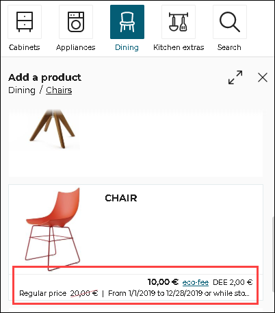
On clicking "eco-fee" link, an Iframe EcoFeeButtonClicked is sent, allowing kitchen retailer to show the information about eco-fee.The Bill of Material (BOM) of the selected product is included in the message.
| Key | Type | Value/Template | Description |
|---|---|---|---|
| event | string | EcoFeeButtonClicked | – |
| content | object | bomProductSelected | bomProductSelected: JSON BOM of the selected product. |
Template
{
	"bomProductSelected": jsonBomobject
}
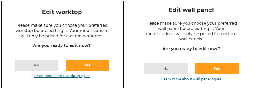
WorktopTypesInfoRequested
Output emitted if the user clicks on the Edit worktop or Edit wall panel pop-in links ("Learn more about worktop types" or "Learn more about wall panel types") as shown below. Can be used by integration developer to display more information on worktops/wall-panel types.
Note: The event is called
WorktopTypesInfoRequestedeven for the wall-panel pop-in.
| Key | Type | Value/Template | Description |
|---|---|---|---|
| event | string | WorktopTypesInfoRequested | – |
| content | – | – | – |
Bill Of Material (BOM)
BOMComputationReady
Output emitted at the first time when the BOM is able to be computed by the planner (e.g. after opening a project).
| Key | Type | Value/Template | Description |
|---|---|---|---|
| event | string | BOMComputationReady | – |
| content | – | BOM | Product List, refer to Bill of Material Reference for a complete description of BOM in JSON format. See also SetUpSettings to set the BOM version. |
BOMRequested
Input request for a BOM generation. Listen to ProductListWithBOMRequested message afterwards.
| Key | Type | Value/Template | Description |
|---|---|---|---|
| event | string | BOMRequested | – |
| content | string | origin | origin(optional): Used to identify the source from which the message is originated. |
ProductListWithBOMRequested
Output emitted after receiving BOMRequested message. Kitchen planner will send this message (same content as ProductListWithBOM message).
| Key | Type | Value/Template | Description |
|---|---|---|---|
| event | string | ProductListWithBOMRequested | – |
| content | object | BOM origin | Product List, refer to Bill of Material Reference for a complete description of BOM in JSON format. See also SetUpSettings to set the BOM version.If origin parameter is received from the BOMRequested, then this origin parameter will be sent along with BOM in the ProductListWithBOMRequested |
LinearExportRequested
Input request for manufacturing export information of the desired linears. The linear types exported are controlled by parameters.
| Key | Type | Value/Template | Description |
|---|---|---|---|
| event | string | LinearExportRequested | – |
| content | object | worktopwallPanelwallEdgeStrip | worktop: Compute the worktop export or not. wallPanel: Compute the wall panel export or not. wallEdgeStrip: Compute the wall edge strip export or not. |
Note: The planner does not listen to this event in the auto-design step (step 2). If you send it during this step, the planner will not replay anything.
Template
{
 "worktop": true,
 "wallPanel": true,
 "wallEdgeStrip": false
}
LinearExportGenerated
Output response generated after LinearExportRequested is sent.
| Key | Type | Value/Template | Description |
|---|---|---|---|
| event | string | LinearExportGenerated | – |
| content | object | versionexportWorktop exportWallpanelexportWallEdgeStrip | version(optional): The Iframe version (Cf. SetUpSettings).exportWorktop(optional): The manufacturing export object corresponding to the worktops in the room. Only present if worktop export was required.exportWallpanel(optional): The manufacturing export object corresponding to the wall panels in the room. Only present if wall panel export was required.exportWallEdgeStrip(optional): The manufacturing export object corresponding to the wall edge strips in the room. Only present if wall edge strip export was required. |
Template
{
    "version": 0,
    "exportWorktop": {
        ...
     },
    "exportWallpanel": {
        ...
    },
    "exportWallEdgeStrip": {
    ...
    }
}
Print 2D Plans
Refer to Print for guidance on how to implement the print command.
PrintButtonClicked
Output emitted if the user clicks "Print" button.
| Key | Type | Value/Template | Description |
|---|---|---|---|
| event | string | PrintButtonClicked | – |
| content | – | – | – |
ProjectSavedRequestForPrint
Output emitted when the user clicks the "Print" button and when the project is already saved. By listening to this event, the integration developer can display the print layer.
| Key | Type | Value/Template | Description |
|---|---|---|---|
| event | string | ProjectSavedRequestForPrint | – |
| content | – | – | – |
Compute2DPlans
Input request for computation of the 2D plans. The desired 2D plan version can be specified. If the version key is not given, the planner will use the latest available version. Note that the 2D plans version is not same as the Iframe version.
➡️ To use the new vectorial and symbolic 2D Plans, you need to increase the version to 2 in the "version" attribute.
➡️ Refer to 2D Plans Information 🔗 for more details about the parameters
There are two ways to configure the 2D plans:
Global Configuration
This is the easiest way to configure the 2D Plans if all the requested plans have the same configuration
| Key | Type | Value/Template | Description |
|---|---|---|---|
| event | string | Compute2DPlans | – |
| content | object | versiontopPlansfacePlansgroundFurnitureTopPlanswallFurnituresTopPlansworktopPlanswallpanelPlanswallEdgeStripPlansshowAnnotationsshowExteriorsshowFurnitureshowFurnitureDimensionshowDepthDimensionshowWallDimensionshowFullIslandDimensionshowInfoGridshowFrameBordersshowNumberingshowCutoutsshowFrontsshowEquipmentReferenceshowCabinetReferencetagsToShowtagsToHidetagsToMeasureroomsOnlysaveWithProjectresolscaleimageWidthimageHeight groupLinears | version: Positive integer(>=0). topPlans: 0 or 1, compute top plans. (default value: 0)facePlans: 0 or 1, compute face plans. (default value: 0)groundFurnitureTopPlans:0 or 1, compute top plans with furniture on the ground. (default value: 0)wallFurnituresTopPlans: 0 or 1, compute top plans with furniture not touching the ground. (default value: 0)worktopPlans: 0 or 1, compute worktop plans from top. (default value: 0)wallpanelPlans: 0 or 1, compute wallpanel plans by face. (default value: 0)wallEdgeStripPlans: 0 or 1, compute wall edge strip plans from top. (default value: 0)showAnnotations: 0 or 1, draws the annotations coming from the front elevation or top views. (default value: 0)showExteriors: 0 or 1, draws the exteriors. (default value: 1)showFurniture: 0 or 1, draws the furniture. (default value: 1)showFurnitureDimension: 0 or 1, draws the furniture dimensions. (default value: 0)showDepthDimension: 0 or 1, draws the furniture depth dimensions. (default value: 0)showWallDimension : 0 or 1, draws the wall and bay dimensions. (default value: 0)showFullIslandDimension : 0 or 1, draws 2 positioning dimensions on islands instead of just one. (default value: 0)showInfoGrid : 0 or 1, draws grid in the bottom of the image. (default value: 1)showFrameBorders : 0 or 1, draws border around the image. (default value: 1)showNumbering: 0 or 1, draws the furniture numbers. (default value: 0)showCutouts: 0 or 1, draws the cutouts in wortops and wallpanels plans (default value: 1). showFronts: 0 or 1, draws the front and handles of the cabinets (default value: 1). tagsToShow: a list of product tags to show in the 2D Plans showEquipmentReference : 0 or 1, draws equipement references (default value 1). showCabinetReference : 0 or 1 draws cabinet references (default value: 0). tagsToHide: a list of product tags to hide in the 2D Plans tagsToMeasure: a list of product tags to measure in the 2D Plans roomsOnly: 0 or 1, draws a Plan for Each Room that contains Cabinets (default value: 1).saveWithProject: 0 or 1, save with current project. (default value: 0)resol: Resolution in PPI. (default value: 300)scale: Scale of the plan when printed at the current resol (20 means 1/20 scale) (default value: 20).imageWidth: Width of the 2D plans in pixels.imageHeight: Height of the 2D plans in pixels.groupLinears: 0 or 1, draws all the worktop boards in the same 2D Plan. (default value 0). |
Example:
{
    version: 2,
    topPlans: 1,
    saveWithProject: 1,
    showAnnotations: 1,
    showExteriors: 1,
    showFurniture: 1,
    showFurnitureDimension: 1,
    showWallDimension: 1,
    showEquipmentReference: 1,
    showFullIslandDimension: 0,
    showNumbering: 1,
    showFronts: 1,
    roomsOnly: 1,
    resol: 300,
    imageWidth: 2244,
    imageHeight: 1772,
    groupLinears: 1
}
Multiple Configurations
This allows the generation of different 2D plans configurations. For example, it is possible to generate the same view twice, but with different visible elements on each view
| Key | Type | Value/Template | Description |
|---|---|---|---|
| event | string | Compute2DPlans | – |
| content | object | versionsaveWithProjectinstallationPlans nomenclature configs | version: Positive integer(>=0). saveWithProject: 0 or 1, save with current project. (default value: 0)installationPlans: 0 or 1, Customized 2D Plans. nomenclature: 0 or 1, nomenclature added in the current project (default value: 0) configs: a list of configuration objects |
Possible parameters for a configuration:
| Name | Mandatory | Type | Possible Values | Description |
|---|---|---|---|---|
typePlan | yes | string | "Top" "Face" "TopGround" "TopWall" "Worktop" "WallPanel" "WallEdgeStrip" | the type of plan to compute |
showAnnotations | – | num | 0 or 1 | draws the annotations coming from the front elevation or top views. (default value: 0) |
showExteriors | – | num | 0 or 1 | draws the exteriors. (default value: 1) |
showFurniture | – | num | 0 or 1 | draws the furniture. (default value: 1) |
showFurnitureDimension | – | num | 0 or 1 | draws the furniture dimensions. (default value: 0) |
showDepthDimension | – | num | 0 or 1 | draws the furniture depth dimensions. (default value: 0) |
showWallDimension | – | num | 0 or 1 | draws the wall and bay dimensions. (default value: 0) |
showFullIslandDimension | – | num | 0 or 1 | draws 2 positioning dimensions on islands instead of just one. (default value: 0) |
showNumbering | – | num | 0 or 1 | draws the furniture numbers. (default value: 0) |
showCutouts | – | num | 0 or 1 | draws the cutouts in wortops and wallpanels plans (default value: 1) |
showFronts | – | num | 0 or 1 | draws the front and handles of the cabinets (default value: 1) |
showEquipmentReference | – | num | 0 or 1 | draws equipement references (default value: 1) |
showCabinetReference | – | num | 0 or 1 | draws equipement references (default value: 0) |
tagsToShow | – | Array<num> | [...] | a list of product tags to show in the 2D Plans |
tagsToHide | – | Array<num> | [...] | a list of product tags to hide in the 2D Plans |
tagsToMeasure | – | Array<num> | [...] | a list of product tags to measure in the 2D Plans |
roomsOnly | – | num | 0 or 1 | draws a plan for each room that contains cabinets (default value: 1) |
resol | – | num | 1 - 1000 | Resolution in PPI. (default value: 300) |
scale | – | num | 0 or 1 | Scale of the plan when printed at the current resol (20 means 1/20 scale) (default value: 20) |
imageWidth | – | num | 0 or 1 | Width of the 2D plans in pixels |
imageHeight | – | num | 0 or 1 | Height of the 2D plans in pixels |
groupLinears | – | num | 0 or 1 | Draws all the worktop boards in the same 2D Plan. (default value 0) |
Example :
{
    version: 2,
    saveWithProject: 1,
    installationPlans: 1,
    nomenclature: 1,
    configs: [
        {
            typePlan: "Top",
            showAnnotations: 1,
            showExteriors: 1,
            showFurniture: 1,
            showFurnitureDimension: 1,
            showWallDimension: 1,
            showEquipmentReference: 1,
            showFullIslandDimension: 0,
            showNumbering: 1,
            showCutouts: 1,
            showFronts: 1,
            roomsOnly: 1,
            resol: 300,
            scale: 20,
            imageWidth: 2244,
            imageHeight: 1772,
        },
        ...
    ]
}
Here is the formula giving the distance in pixels, from the scale and resolution parameters:
Npixels = dist/scale * resol/25.4
Npixels: The number of pixels
dist: The distance in mm
scale: The value of the scale parameter
resol: The value of the resolution parameter
Example: For scale = 20 and resol = 300 ⇒ 1000 mm = 590 pixels
Note: If imageWidth and imageHeight is defined, the scale value is ignored in order to fit into an image of these dimensions.
Note: showAnnotations parameter is only handled with the version 2 of 2DPlans. The annotations are not managed in version 1.
Plans2DStart
Output emitted when the computation of the 2D plans starts.
| Key | Type | Value/Template | Description |
|---|---|---|---|
| event | string | Plans2DStart | – |
| content | – | – | – |
Plans2DStop
Output emitted when the computation of the 2D plans is finished.
| Key | Type | Value/Template | Description |
|---|---|---|---|
| event | string | Plans2DStop | – |
| content | object | nameunitSystemtypeimagenumbersversionconfig | A list of plans 2D.name: Either "TopPlan n" or "FacePlan n" where "n" is a number.unitSystem: "metrics" or "imperial".type: Represents the type of 2D plan.image: Contains a jpeg image of the plan as a base-64 encoded string.(can be set directly to an img by doing "img.src = image"). numbers: A sorted array of integers matching the furniture/board numbers appearing in the 2D plan.version: Specifies the version of the 2D plans data structure. To get the 2D plans at a specific version, see Inputs/2DPlans.config: the config used to generate the 2D Plan |
Template
[
  {
    "name": string
    "unitSystem": string
    "type": string
    "image": string
    "numbers": array
    "version": number
    "config":
    {
      typePlan: "Top",
      showExteriors: 1,
      showFurniture: 1,
      showFurnitureDimension: 1,
      showFullIslandDimension: 0,
      showWallDimension: 1,
      showNumbering: 1,
      showCutouts: 1,
      showFronts: 1,
      roomsOnly: 1,
      resol: 300,
      scale: 20,
      imageWidth: 2244,
      imageHeight: 1772
    }
  },
  ...
]
CrossCutImagesRequested
Input request for the crosscut (section) images of all the pieces of furniture of the current project.
You must specify a width and a maximum height that will apply for all rendered images (see notes below).
You can specify the version you want to use here. If the version key is not given, the planner will use the latest available version. Note that the crosscut images version is not same as the Iframe version.
| Key | Type | Value/Template | Description |
|---|---|---|---|
| event | string | CrossCutImagesRequested | – |
| content | object | versionsaveWithProjectimagesWidthimagesMaxHeightenableSameScaleenableGraduationslineWidthtextSize | version: A positive integer (>= 0). saveWithProject: True to save the atlas with the project. False by default. imagesWidth(MANDATORY): The width in pixels of the rendered images.imagesMaxHeight (MANDATORY): The maximum height of the rendered images.enableSameScale: True if all furnitures in cross cut images have the same scale. False if they occupy the more space they can in the image.enableGraduations: True to display graduations scale.lineWidth: Define the line width of furniture and linear. Expressed in pixels.textSize: Define the text size of the text expressing the graduations scale. Expressed in pixels. |
Template
{
     "version": integer,
     "saveWithProject": boolean,
     "imagesWidth": integer,
     "imagesMaxHeight": integer,
     "enableSameScale": boolean,
     "enableGraduations": boolean,
     "lineWidth": integer,
     "textSize": integer
}
Note:
▪ The height of the rendered images will depend on the width/height ratio of each cabinet.
▪ If the height is higher thanimagesMaxHeight, it will be fixed toimagesMaxHeightand white areas will be added left and right of the image to preserve ratio.
▪ In every case, the width of each rendered image will be equal toimagesWidth.
▪ To add graduations next to a furniture, the furniture must contains an assembly component tagged as ‘Box' with the closed tag: ByMeAPI.ClosedTags.Boxes.
Note: The planner only listens to this event in the following steps :
▪ Floorplan step
▪ Design step
▪ Summary step
If sent in any other step, the planner will replay with a CrossCutImagesNotSupported message.
CrossCutImagesGenerated
Output response generated after CrossCutImagesRequested is sent.
The generated cross-cut images are placed in a big image (an atlas).
A mapping table allows linking a specific image with its position in the atlas.
Version: 1
| Key | Type | Value/Template | Description |
|---|---|---|---|
| event | string | CrossCutImagesGenerated | – |
| content | object | versionatlasImage mappingfront & crossnomenclatureNumberxOffsetyOffsetwidth height | version: Specifies the version of the crosscut images data structure. To get crosscut images at a specific version, see Inputs/CrossCutImagesRequested.atlasImage: Base64 URL of the atlas image.mapping: JSON object that contains the location of each image in the atlas. The keys of this object are the nomenclature numbers of the cabinets (this eases the retrival of 1 specific cabinet's images).front & cross: Each cabinet has 2 images: The front view and the cross-cut view.For each image: nomenclatureNumber: The unique number that identifies the piece of furniture. It is the same number as the one in the BOM or in the 2D plans.xOffset: The X position of the image in the atlas (origin is top left).yOffset: The Y position of the image in the atlas (origin is top left).width: The width in pixels of the image.height: The height in pixels of the image. |
Template
{
    "version": 1,
    "atlasImage": string,
    "mapping": {
        1: {
            "front": {
                "nomenclatureNumber": integer
                "xOffset": integer
                "yOffset": integer
                "width": integer
                "height": integer
            },
            "cross": {
                "nomenclatureNumber": integer
                "xOffset": integer
                "yOffset": integer
                "width": integer
                "height": integer
            }
        },
        ...
    }
}
Note:
▪ For versions>=1, if the atlas is saved as a project media (see CrossCutImagesRequested), the "mapping" object is stored in the metadata of the image.
▪ For Filler Piece, only the Front view will be generated. To be considered as a Filler Piece, the catalog element must have the one of the following "close-tag": "Filler strip" - "Filler strip angle" - "Free standing filler strip".
▪ For freestanding appliance, no images (neither Front view nor Cross Cut View) will be generated. To be considered as a freestanding appliance, the catalog element must have the following option: "layout = "freeStanding".
Version: 0 deprecated
| Key | Type | Value/Template | Description |
|---|---|---|---|
| event | string | CrossCutImagesGenerated | – |
| content | object | versionfrontImages crossCutImagesImagenomenclatureNumberwidth height | version: Specifies the version of the crosscut images data structure. To get crosscut images at a specific version, see Inputs/CrossCutImagesRequested.frontImages: JSON object that contains all information about front images. The keys of this object are the nomenclature numbers of the cabinets (this eases the retrival of 1 specific cabinet's images).crossCutImages: JSON object that contains all information about cross-cut images. The keys of this object are the nomenclature numbers of the cabinets (this eases the retrival of 1 specific cabinet's images).For each image: Image: Base64 URL of the image.nomenclatureNumber: The unique number that identifies the piece of furniture. It is the same number as the one in the BOM or in the 2D plans.width: The width in pixels of the image.height: The height in pixels of the image. |
Template
{
    "version": 0,
    "frontImages": {
        1: {
            "image": string,
            "nomenclatureNumber": integer
            "width": integer
            "height": integer
        },
        ...
    },
    "crossCutImages": {
        1: {
            "image": string,
            "nomenclatureNumber": integer
            "width": integer
            "height": integer
        },
        ...
    },

}
CrossCutImagesNotSupported
Output response generated when the request CrossCutImagesRequested has been sent in a forbidden state.
The only states that will allow to generate the cross cut image response are: "Floor plan", "DesignYourRoom" and "Summary".
Summary
ContactForHelp
Deprecated. The button is removed. The integration developer can provide this capabilities in "Proceed" flow or in help center. See ShareProjectBOM or NeedHelpClicked.
Output emitted when the user clicks "Contact a co-worker" button in the summary step. By listening to this event, the integration developer can display a pop in and implement the business logic of the kitchen retailer for contacting a co-worker.
| Key | Type | Value/Template | Description |
|---|---|---|---|
| event | string | ContactForHelp | – |
| content | object | tokendrawingID | Token: Token of the user to know who ask help.drawingID: ID of the current project. |
Template
{
  "token": string,
  "drawingID": number
}
ShareProjectBOM
Output emitted when the user clicks "Proceed" button in Summary step. By listening to this event, the integration developer can implement the next steps of the consumer journey with the kitchen retailer. It can be purchase of the kitchen or an appointment with a co-worker in store.
| Key | Type | Value/Template | Description |
|---|---|---|---|
| event | string | ShareProjectBOM | – |
| content | string | BOM | Product List, refer to Bill of Material Reference for a complete description of BOM in JSON format. See also SetUpSettings to set the BOM version. |
ShareProject
Output emitted when the user clicks "Share" button. By listening to this event, the integration developer can display a pop in and implement the business logic of the kitchen retailer for sharing options.
| Key | Type | Value/Template | Description |
|---|---|---|---|
| event | string | ShareProject | – |
| content | object | projectIDimage | projectID: ID of the project.image: Project snapshot or HQ rendering image encoded in base64. |
Template
{
  projectID: "DE211A64-1AF0-4231-86EF-C49E0C4447F5",
  image: "data:image/jpeg;base64,SxDeddd..."
}
Note: For "Share" button to be visible,
sharingparameter must be enabled in application distribution.
Also, before the Iframe message, a log-in + save action will be asked if user not logged in and/or project not saved.
See also Share project.
DeliveryInfoRequested
The display of delivery date in step 4 - Summary and the corresponding Iframe messages mechanism is controlled by the parameter delivery in application distribution.
Output emitted by the planner in the step 4 - Summary.
By listening to this event, the integration developer can implement the business logic of the kitchen retailer for computing the delivery date and price. The BOM provided in the message can be used to check on another system if all products are available. The computed delivery date and delivery price(optional) have to be sent back to the planner with the message DeliveryInfoGenerated.
| Key | Type | Value/Template | Description |
|---|---|---|---|
| event | string | DeliveryInfoRequested | – |
| content | string | BOM | Product List, refer to Bill of Material Reference for a complete description of BOM in JSON format. See also SetUpSettings to set the BOM version. |
DeliveryInfoGenerated
Input received by the planner when user enters step 4 - Summary, when it receives the message DeliveryInfoRequested. The content of this message is computed by integration website, and it displays delivery date and price in the planner.
| Key | Type | Value/Template | Description |
|---|---|---|---|
| event | string | DeliveryInfoGenerated | – |
| content | string | "Thu 16th Jul" | Delivery date to be displayed to the customer . |
| content | string | "€ 99" | Delivery price to be displayed to the customer. It is optional to display deliver price. |
Note: The planner only listens to this event in the finalize step. Sending this event at any other step will not have any effect.
InstallationInfoRequested
The display of Installtion Service in step 4 - Summary and the corresponding Iframe messages mechanism is controlled by the parameter installation in application distribution.
Output emitted by the planner in the step 4 - Summary.
By listening to this event, the integration developer can implement the business logic of the kitchen retailer for computing the installation date. The BOM provided in the message can be used to check on another system if all products are available. The computed installation date and price(optional) has to be sent back to the planner with the message InstallationInfoGenerated.
| Key | Type | Value/Template | Description |
|---|---|---|---|
| event | string | InstallationInfoRequested | – |
| content | string | BOM | Product List, refer to Bill of Material Reference for a complete description of BOM in JSON format. See also SetUpSettings to set the BOM version. |
InstallationInfoGenerated
Input received by the planner when user enters step 4 - Summary, when it receives the message InstallationInfoRequested, the planner displays this content as installation date and price.
| Key | Type | Value/Template | Description |
|---|---|---|---|
| event | string | InstallationInfoGenerated | – |
| content | string | "Thu 16th Jul" | Installation date to be displayed to the customer. |
| content | string | "€ 2120" | Installation price to be displayed to the customer. It is optional to display installation price. |
Note: The planner only listens to this event in the finalize step. Sending this event at any other step will not have any effect.
ServicesInfoRequested
The display of the Service module in step 4 - Summary and the corresponding Iframe messages mechanism is controlled by the parameter servicesInfo in application distribution.
Output emitted by the planner in step 4 - Summary.
By listening to this event, the integration developer can implement the business logic of the kitchen retailers to add custom information. This will be most commonly used for services but could be for any other reason (book an appointment, book home measure, request brochure, find a local store, etc)
| Key | Type | Value/Template | Description |
|---|---|---|---|
| event | string | ServicesInfoRequested | – |
| content | – | – | – |
Images2DPlansRequested
Output emitted when the user clicks on "View all" button in Summary step, which allows the integration developers to display the project's medias layer.
| Key | Type | Value/Template | Description |
|---|---|---|---|
| event | string | Images2DPlansRequested | – |
| content | object | plan2DAvailableimageAvailableplans2D images imageClicked | plan2DAvailable: Boolean, indicates whether the generation of 2D plans is available or not (controlled by application distribution parameter 2dplans) imageAvailable: Boolean, indicates whether the generation of HQ renders and 360 renders is available or not (controlled by application distribution parameters hqRendering and 360rendering) plans2D: an array of generated 2D plans. Each item in plans2D contains following properties: - name: the name of the 2D plan - url: Base64 url of the image images: an array of project medias. Each item in images contains following properties: - id: the id of the project media - creationDate: the creation date of the project media - url: the url of the project media - name: the name of the project media - metadata: the metadata of the project media - typeMediaID: the type of project media (possible values are: "HQRendering" and "Rendering360") imageClicked: the ID of the media clicked by the user, as a string. If not clicking a specific image, the value is false |
Template
{
  "event": "Images2DPlansRequested",
  "content": {
    "plan2DAvailable": true,
    "imageAvailable": true,
    "plans2D": [
        {
          "name": "TopPlan 1",
          "url": "data:image/jpeg;base64,SxDeddd..."
        },
    ],
    "images": [
      {
        "id": 75327,
        "creationDate": "2020-08-08T12:43:04.000Z",
        "url": "https://...",
        "name": null,
        "typeMediaID": "HQRendering",
        "metadata": {
          "media": "",
          "quality": "High"
        }
      },
    ],
    "imageClicked": "75327"
  }
}