Design Your Kitchen
This is the third step in the application. Modifications in the design of the kitchen layout, or to start designing from scratch is done here.
This step helps in designing the kitchen by browsing catalog and adding new products, editing products, deleting products and pricing of products.
Adding Products
Cabinets: Adds cabinets to the kitchen, and helps in editing cabinets of the kitchen.
Appliances: Adds appliances like cooktop, dishwasher, fridge, ovens, and sinks.
Dining: Adds dining accessories to the kitchen.
Kitchen Extras(accessories): Adds kitchen extras(accessories) to the kitchen.
After adding the objects, you can move and place the objects on the wall (like the clock) or on the top of other products (like a flower on the cabinet/table).
Favorites: You can create lists of your favorite products. The availability of this feature is controlled by the application distribution parameter. See Favorites for more details.
Search: This feature helps in searching a particular product and adding it to the kitchen.
A product can be searched by entering its type, reference, color, material and so.
Filter List
In the filter list, you can change the order.
⚙️ Set up: Application distribution parameter sortStringFilter🔗 and sortNumericFilter🔗
⚙️ Set up: Application distribution parameter sortBy🔗 and filters🔗
-
If the value of the parameter
sortStringFilteris set toasc, then the sorting of the filters is in alphabetical order in the catalog, as shown below:
The default value of the parameter is set todesc.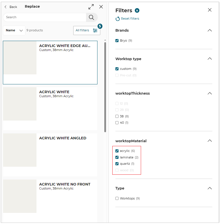
-
If the value of the parameter
sortNumericFilteris set toasc, then the sorting of the filter is in ascending order in the catalog, as shown below:
The default value of the parameter is set todesc.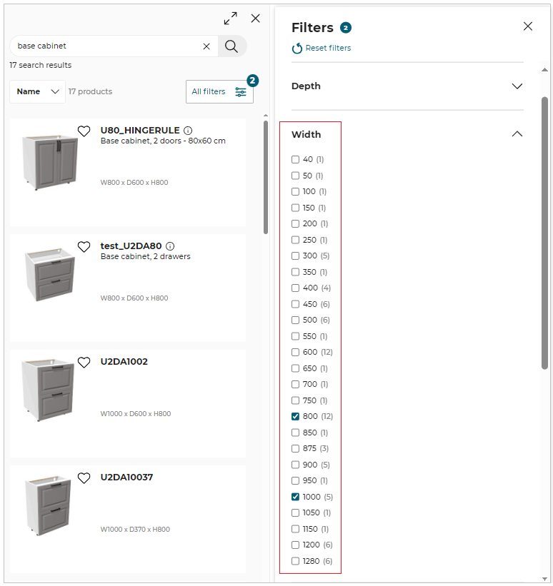
After adding a product from the catalog, the product remains in the selected state, so that the manipulator options (like Elevate, Move, Rotate, etc) can be used. Also, the editing toolbar (like Edit, Zoom To, Position, Duplicate and Delete) appears for the inserted product on closing the catalog browser.
The user can insert as many products as they want until there is no more space in the room. When there is no space available, a popin is displayed in order to inform the user that there is no space available in the current room.
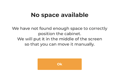
Note:
If there is no space available, the product is still inserted in the center of the room automatically. The user will therefore have to position these products one by one manually.
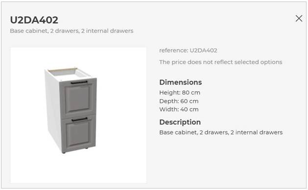
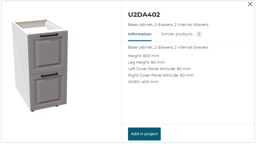
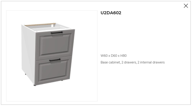
Product Information
The Product information such as product name, product dimensions, and similar products list is displayed in the product sheet pop-in window.
The Default Widget or ByMeAPI.UI.ProductSheet, or product sheet generated using SpecialProductInfoRequested iframe message for the product information is displayed depending on the application distribution settings.
- To open the product information window, click the product information
 icon.
icon.
⚙️ Set up: Application distribution parameter productinfobyiframe 🔗, productSheet 🔗 and SpecialProductInfoRequested 🔗
- Below are the parameters set in the Application distribution parameter to display the product information sheet:
- If the value of
productinfobyiframeis set to true, then the product sheet developed usingSpecialProductInfoRequestediframe message is displayed.
- If the value of
productinfobyiframeis set to false andproductSheetin the standard module to true, then the default widget is displayed for the product information.
To add the product from the product sheet, click the Add in project option, as shown below:
For more information, please refer to Product Sheet Widget 🔗
- If the value of
productinfobyiframeandproductSheetin thestandardModuleto false, then the product information sheet is displayed using the ByMeAPI.UI.ProductSheet
Editing Products
Worktop: Worktop can be edited in worktop editor according to the user requirement.
Wall Panel: Wall panel can be added to the kitchen and cabinets, and also be edited in wall panel editor.
Wall Edge Strip: Wall Edge Strip can be added to the cabinets, and can be edited in wall edge strip editor.
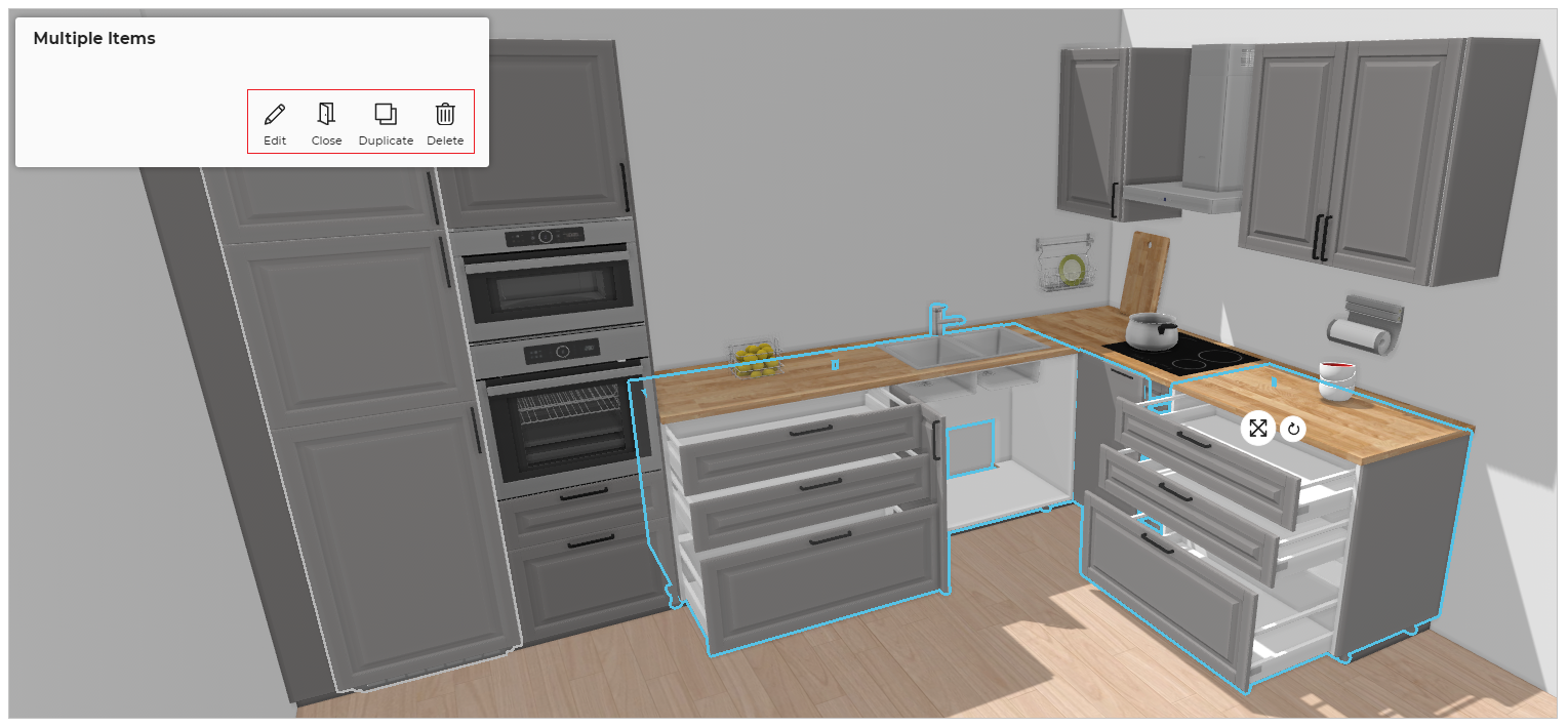
Multiple Product Selection:
To select multiple products press Ctrl button and select products. After selecting multiple products, you can perform following operations:
Move: Reposition multiple products using manipulators.
Rotate: Rotate the multiple products in clockwise and anti-clockwise direction.
Edit: Modify shared parameters across all selected products simultaneously.
Duplicate: Duplicate the multiple products selected. The orientation of the duplicate product is consistent with the existing product.
Open/Close: You can open/ close the multiple products selected simultaneously.
Delete: Deletes the multiple products selected.
Expired Product
If your project consists of expired product, you can replace or delete the product.
- Click the
 icon, the Help center is displayed, as shown below:
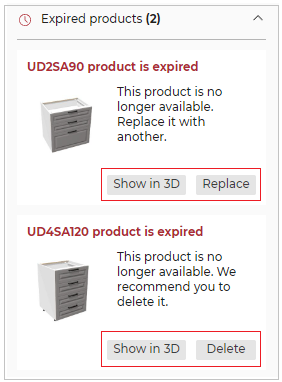
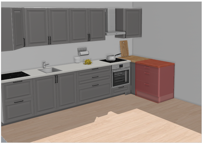
To locate the expired product in the project, click the Show in 3D option, the product is displayed, as shown below:
- To replace the expired product:
- Click the Replace button.
The Replace an expired product pop-up is displayed, as shown below:
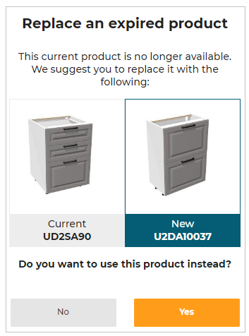
- Select the Yes option, to replace the product.
If there is no replacement possible for the expired product, the Price is not available is displayed for project price.
- To delete the expired product:
- Click the Delete button.
The confirmation pop-up message to delete the expired product is displayed, as shown below:

- Select the Yes option, to delete the expired product.
Navigation Panel
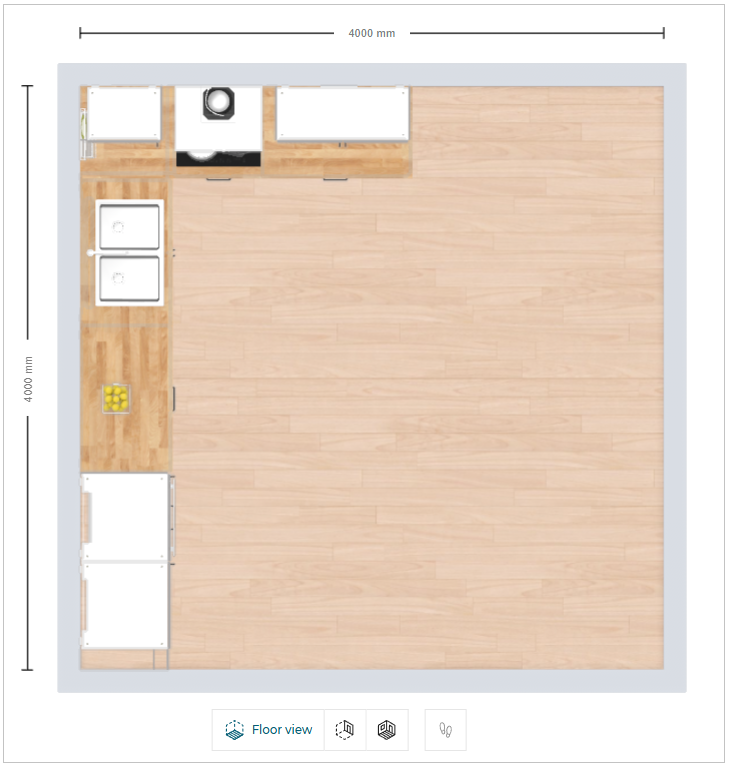
You can switch the room view to Floor view, Front view, 3D view, or First person view.
Floor view:
⚙️ Set up: Application distribution parameter designTechnicalView 🔗
ThedesignTechnicalViewconfiguration lets you assign dedicated colors to elements displayed in the 2D view during Design step. These colors are applied when a specific View Mode is selected.
| View Mode Option | What It Controls | What the User Can Customize |
|---|---|---|
onGround | Displays products placed directly on the floor. | Color for all on-ground products. |
aboveGround | Displays products mounted or placed above the floor level. | Color for above-ground product elements. |
walls | Shows walls in the 2D workspace. | Wall color in technical view. |
productBorders | Outlines around products in 2D view. | Border line color. |
wokrtopAltitude | Displays worktops based on their height. | Worktop color in technical view mode. |
- Click the
 icon in the navigation panel. The floor view is displayed, as shown below:
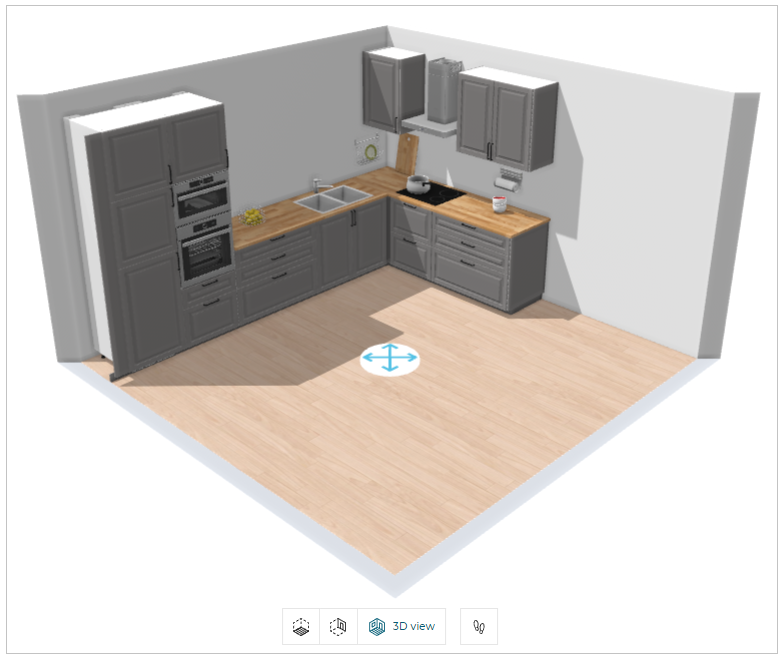
3D view:
- Click the
 icon in the navigation panel. The 3D view is displayed, as shown below:
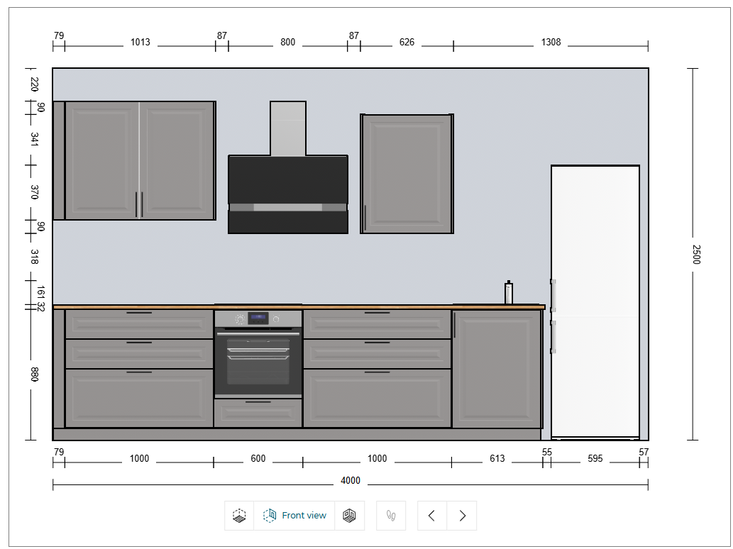
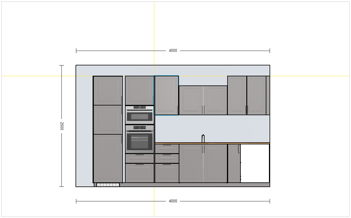
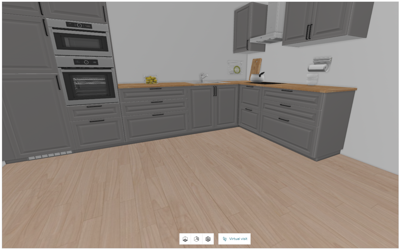
Front view:
- Click the
 icon in the navigation panel. The front view is displayed, as shown below:
You can also switch the view of the room to front view by selecting the wall in 2D/3D view.
- In the 2D/3D view, click on the wall you want to modify.
The option to switch to the front elevation view is displayed, as shown below:

- Click the icon, the room view switch to the front elevation view and the mini map is displayed, as shown below:
Next/Previous:
- Click the
 icon to display the wall immediately preceding the currently viewed wall, as shown below:

- Click the
 icon to display the wall immediately following the currently viewed wall, as shown below:

You can select and edit the products in front view, as shown below:
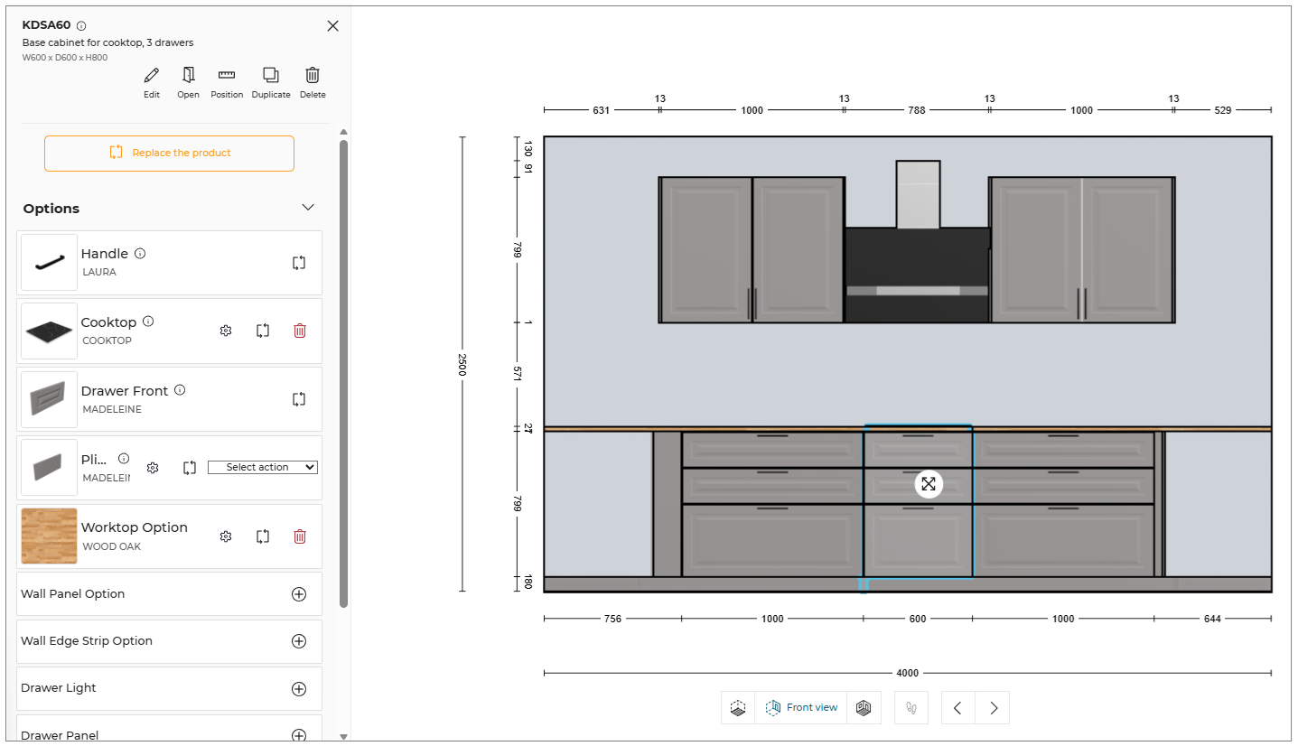
- Toggle Off the Display colour from the view mode options, the color of products in front view is removed, as shown below:

While dragging the products in front view, the snap line is displayed, as shown below:
When designing a kitchen in the front view, if there is no space available on the wall, then the product is inserted on another wall, and the notification to switch the view is displayed, as shown below:

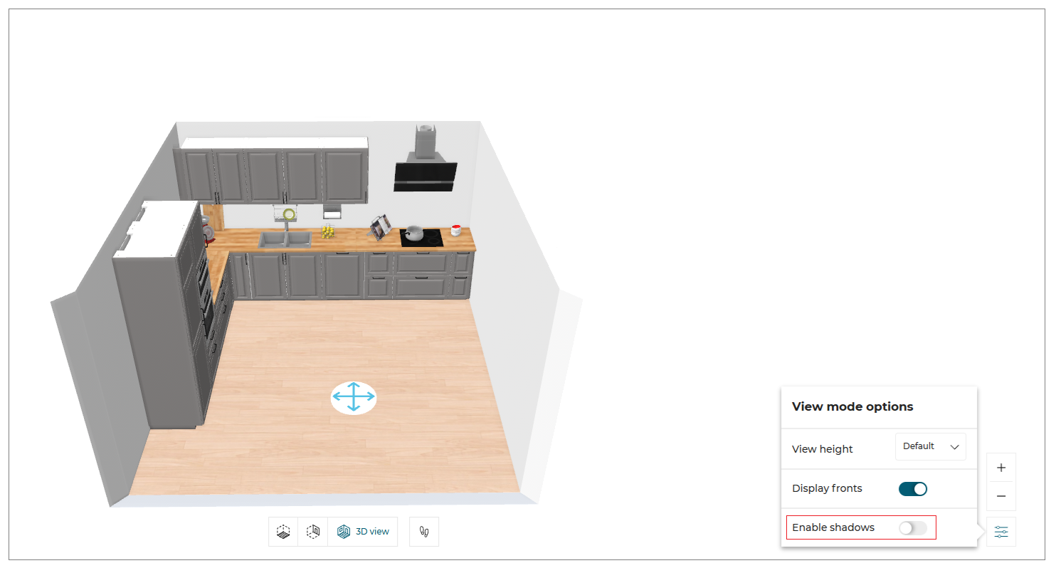
View mode options
You can select the View mode options in 2D/3D view.
- Click the
 icon in 2D view. The View mode options are displayed, as shown below:

- Visible items :
You can hide/show the items inside the room.
Select the dropdown option of the Visible items, the list is displayed, as shown below:
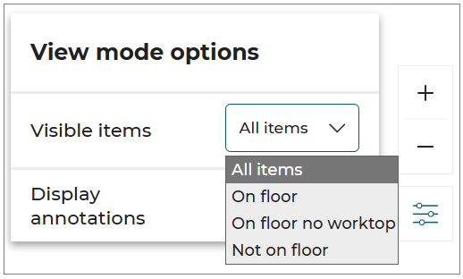
From the dropdown list, select the required option from the visible list.
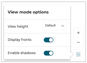
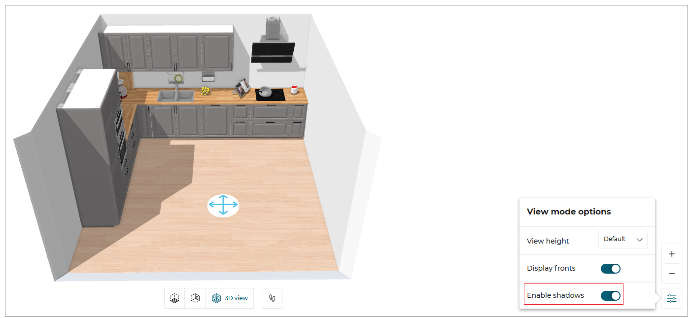
- Click the icon in 3D view. The View mode options are displayed, as shown below:
-
View height:
You can adjust the height of the view from the available options in View height -
Display fronts:
To hide/show the fronts of the cabinets, toggle ON/OFF the Display fronts option. -
Enable shadows:
To hide/show the shadows in the room, toggle ON/OFF the Enable shadows option.
⚙️ Set up: Application distribution parameter shadingOption 🔗
TheshadingOptionconfiguration lets you enable/disable the shadows in the room. The default value of theshadingOptionis set to false.
- Enable shadows toggle ON:
The shadows are displayed in the room, as shown below:
- Enable shadows toggle OFF:
The shadows are hidden in the room, as shown:
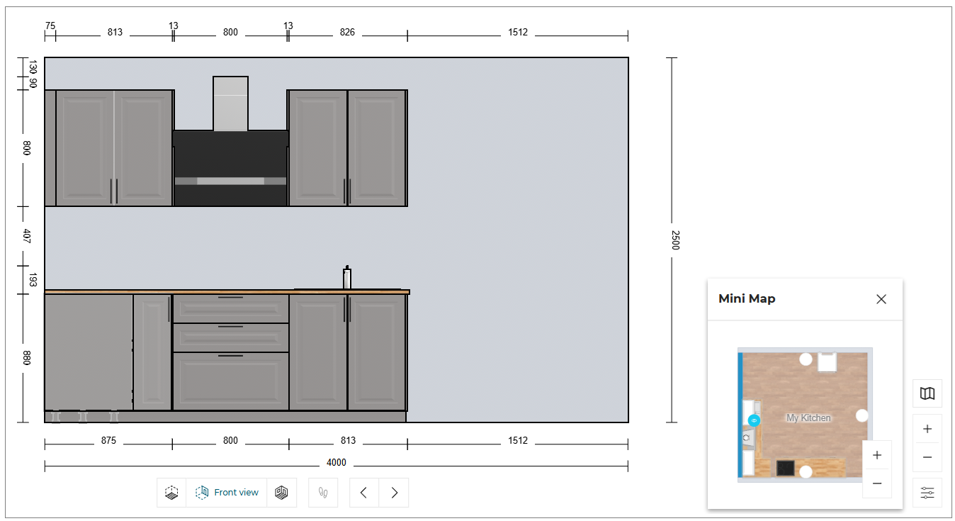
Mini Map
The mini-map feature enhances your design experience by providing a comprehensive overview of your entire project.
This tool allows you to easily switch between different walls in the Front Elevation view.
- Select the wall option to switch between walls, as shown below:
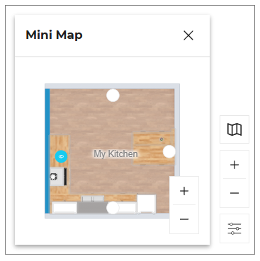
- Click the
 icon to close the mini map.
You can Zoom in or Zoom out the room in the mini map using the mouse scroll wheel.
First person view
- Click the
 icon in the navigation panel. The First person view is displayed, as shown below:
The First person view option is disabled in 2D view and becomes active only when switched to 3D view.
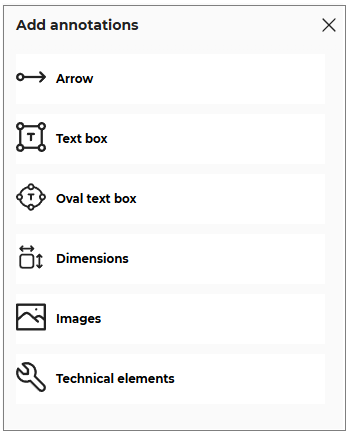
Annotations
You can add the annotations in front/floor view for the products in the planner.
❗ Note that if the users want to see the annotations added in the scene in 2D Plans, the range maintainer has to set the 2D Plans configuration to the version 2.
- Click the
 icon, the options to add the annotations are displayed, as shown below:
- Click the
 icon, to select the Linear arrow option.
To add the linear arrow click in the planner, as shown below:
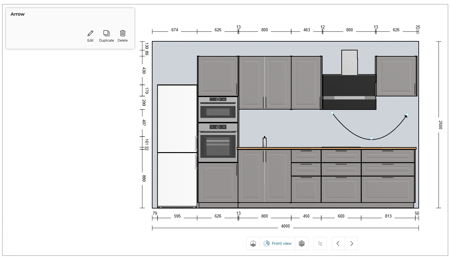
You can shape the arrow by selecting the points of the linear arrow.
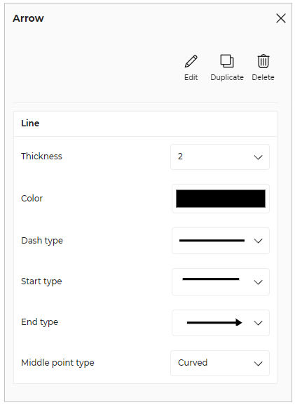
- Click the Edit button, the options to edit the linear arrow are displayed, as shown below:
- Click the
 icon, to add the annotation text.
To add the annotation text click in the planner, as shown below:
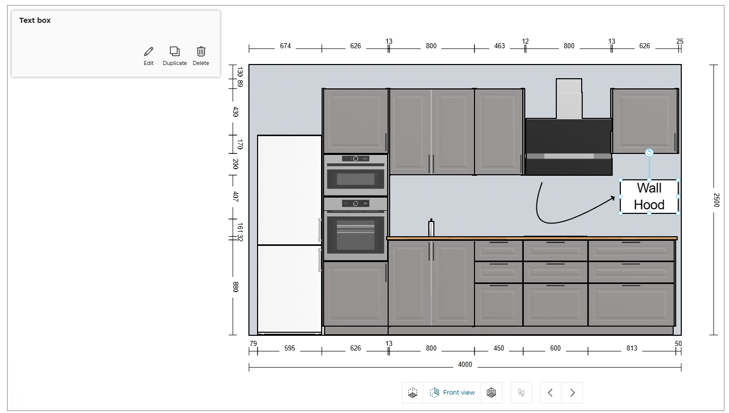
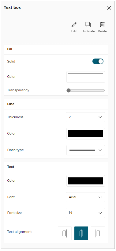
- Click the Edit button, the options to edit the text and text box are displayed, as shown below:
- Click the
 icon, to select the Oval Annotations Box option.
To add the oval annotation box click in the planner, as shown below:
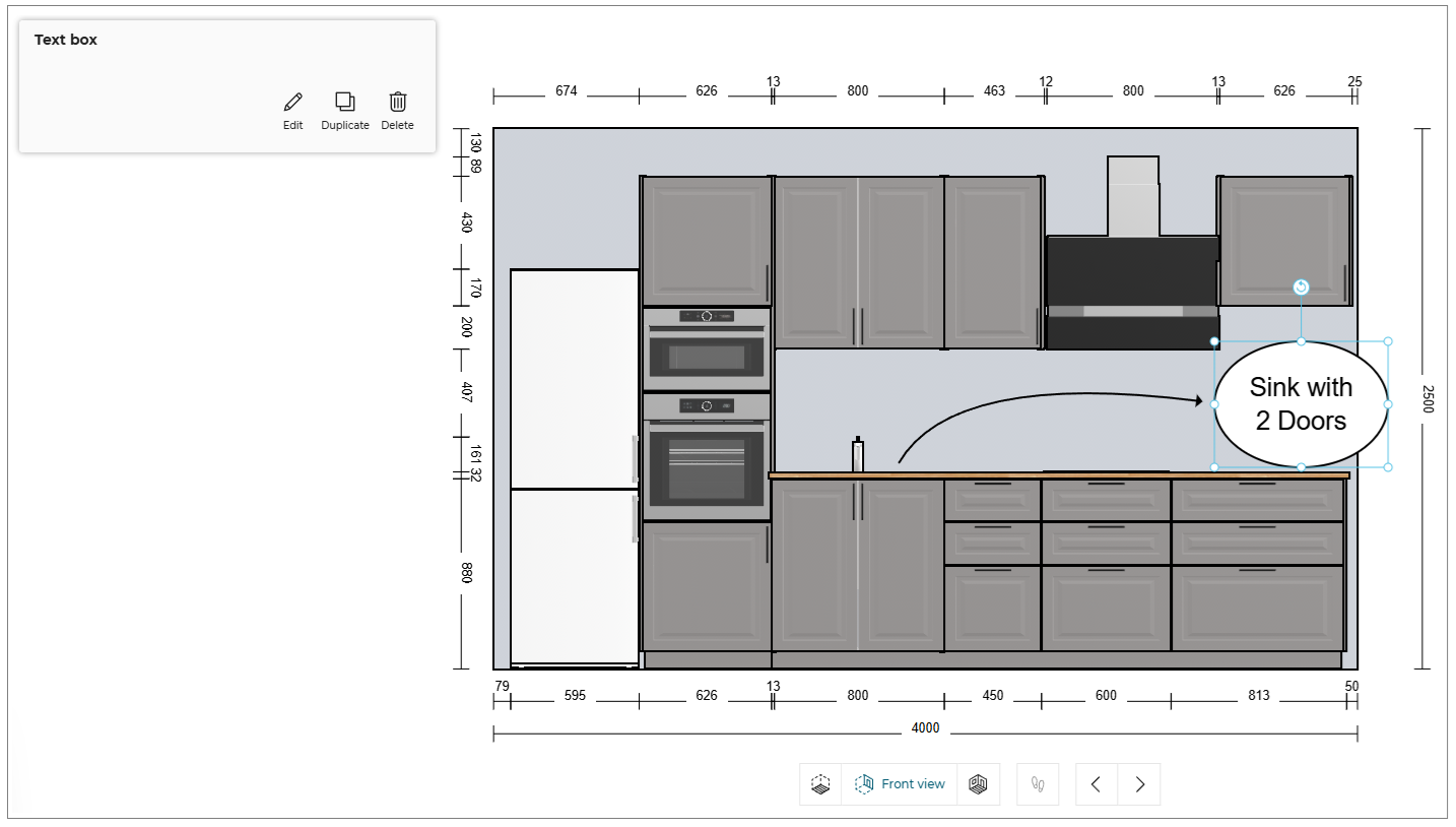
You can shape the oval annotation box by selecting the points of the box.
- Click the
 icon, to select the Dimensions option.
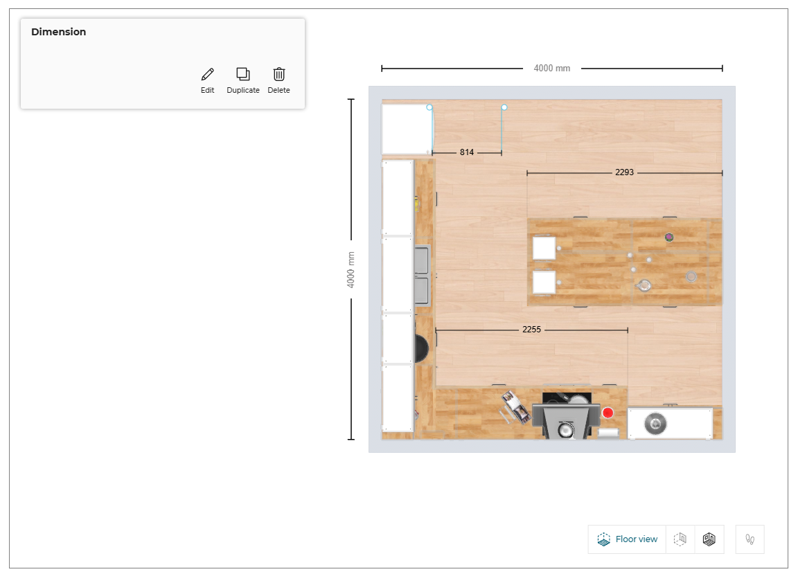
To add the dimension annotation, click in the planner or drag from one point to other point to add dimension between two points, as shown below:
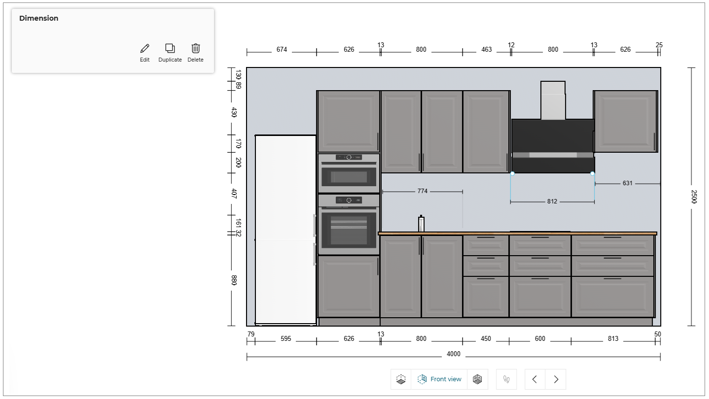
- Click the
 icon, the options to edit the dimension annotation is displayed, as shown below:
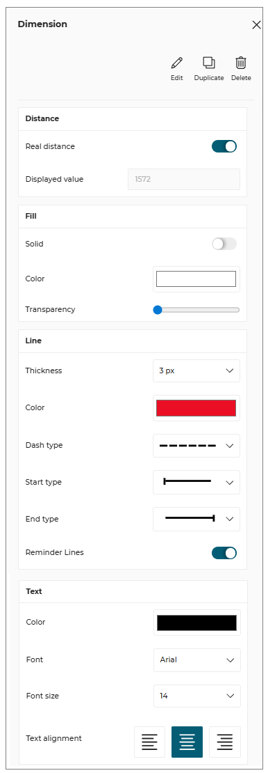
Distance
❗ This feature is only available in Kitchen Specialist offer. For more information and to subscribe to this offer, please read the dedicated section (available soon).
You can modify the dimension value.
- Toggle OFF the Real distance option to enable the real distance option, as shown below:

- Select and modify the displayed value of the distance, as shown below:

- Click the Enter key or click outside the input box to save the modified distance.
Images
You can upload the images in front/floor view in the planner.
- Click the
 icon to upload the image file.
The uploaded image is displayed, as shown below:
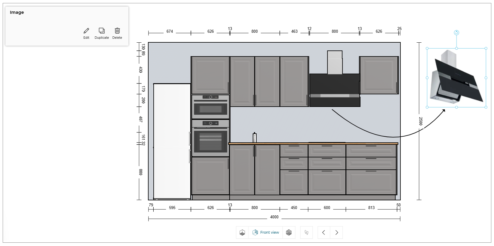
You can shape the image by selecting the points of the image.
- Click the Edit button, the options to edit the image are displayed, as shown below:

- You can upload the images in .png, .jpeg, or jpg file format.
- The Save your project window appears if the project is not already saved.
Technical elements
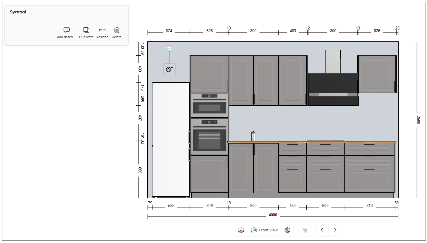
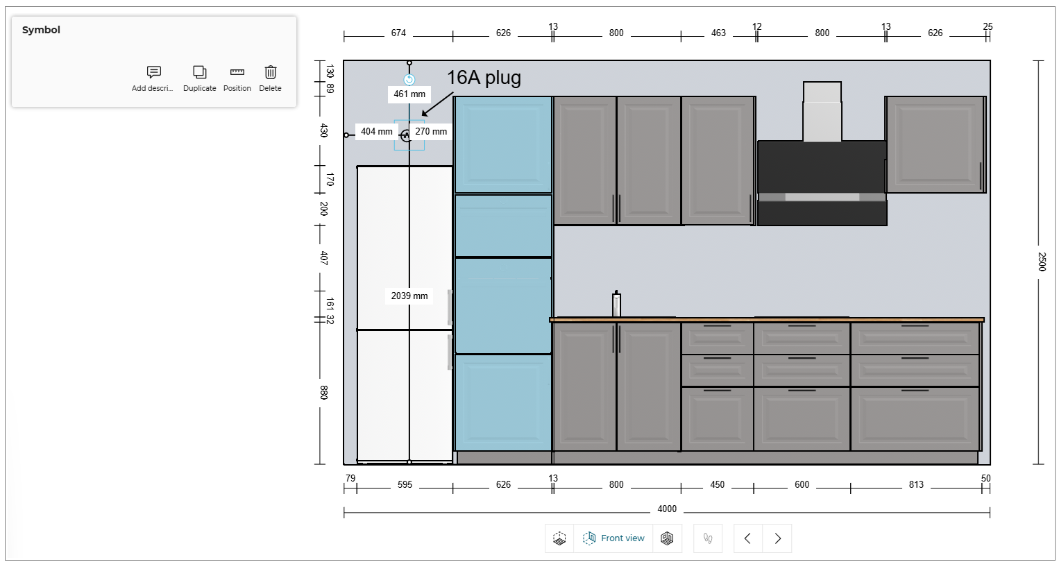
You can add the symbols of the technical elements to the products in the planner.
- Click the
 icon, to add the technical element symbol.
The technical element symbol catalog is displayed, as shown below:
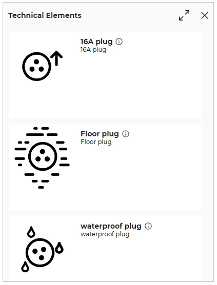
- Select the required symbol from the catalog and click in the planner, as shown below:
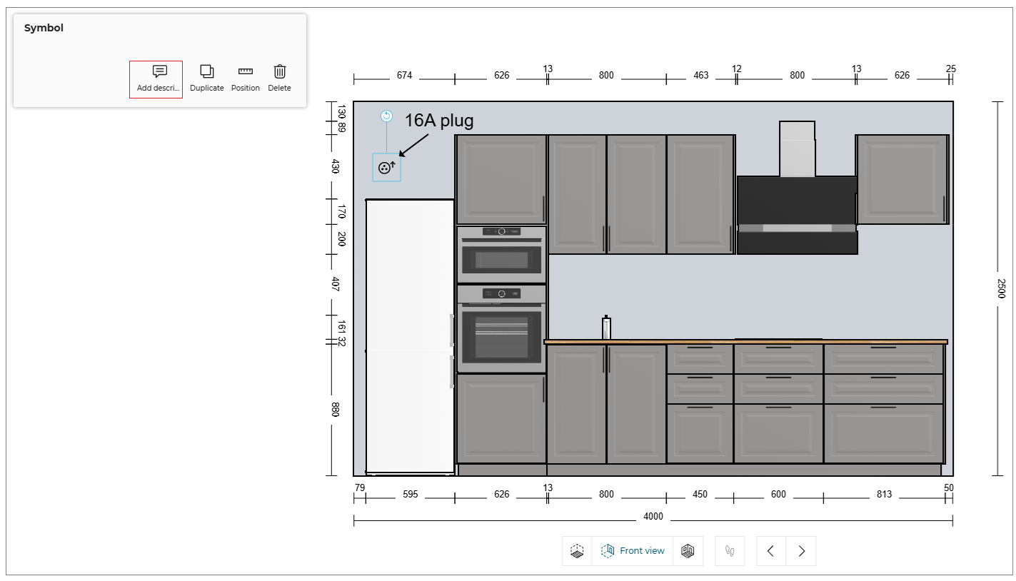
- Click the Add description option to add the description to the symbol, as shown below:
- Click on the Position option will show the measurement of annotation from the nearest object like wall/ ceiling or cabinet, as shown below:
You can modify the position of annotation by drag drop or by editing the measurement value.
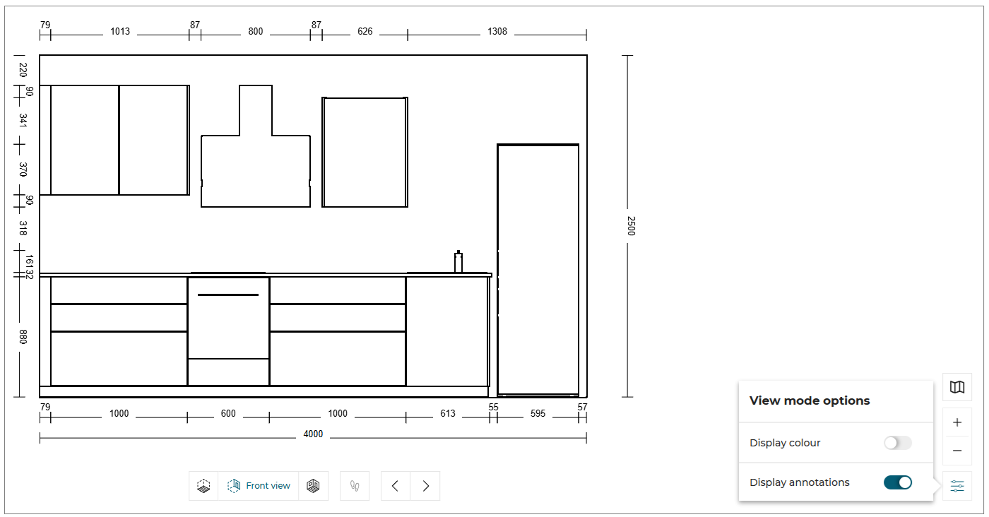
Display Annotations
You can hide/show the annotations in Floor view.
- Click the
 icon, the View mode options is displayed, as shown below:

- Toggle ON/OFF the Display annotations option to hide/show the annotations.
The Display annotations option is available for the Floor view and Front view only.
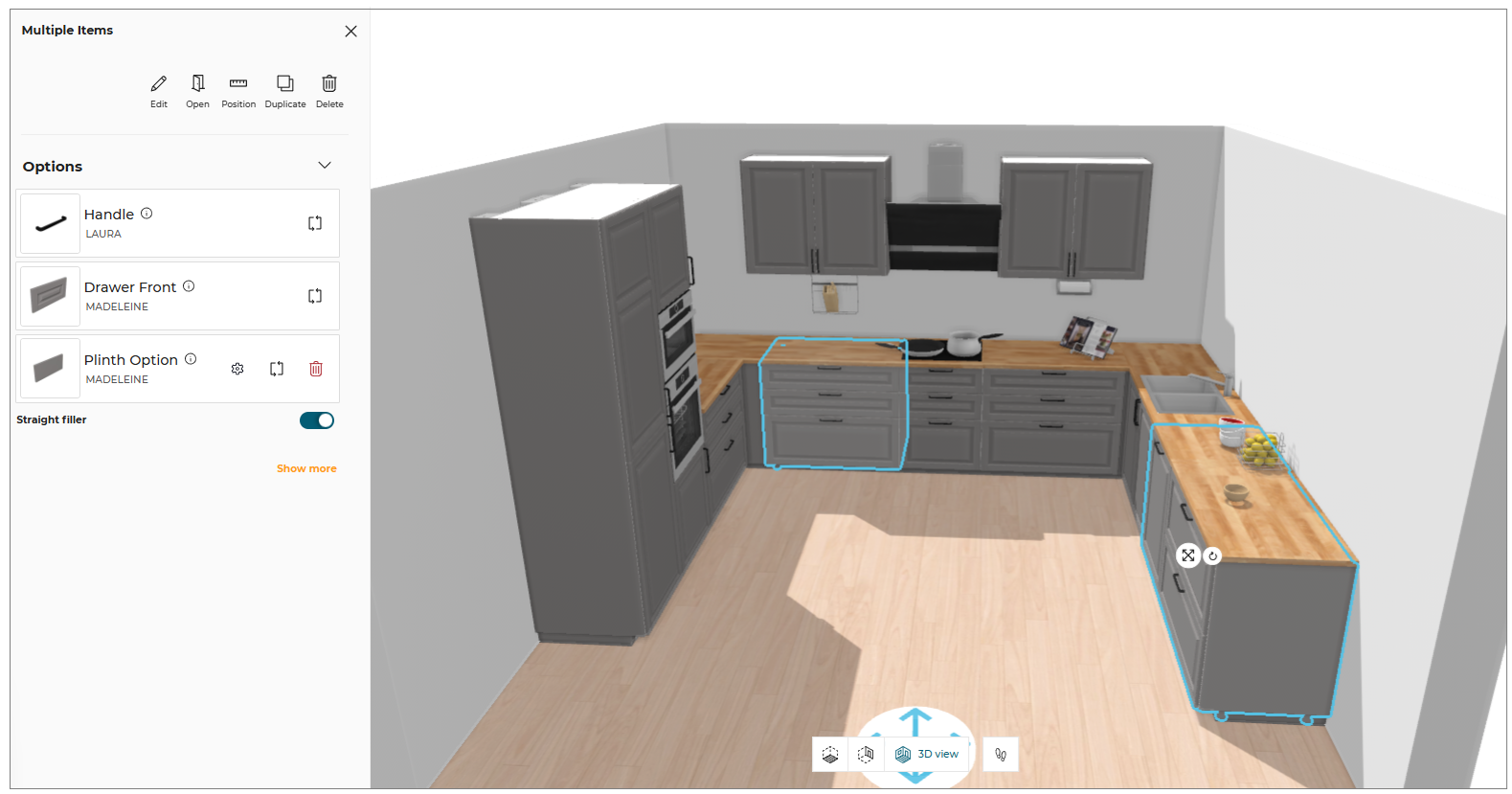
Editing Multiple Products
⚙️ Set up: Application rules parameter MatchingProductsRule 🔗
The Edit option is displayed only if the multiple selected products shares atleast one parameter (for example - Drawer Front, Handle etc).
To edit the parameter of multiple products, select the products & click Edit to open the edit panel.
Case 1: Selected products shares parameter as well as its value.
The parameter, name & thumbnail of its value & relevant buttons like Replace, Options, Delete will be displayed for editing the parameter value.
Case 2: Selected products shares the same parameters but not it's value.
The parameter, its value as "Multiple settings" & relevant buttons like Replace, Options, delete etc. will be displayed for editing the parameter value.
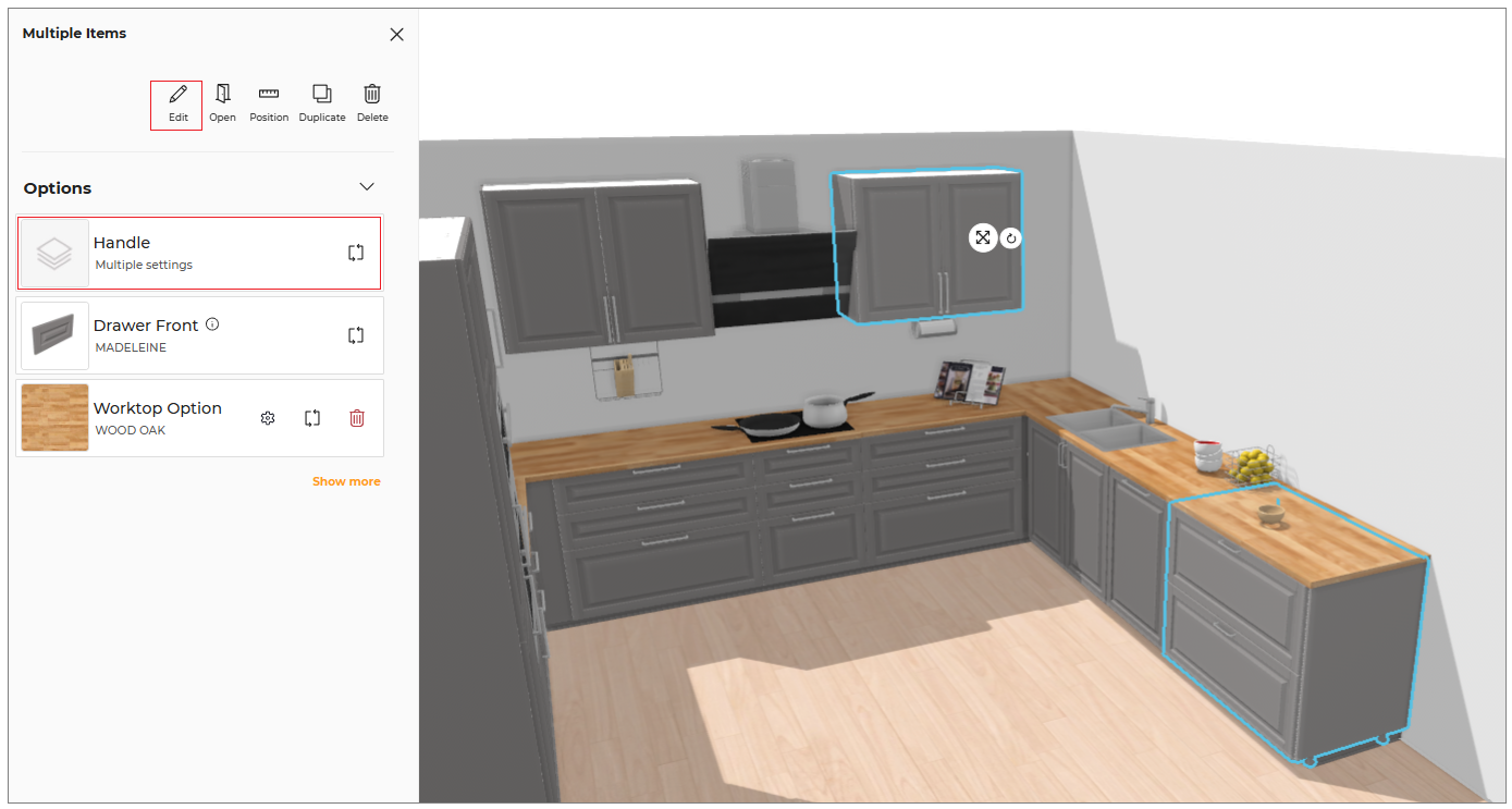
- For text value, once the possible value from 'Multiple values' option is selected, the 'Multiple values' option will not be displayed.
- For 'Multiple settings' value, the toggle button will be in the middle. You can set it to left or right.
Case 3 : Selected products shares the same parameter but the value for one of the product is not set.
In the below example, the selected product shares the parameter "Drawer Light" but the drawer light is added with wall cabinet only and not with the corner cabinet, so in this case the "Drawer Light" parameter is not displayed in Edit menu.
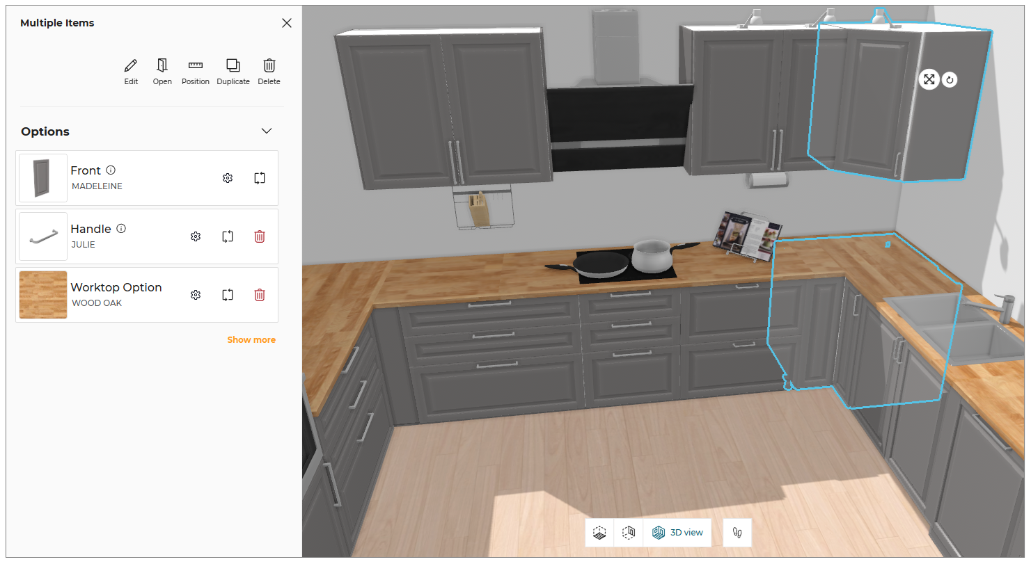
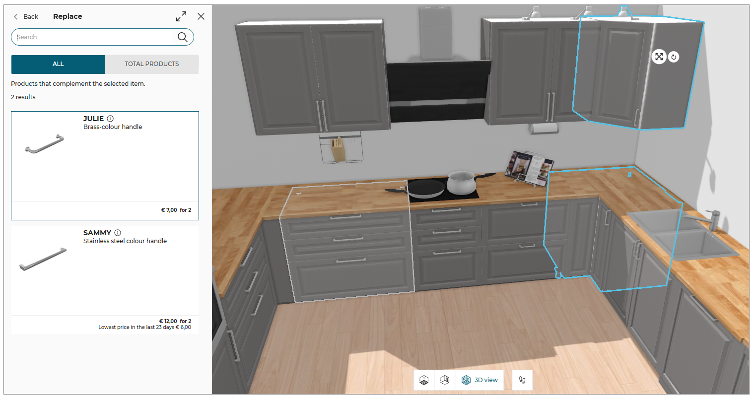
- While adding or replacing any parameter value, the catalog displays list of products that is union of sets of products applicable to all the selected products.
- when selecting multiple products having different settings then the several products will be outlined in the catalog.
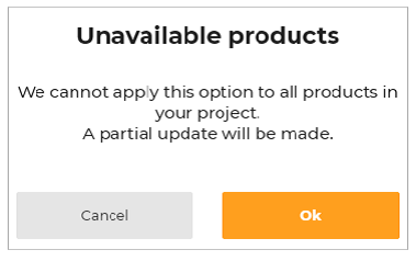
- While editing a parameter of multiple products, if the possible value of one or more products differs then the following warning message will be displayed.
Replacing with multiple cabinets
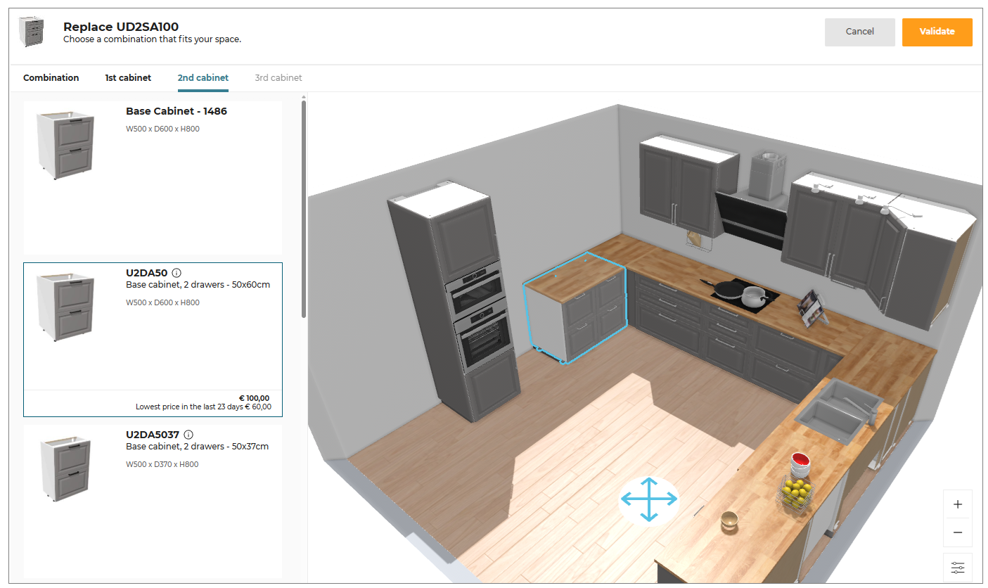
You can replace single cabinet with multiple cabinets.
To replace the cabinet:
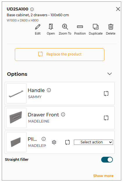
- Select the cabinet, the edit panel is displayed, as shown below:
- Click the Replace button from the edit panel, the catalog with available products is displayed, as shown below:
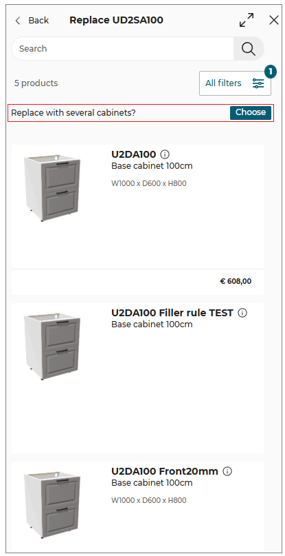
- Select the multiple cabinets you want to replace by clicking the Choose button. The available combinations is displayed.
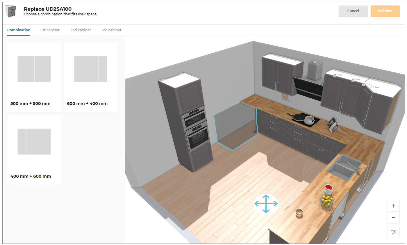
- Choose the combination as per the requirement and select 1st and 2nd cabinets, as shown below:
- Click the Validate button to continue.
Ungroup Product Set
You can ungroup a grouped set of products, to Edit, Position, Replace, Duplicate, or Delete the products separately.
To Ungroup the set of products:
- Click the product set, to open the property panel, as shown below:
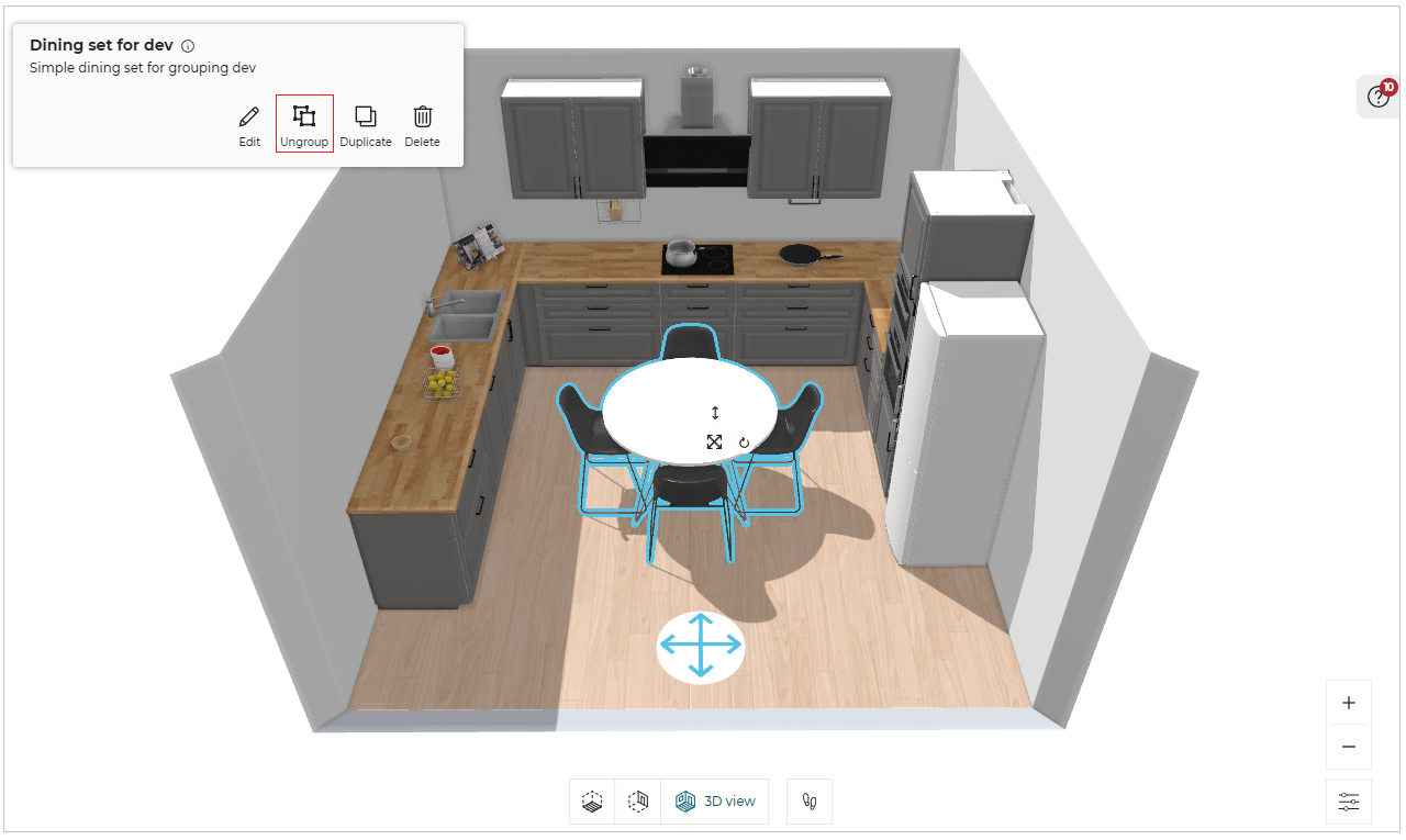
- Select the Ungroup option from the panel, to ungroup the set of products.
A popup message to notify Products have been ungrouped appears, once the product set is ungrouped.
Once the product set is ungrouped, you cannot group the products except Undo ungroup operation.
Deleting Products
You can delete all the products from the room at once.
- In step 3, select the floor where you want the products to be deleted.
The pop-up window appears, as shown below:

- Click the Empty button, a notification for confirmation appears, as shown below:
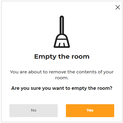
- Click the Yes option to continue.
You can undo the action by clicking the Undo button.
Pricing of Products
⚙️ Set up: Application distribution parameters assemblyCatalogPrice 🔗 and nonAssemblyCatalogPrice 🔗
-
If the values of
assemblyCatalogPriceis set to False, then the price of the product is not displayed in the product catalog, as shown below:
The default values of the parameter is set to True.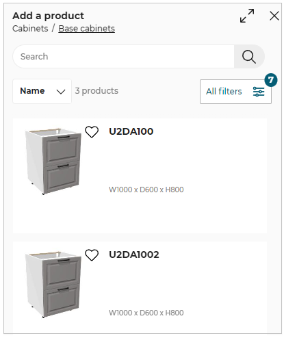
-
If the values of
nonAssemblyCatalogPriceis set to False, then the price of the product is not displayed in the product catalog, as shown below:
The default values of the parameter is set to True.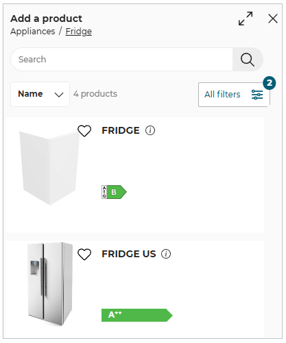
Product Pricing:
On browsing catalog, different products have different prices associated with them.
See Pick a Layout for more information about pricing structure.
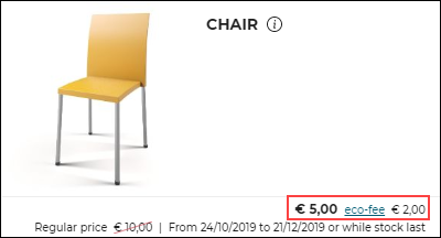
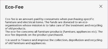
Eco-fee Pricing:
Eco-fees, or environmental handling fees, are used to finance the recovery and recycling of regulated products at the end of their life cycle.
If a customer buys an eco-fee product and returns it according to the applicable policy, the eco-fee will be refunded for the product to the customer.
Eco-fees is a part of the total price of the product. Hence, it is not added separately in the pricing structure.
However, eco-fees is diplayed along with the total price of the recyclable product, as shown below.
Eco-fee can be added to recyclable products as well as electrical equipments, electronic equipments.
For electrical and electronic equipments, DEEE is mentioned.
DEEE/WEEE stands for Waste Electrical and Electronic Equipment.
Examples of DEEE/WEEE products are dishwasher, washer, fridge and so.
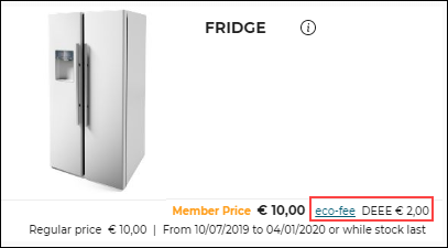
Click eco-fee for eco-fee information. Details on eco-fee appear.
⚙️ Set up: Application distribution parameter ecoFee 🔗
- Below are the parameters set in the Application distribution parameter to display the product Eco Fee sheet:
-
If the value of
productinfobyiframeis set to true, then the Eco Fee information sheet developed usingSpecialProductInfoRequestediframe message is displayed. -
If the value of
productinfobyiframeis set to false andecoFeein the standard module to true, then the default widget is displayed for the Eco Fee information.
For more information, please refer to Eco Fee Widget 🔗 -
If the value of
productinfobyiframeandecoFeein thestandardModuleto false, then the Eco Fee information sheet is displayed using the ByMeAPI.UI.ProductSheet
Calculation of eco-fee price
⚙️ Set up: Application rules parameter ecoFee 🔗
The eco-fee price is displayed based on the computed weight of a linear using linear weight or surface weight.
-
For Worktops and Wallpanels: The eco-fee price is calculated based on the weight per surface area of the product set as
surfaceWeightfor the product. -
For Linear products: The eco-fee price is calculated based on the weight per length for (Plinths, Wall edge strip, Cornices, and Deco-strips) set as
linearWeightfor the product.
For more information, please refer to EcoFee Reference 🔗
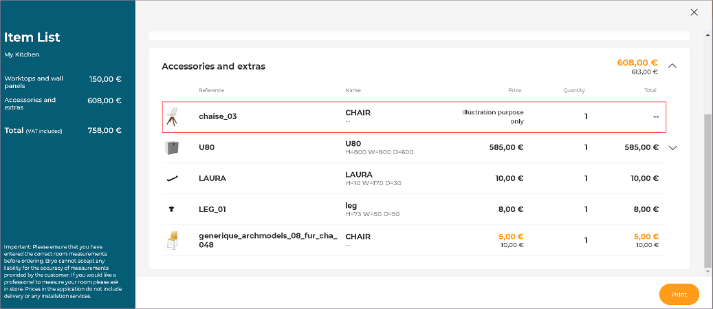
Illustration Products:
These products are examples of useful kitchen products and can be used only for visual purpose.
You can add and use these products for designing kitchen in the application.
Illustration products can be an entire product or a part of product.
Example: Chairs, worktops, wall panels.
"Illustration purpose only" is labelled in the catalog, for such products, as shown below.
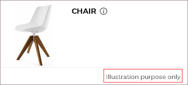
Since, Illustration products can be used only for visual purpose, they do not have a price. Hence, they are not added in the pricing structure, as shown below.
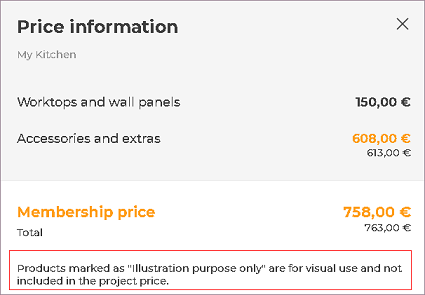
Note:
If any Illustration product has a price to it, then the "Illustration purpose only" label will not be visible.
The price of the product will be visible and will be added to the total price of the kitchen.
Illustration product label and price cannot be displayed at the same time for a product.
External Price
⚙️ Set up: Application distribution parameter externalPrice🔗 and kitchen iframe message ExternalPriceRequested🔗.
If the value ofexternalPriceis set to true , then the kitchen iframeExternalPriceRequestedoption is displayed.
The value of theexternalPriceis by default set to false.
External Monthly Price
⚙️ Set up: Application distribution parameter externalMonthlyPrice 🔗.
If the value of the parameter externalMonthlyPrice is set to true, then the response set for the minimumMonthlyPrice 🔗 is displayed.
For example: The value of the minimumMonthlyPrice is set to Financing available from £200 is displayed, as shown below:
The value of the externalMonthlyPrice is by default set to false.

Error Free Design
⚙️ Set up: Application distribution parameter rulePopin 🔗.
If the value of the parameter rulePopin is set to designDone, then after clicking the Next button or switching the step from Design your kicthen to Summary, the pop-up window informing Issues to resolve is displayed, as shown below.
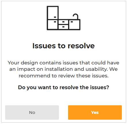
Click the *Yes button to open the help center to resolve the issues or,
Select the No button to continue to Summary step.