Need Mapping Widget
Objective
Need Mapping widget enables the user to select the parameters that will be passed to the template generator algorithm.
Widget Overview
Access
Users can have access to Need Mapping from Kitchen Retailer Application and Bryo Home Website.
Context
Like other default widgets, Need Mapping should be embedded in the application as an iframe, the communication between the application and default widget should be established on iframe messages. To have an overview of the subject, please refer to window.postMessage() 🔗. Every Message published or subscribed by the Need Mapping default widget should respect the following format:
| Key | Type | Description |
|---|---|---|
| event | String | Name of the event, which is used as a unique identifier |
| content | Object | Content of the event, which brings arguments helps to event handling |
Example
{
  "event": "event name",
  "content": {
    "key1": "value for key1",
    "key2": "value for key2"
  }
}
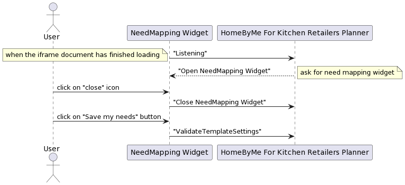
Overview of the Synchronization Process
The following sequence diagram explains possible data synchronization between the application and Need Mapping default widget.
Published Events (Output events)
Published events are those events that go from default widget to application.
"Listening"
Context
When the document and all sub-resources have finished loading, send the "Listening" event to inform the application (parent window) that it is ready to listen to parent window messages. This event must be sent once and only once.
Message Format
| Key | Type | Value/Template | Description |
|---|---|---|---|
| event | String | "Listening" | - |
Message Example
{
    "event": "Listening",
}
"CloseNeedMapping"
Context
When the user clicks on the "close" icon on the Need Mapping default widget, send the "CloseNeedMapping" event to inform the application that the default widget has been destroyed.
Message Format
| Key | Type | Value/Template | Description |
|---|---|---|---|
| event | String | "CloseNeedMapping" | - |
Message Example
{
  "event": "CloseNeedMapping"
}
"ValidateTemplateSettings"
Context
When the user clicks on the "validate" button on the Need Mapping default widget, send the "ValidateTemplateSettings" event to inform the application that the default widget has been destroyed.
Message Format
| Key | Type | Value/Template | Description |
|---|---|---|---|
| event | String | "ValidateTemplateSettings" | - |
| content | Object | styleVersion: IntegerlinearStyle: ObjectfurnitureStyle: Object floorStyle: ObjectwallStyle: Object name: StringtemplateTags: Array | styleVersion: Positive integerlinearStyle: defines the linear style. The only supported keys are: "worktop", "plinth", "wallPanel", "wallEdgeStrip", "cornice" and "decostrip"furnitureStyle: defines furniture style. Can contain any parameter name. floorStyle: defines floor style. Can contain any parameter name.wallStyle: defines wall style. Can contain any parameter name. name: optional information used to identify the need-mapping style name chosen by the usertemplateTags: Array containing objects containing:required: Array of stringexcluded: Array of string. It is used to set up template filters. It defines groups of required and excluded tags to filter templates that the application will compute. To fit in a group, a template's tags must contain all tags defined in required array and must not contain any tags defined in excluded array. Each group will be computed in the same order as they are defined in the message and solutions are displayed as the same order. |
Message Example
{
  "event": "ValidateTemplateSettings",
  "content": {
    "name": "signature",
    "templateTags": [
      { "required": ["I", "integratedOven", "freeStandingFridge", "priority"] },
      {
        "required": ["I", "integratedOven", "freeStandingFridge"],
        "excluded": ["priority"]
      }
    ],
    "styleVersion": 1,
    "linearStyle": {
      "plinth": "15773",
      "cornice": "14178",
      "worktop": "14128",
      "decostrip": "14116",
      "wallPanel": "14135",
      "wallEdgeStrip": "14174"
    },
    "furnitureStyle": {
      "handle": [null],
      "drawerFront": ["15765"],
      "front": ["15764"],
      "leftCoverPanel": ["16050"],
      "rightCoverPanel": ["16050"],
      "backCoverPanel": ["16051"],
      "topCoverPanel": ["16052"],
      "fillerPiece": ["16051"]
    },
    "floorStyle": { "front": ["15764"] },
    "wallStyle": { "front": ["15764"] }
  }
}
Subscribed Events (Input events)
Subscribed events are those events that go from the application to the default widget.
"OpenNeedMapping"
Context
When the default widget has finished being loaded, the application is send this event to the Need Mapping default widget asking for the media list of the project.
For getting all the necessary information related to the Need Mapping default widget, a JSON file named needmapping.json is fetched. The file contains several pieces of information related to the tabs displayed in the widget.
Following is the structure of the JSON file:
{
  "steps": [],
  "styleCatalogData": [],
  "styleBackgroundImg": "",
  "styleSizerImg": ""
}
- steps object
  "steps": [
        {
            "name": "style",
            "description": "Create a style",
            "options": [
                {
                    "name": "par-grey",
                    "value": {
                        "linearStyle": {
                            "plinth": "13950",
                            "cornice": "14178",
                            "decostrip": "14116",
                            "wallPanel": "14134",
                            "wallEdgeStrip": "14174"
                        },
                        "furnitureStyle": {
                            "drawerFront": ["13700"],
                            "front": ["13855"],
                            "leftCoverPanel": ["13857"],
                            "rightCoverPanel": ["13857"],
                            "backCoverPanel": ["13890"],
                            "topCoverPanel": ["13893"],
                            "fillerPiece": ["13890"]
                        },
                        "floorStyle": {
                            "front": ["13855"]
                        },
                        "wallStyle": {
                            "front": ["13855"]
                        }
                    }
                }
            ]
        },
        {
            "name": "layout",
            "description": "Pick a layout",
            "options": [
                {
                    "name": "I-shaped",
                    "value": "I",
                    "imageURL": "image/i-shaped.jpg"
                },
                {
                    "name": "L-shaped",
                    "value": "L",
                    "imageURL": "image/l-shaped.jpg"
                },
                {
                    "name": "U-shaped",
                    "value": "U",
                    "imageURL": "image/u-shaped.jpg"
                },
                {
                    "name": "II-shaped",
                    "value": "II",
                    "imageURL": "image/ii-shaped.jpg"
                }
            ]
        },
        {
            "name": "cooking",
            "description": "Oven position",
            "options": [
                {
                    "name": "Under worktop",
                    "value": "ovenUnderWorktop",
                    "imageURL": "image/under.png"
                },
                {
                    "name": "Integrated",
                    "value": "integratedOven",
                    "imageURL": "image/column.png"
                }
            ]
        },
        {
            "name": "refrigeration",
            "description": "Fridge position",
            "options": [
                {
                    "name": "Freestanding",
                    "value": "freeStandingFridge",
                    "imageURL": "image/free_style.png"
                },
                {
                    "name": "Integrated",
                    "value": "integratedFridge",
                    "imageURL": "image/built-in.png"
                }
            ]
        }
    ]
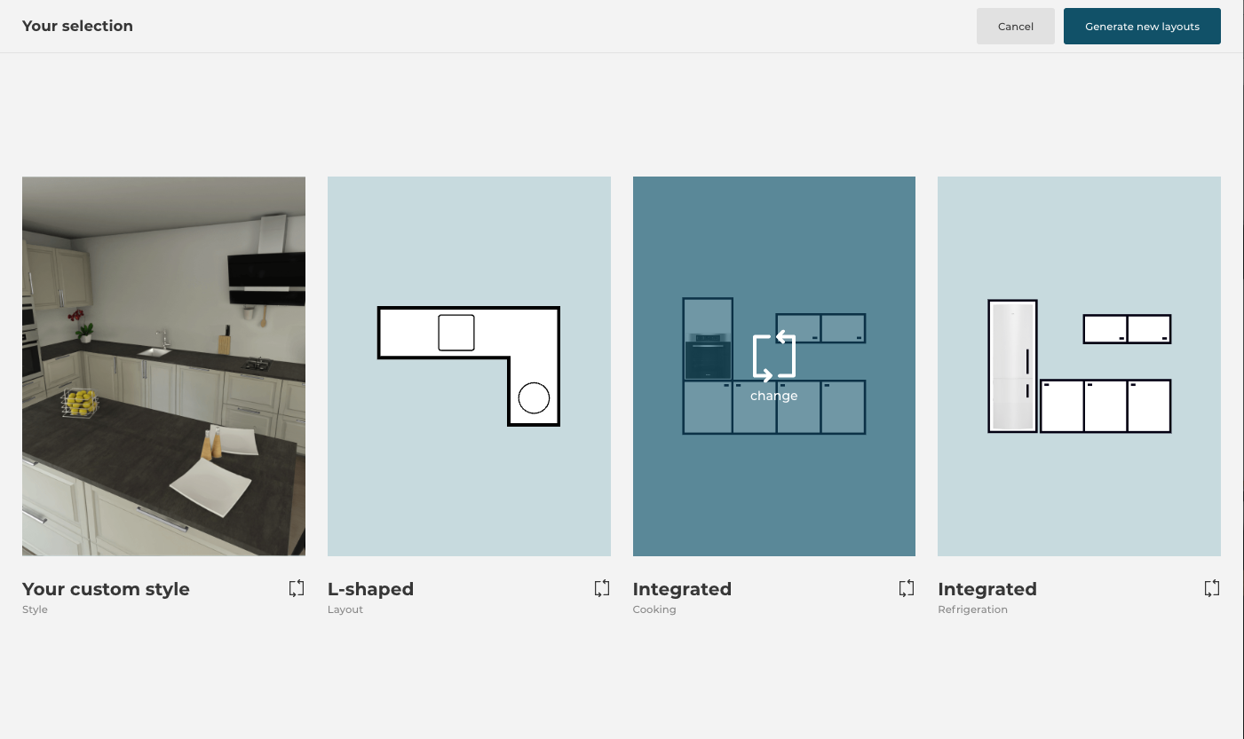
The above data contains important information for the Need Mapping widget.
Each object of the array represents the tabs of the widgets, which are configurable, which means by adding the objects in the array will lead to adding more tabs in the widget and vice versa.
If the tab data contains the "style" object, then it should always be placed in the first place and the position of other tabs can be changed according to the requirement.
The object contains keys like "name", "description" and "options":
"name" : String: Name of the tab/setting.
"description": String : Description of the tab/setting.
"options": Array: Array containing objects.
 Each object defines an option that is present inside the tab and options are also configurable, which means by adding the objects in the array will lead to adding more options in the tab and vice versa.
 Objects are as follows:
    "name" : String: Name of the option.
    "value" : String: Value of the option used while generating the templates.
    "imageURL" : String: URL of the image displayed.
Note: The above information related to options is applicable for other tabs rather than the "style" tab because options defined for the "style" tab have a different purpose. The options of the "style" tab are the style data used to generate the templates. The values defined in each option of the "style" tab contain several other styles that get selected on the basis of the selection of the "front" from the catalog of fronts. So it is important to have one style option for each front present in the catalog to create the template with correct styles.
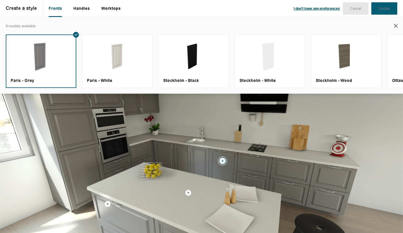
- styleCatalogData object
  "styleCatalogData": [
        {
            "name": "fronts",
            "heading": "Fronts",
            "options": [
                {
                    "id": "par-grey",
                    "name": "Paris - Grey",
                    "catalogImg": "catalog/front-4.jpg",
                    "displayImg": "display/fronts-4.png",
                    "index": 1,
                    "type": "front",
                    "hasHandle": true
                },
                {
                    "id": "sto-black",
                    "name": "Stockholm - Black",
                    "catalogImg": "catalog/front-1.jpg",
                    "displayImg": "display/fronts-1.png",
                    "index": 2,
                    "type": "front",
                    "hasHandle": false
                }
            ]
        },
        {
            "name": "handles",
            "heading": "Handles",
            "options": [
                {
                    "id": "14087",
                    "name": "143mm Bar Handle",
                    "catalogImg": "catalog/handle-1.jpg",
                    "displayImg": "display/handles-1.png",
                    "index": 1,
                    "type": "handle"
                },
                {
                    "id": "13776",
                    "name": "170mm Bar Handle",
                    "catalogImg": "catalog/handle-2.jpg",
                    "displayImg": "display/handles-2.png",
                    "index": 2,
                    "type": "handle"
                }
            ]
        },
        {
            "name": "worktops",
            "heading": "Worktops",
            "options": [
                {
                    "id": "14128",
                    "name": "38mm Acrylic Worktop",
                    "catalogImg": "catalog/worktop-1.jpg",
                    "displayImg": "display/worktop-1.png",
                    "index": 1,
                    "type": "worktop"
                },
                {
                    "id": "14129",
                    "name": "38mm Laminate Worktop",
                    "catalogImg": "catalog/worktop-2.jpg",
                    "displayImg": "display/worktop-2.png",
                    "index": 2,
                    "type": "worktop"
                }
            ]
        }
    ]
The above key is required when we have added the "style" object in the "steps" data.
Each object of the array represents one catalog and the options present under catalog are the products that are displayed and can be used for styling.
We can have a maximum of 3 catalogs: "Fronts", "Worktops" and "Handles" and it is important to have the "Fronts" and the "Worktops" catalog in the list and "Fronts" catalog should always be placed at the first position and the remaining can be placed at any position.
Each catalog option should contain at least one object so that catalog has products to display.
The object contains keys like "name", "heading" and "options":
"name" : String: Name of the catalog.
"heading": String : Heading displayed for the catalog.
"options": Array: Array containing objects.
 Each object defines an product that is present in the catalog under "style" tab and these products are configurable, which means by adding the objects in the array will lead to adding more products in the catalog and vice versa.
 Objects are as follows:
    "id" : String: ID of the catalog product.
    "name" : String: Name of the catalog product.
    "catalogImg" : String: URL of the image displayed in the catalog.
    "displayImg" : String: URL of the image displayed after adding the product.
    "index" : String: Index number of the product to define the sequence of product.
    "type" : String: Type of the product.
    "hasHandle": Boolean: Defines whether the product supports the handle or not.
Note: The "hasHandle" key in the options array is only applicable in the case of "fronts" catalog to check whether the front supports the handle or not.
Note: Fronts Catalog: The "id" key present in the options of the front catalog is linked to the "name" key present under the options of the "style" tab, both of them are similar, which is used to extract the values of other styles to generate correct template.
Note: In the case of "Handles" and "Worktops" the default selected product while opening the style tab for the first time will be the first object present in the options of each catalog, and for "Fronts" the first option of "style" tab will be selected if also present in the "Fronts" catalog options otherwise, it will also select the first object of catalog options.
The following is the image of "style" tab, showing "Fronts" catalog.
- styleBackgroundImg object
"styleBackgroundImg": "image/background.jpg"
The above key is required when we have added the "style" object in the "steps" data.
The variable contains an image, which is used to display the background under the "style" tab.
- styleSizerImg object
"styleSizerImg": "image/sizer.jpg"
The above key is required when we have added the "style" object in the "steps" data.
The variable contains an image, which is used in the "style" tab for providing size to the background image and for placing other images on it.
Upload Need Mapping JSON
After adding the data in the needmapping.json file, the last step is to upload the JSON file.
The process of uploading the file is similar to the way the style.jsonc file gets uploaded.
Before uploading, is important to validate that the created JSON file is error free. Some common errors are given here.
Lastly, the file can be uploaded using the following process.
Note: In case the JSON file has not been uploaded or fetched correctly, a default mapping data will be used, having three tabs which are "Layout", "Oven Position" and "Refrigeration".
Message Format
| Key | Type | Value/Template | Description |
|---|---|---|---|
| event | String | "OpenNeedMapping" | |
| content | Object | brandingJson:Object isUpdate:Boolean language:String translation:Object namespace: String steps:Array styleCatalogData:Array styleBackgroundImg:String styleSizerImg:String preselectedSettings: Object | - brandingJson: Full style object as described here - isUpdate:If false, the widget will open in step 1 and will go through each step. If true, it will open on the summary of the steps. - language: locale code - translation: Mapping of translations, with which to override the default one in the widget - namespace: namespace - steps: Defines the available step for the widget. Array containing objects containing : - name: String. Name of the step - description: String. Description of the step. - options: Array. Array of objects containing : - name: String. Name of the step option. - imageURL: String. URL of the image of the step option. - value: Object or String. Value of the step option. - styleCatalogData : Defines the catalog data present in the style step. Array containing objects containing : - name: String. Name of the catalog - heading: String. Heading displayed for the catalog. - options: Array. Array of objects containing : - id: String. ID of the catalog product. - name: String. Name of the catalog product. - catalogImg: String. URL of the image shown in the catalog. - displayImg: String. URL of the image used to display the product when added. - index: Number. Indexing of the catalog product. - type: String. Type of the catalog product. - hasHandle: Boolean. Value used only in case of front catalog to determine whether the front supports the handle or not. - styleBackgroundImg: background image url of the style step. - styleSizerImg: image url to provide a size to the background. - preselectedSettings: settings selected previously in the planner. Same structure as the content of the "ValidateTemplateSettings" event described above. |
Message Example
{
  "event": "OpenNeedMapping",
  "content": {
    "isUpdate": true,
    "preselectedSettings": {
      "floorStyle": { "front": ["15764"] },
      "furnitureStyle": {
        "handle": [null],
        "drawerFront": ["15765"],
        "front": ["15764"],
        "leftCoverPanel": ["16050"],
        "rightCoverPanel": ["16050"],
        "backCoverPanel": ["16051"],
        "topCoverPanel": ["16052"],
        "fillerPiece": ["16051"]
      },
      "linearStyle": {
        "plinth": "15773",
        "cornice": "14178",
        "worktop": "14128",
        "decostrip": "14116",
        "wallPanel": "14135",
        "wallEdgeStrip": "14174"
      },
      "wallStyle": { "front": ["15764"] },
      "templateTags": [
        {
          "excluded": [],
          "required": ["I", "integratedOven", "freeStandingFridge", "priority"]
        },
        {
          "excluded": ["priority"],
          "required": ["I", "integratedOven", "freeStandingFridge"]
        }
      ],
      "styleVersion": 1,
      "name": "signature"
    },
    "brandingJson": {},
    "steps": [
      {
        "name": "style",
        "description": "Create a style",
        "options": [{
            "name": "par-grey",
            "value":
             {
              "linearStyle": {
               "plinth": "13950",
               "cornice": "14178",
               "decostrip": "14116",
               "wallPanel": "14134",
               "wallEdgeStrip": "14174"
              },
              "furnitureStyle": {
               "drawerFront": ["13700"],
               "front": ["13855"],
               "leftCoverPanel": ["13857"],
               "rightCoverPanel": ["13857"],
               "backCoverPanel": ["13890"],
               "topCoverPanel": ["13893"],
               "fillerPiece": ["13890"]
              },
              "floorStyle": {
               "front": ["13855"]
              },
              "wallStyle": {
                "front": ["13855"]
              }
            }
        }]
      },
      {
        "name": "layout",
        "description": "Pick a layout",
        "options": [
          {
            "name": "I-shaped",
            "value": "I",
            "imageURL": "image/i-shaped.jpg"
          },
          {
            "name": "L-shaped",
            "value": "L",
            "imageURL": "image/l-shaped.jpg"
          },
          {
            "name": "U-shaped",
            "value": "U",
            "imageURL": "image/u-shaped.jpg"
          },
          {
            "name": "II-shaped",
            "value": "II",
            "imageURL": "image/ii-shaped.jpg"
          }
        ]
      },
      {
        "name": "cooking",
        "description": "Oven position",
        "options": [
          {
            "name": "Under worktop",
            "value": "ovenUnderWorktop",
            "imageURL": "image/under.png"
          },
          {
            "name": "Integrated",
            "value": "integratedOven",
            "imageURL": "image/column.png"
          }
        ]
      },
      {
        "name": "refrigeration",
        "description": "Fridge position",
        "options": [
          {
            "name": "Freestanding",
            "value": "freeStandingFridge",
            "imageURL": "image/free_style.png"
          },
          {
            "name": "Integrated",
            "value": "integratedFridge",
            "imageURL": "image/built-in.png"
          }
        ]
      }
    ],
    "styleCatalogData": [
        {
          "name": "fronts",
          "heading": "Fronts",
          "options": [
            {
              "id": "par-grey",
              "name": "Paris - Grey",
              "catalogImg": "catalog/front-4.jpg",
              "displayImg": "display/fronts-4.png",
              "index": 1,
              "type": "front",
              "hasHandle": true
            },
            {
              "id": "sto-black",
              "name": "Stockholm - Black",
              "catalogImg": "catalog/front-1.jpg",
              "displayImg": "display/fronts-1.png",
              "index": 2,
              "type": "front",
              "hasHandle": false
            }
          ]
        },
        {
          "name": "handles",
          "heading": "Handles",
          "options": [
            {
              "id": "14087",
              "name": "143mm Bar Handle",
              "catalogImg": "catalog/handle-1.jpg",
              "displayImg": "display/handles-1.png",
              "index": 1,
              "type": "handle"
            },
            {
              "id": "13776",
              "name": "170mm Bar Handle",
              "catalogImg": "catalog/handle-2.jpg",
              "displayImg": "display/handles-2.png",
              "index": 2,
              "type": "handle"
            }
          ]
        },
        {
          "name": "worktops",
          "heading": "Worktops",
          "options": [
            {
              "id": "14128",
              "name": "38mm Acrylic Worktop",
              "catalogImg": "catalog/worktop-1.jpg",
              "displayImg": "display/worktop-1.png",
              "index": 1,
              "type": "worktop"
            },
            {
              "id": "14129",
              "name": "38mm Laminate Worktop",
              "catalogImg": "catalog/worktop-2.jpg",
              "displayImg": "display/worktop-2.png",
              "index": 2,
              "type": "worktop"
            }
          ]
        }
    ],
    "styleBackgroundImg": "image/background.jpg",
    "styleSizerImg": "image/sizer.jpg",
    "translation": {
      "common": {
        "back": "Back",
        "cancel": "Cancel",
        "close": "Close",
        "copy_clipboard": "Copy to clipboard",
        "delete": "Delete",
        "delete_overlay_title": "Delete this media?",
        "download": "Download",
        "no": "No",
        "ok": "Ok",
        "save": "Save",
        "share": "Share",
        "yes": "Yes",
        "show_more": "Show more",
        "search": "Search",
        "open": "Open",
        "duplicate": "Duplicate"
      },
      "needMapping": {
        "choose_style": "Create your style",
        "pick_layout": "Pick a layout",
        "oven_position": "Oven position",
        "fridge_position": "Fridge position",
        "your_selection": "Your selection",
        "style": "Style",
        "layout": "Layout",
        "cooking": "Cooking",
        "refrigeration": "Refrigeration",
        "no_choice": {
          "img_text": "change",
          "title": "No preference",
          "info": "I don't have any preferences",
          "info_2": "Skip"
        },
        "step_1": {
          "choice_1": {
            "title": "Signature",
            "info": "Beautiful kitchens tailored to your lifestyle"
          },
          "choice_2": {
            "title": "Modern",
            "info": "Bold, refreshing and on-trend styles"
          },
          "choice_3": {
            "title": "Natural",
            "info": "Environmentally-friendly timber collection"
          },
          "choice_4": {
            "title": "Traditional",
            "info": "Classic painted timeless kitchens"
          }
        },
        "step_2": {
          "choice_1": { "title": "I-shaped" },
          "choice_2": { "title": "L-shaped" },
          "choice_3": { "title": "U-shaped" },
          "choice_4": { "title": "II-shaped" },
          "disclaimer": "Looking for an island? If you have enough space we will include one in your design"
        },
        "step_3": {
          "choice_1": { "alt": "Oven under worktop", "title": "Under worktop" },
          "choice_2": { "alt": "Oven in a column", "title": "Integrated" }
        },
        "step_4": {
          "choice_1": { "alt": "Free-standing fridge", "title": "Freestanding" },
          "choice_2": { "alt": "Built-in fridge", "title": "Integrated" }
        },
        "cta": "Save my needs",
        "cta_2": "Generate new layouts"
      }
    },
    "language": "en-GB",
    "namespace": "translation"
  }
}